HOME | DD
 eep — Woodelf with Birches revisited

Published: 2008-02-06 11:01:45 +0000 UTC; Views: 1682; Favourites: 45; Downloads: 4
Redirect to original
Description
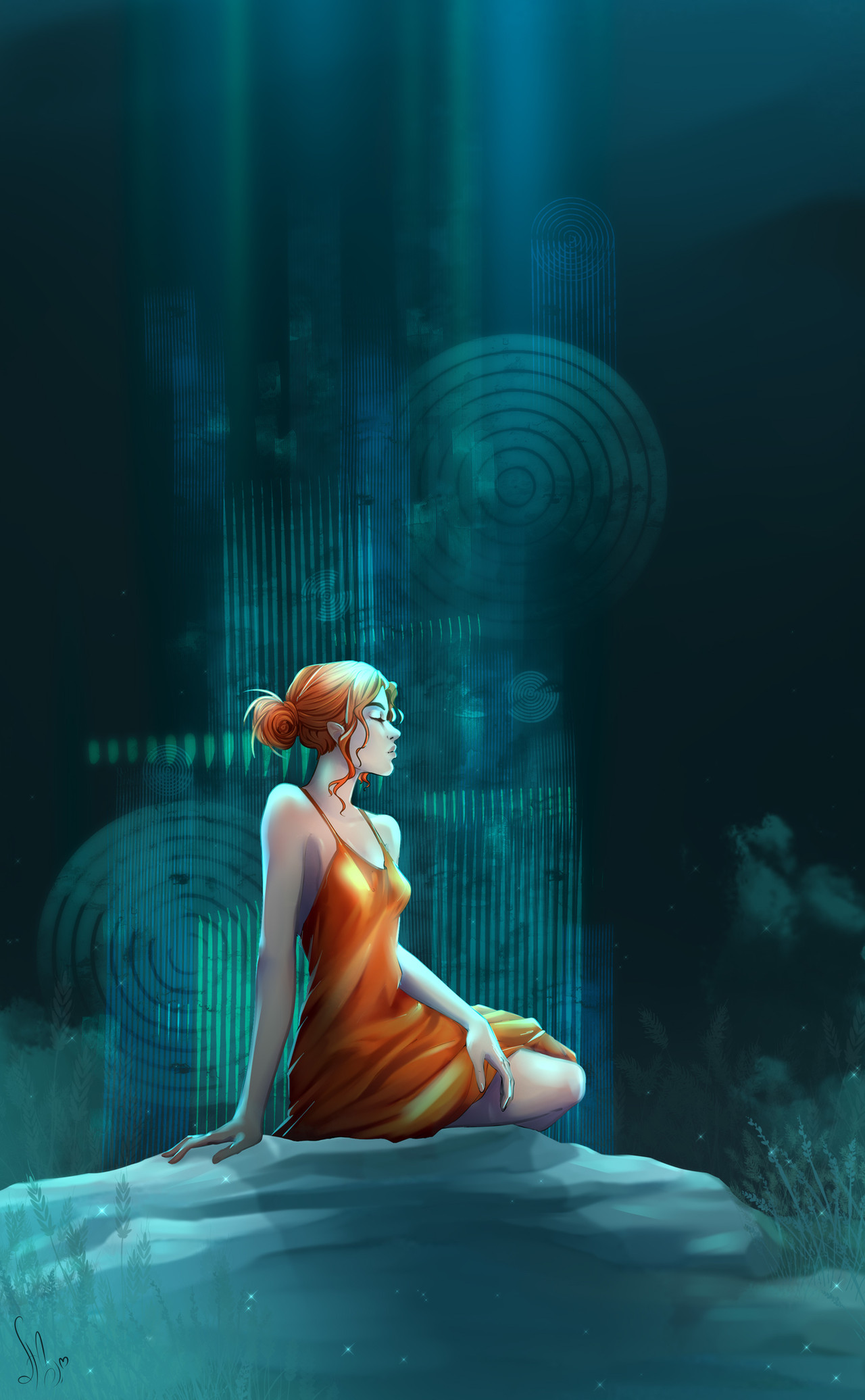
A reworking of my ever-hated Woodelf - Winter image [link]Much favourited, without - in my own opinion - much merit, that image has been driving me mad for a long time. Years, in fact.
I have finally come to terms with it long enough to somewhat fix it, although the detailing badly needed in the background is still far beyond my work ethic.
Perhaps I shall revisit it again in another few years...
")
I hope it pleases all those who favourited the last image, and I would love to see that sort of response from everyone for this new reworking of the image.
Moreover, I would love comments on the changes made, especially from those who favourited the last image, so I can see if I really have improved it...

All adjustments made using the touchpad on my macbook pro. My tablet is elsewhere. Hell, my MOUSE is elsewhere. Either would have been greatly appreciated during those many, many stitches.
EDIT: fixed that wonky patch of colour on her torso.
Related content


Comments: 11


 (Smile)")

I like this one more, because it looks as if in the other picture she is younger and in this one has matured to an even more beautiful elf(as have your skills). And also the fact that shes not smiling in this one gives it more depth i think, she looks like shes in her own world of thoughts... amazing
 (Wink)")
👍: 0 ⏩: 1

Thankyou! I still don't think it's quite right, but it's improving..
👍: 0 ⏩: 0


Ooh, awesome. I remember this! You entered it into my fantasy contest!
Yeah, this one is better. Much shinier. I like the lips better, even though she's not smiling in this one. :3

👍: 0 ⏩: 0

Thats cool, i like it.
And thats all i have to say about that!
👍: 0 ⏩: 0

I think it's absolutely beautiful hun -- and I wouldn't let the lack of detail in the background bother you at all, I actually like it that way. I think it's just enough to set the image, but not so much to look busy or distract from the foreground. It makes my head hurt when people put too much detail into backgrounds because it makes it hard to focus on the direct image. I think you got just the right touch
👍: 0 ⏩: 0

i like the reworking of the fabric and the hair. the colors look richer and warmer. and there's more contrast in the colors than the previous version. i think the hand holding the branch could use a little bit of shadow on it to give it some depth because right now it looks a little flat, but this is just little nitpicking. the overall image is still very beautiful
👍: 0 ⏩: 0

I like this one more than the other... I like that glowy sparkles, her lips...
Her face is so lovely too, I like her expression

👍: 0 ⏩: 1
Yay, her lips were what I hated most! The new lips are a compromise between flat colour and shine, and I'm almost* happy with them
..
Thanks so much for commenting!!
👍: 0 ⏩: 0