HOME | DD
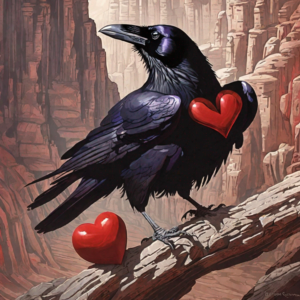
 Eicats — WIP: Raven Alt 1

Published: 2009-11-30 04:34:02 +0000 UTC; Views: 100; Favourites: 2; Downloads: 0
Redirect to original
Description
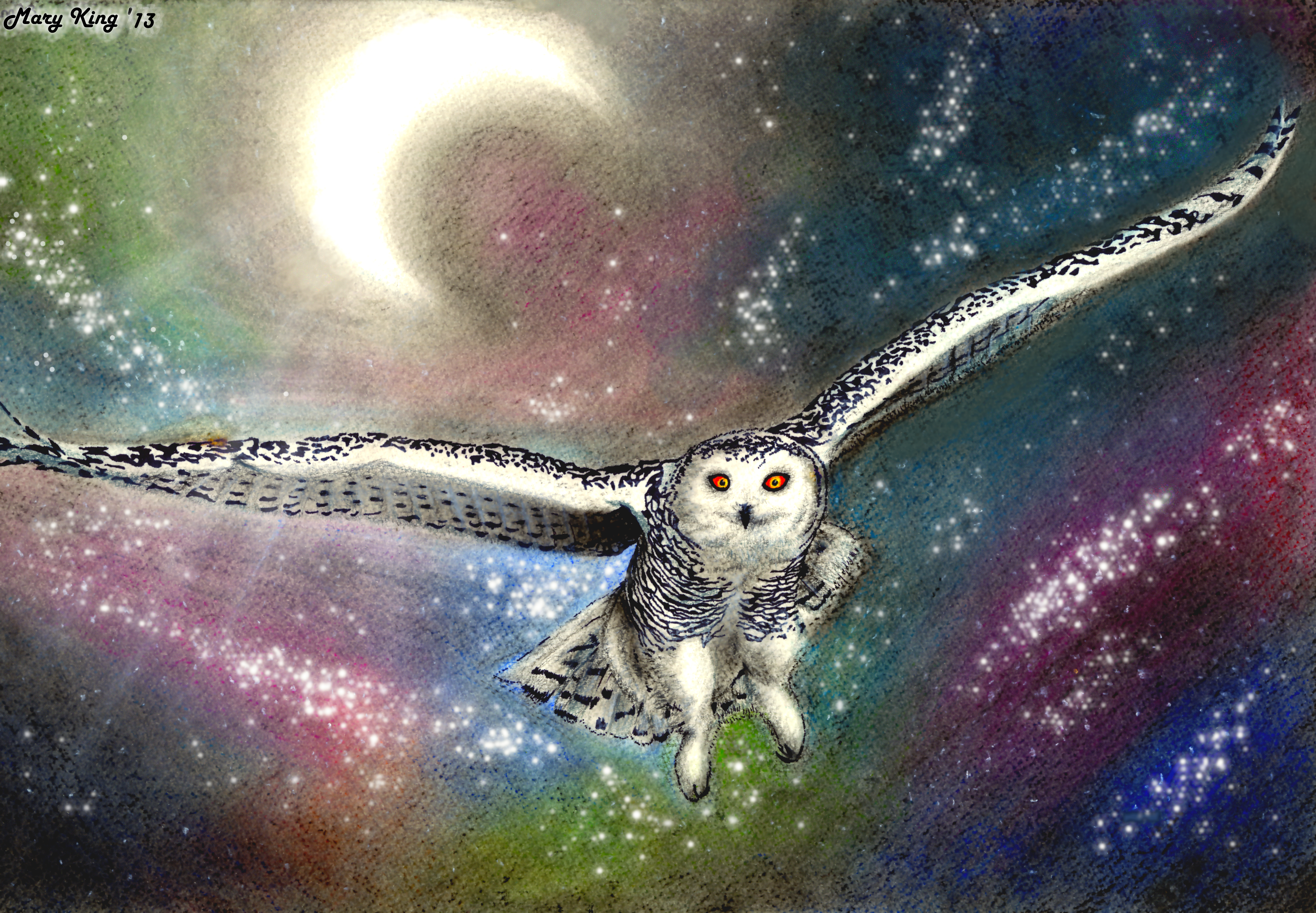
Before I ended up going with the version that became Tomorrow , this was another version I was working on. You can still see the unfinished pencil marks in places--and obviously it is very rough. Had I continued with this version, I would have filled in and edited the colors more, defined the feathers, gave it feet- you know, those kinds of things. (Wink)") And I probably would have touched up the background a bit.
And I probably would have touched up the background a bit.So why did I abandon this version? Because I felt that even after refining the colors and details of the raven, the contrast between the dark bird and dark background was so little that I didn't think it would look very good. Sure, sometimes an all-dark picture can work. But then the problem here is that I have an extremely contrasting part: those white areas in the background. I felt that would have competed too strongly with what I wanted to be the actual focus of the piece. That was also the ending point for me--I figured that I would spend endless amounts of time trying to fix that and counter the problem, only to have the problem remain, regardless.
Thoughts?
Related content


Comments: 2

Hm...I understand the contrast-problem, and I think the background of 'Tomorrow' does look better because of that. Nevertheless I like the structure of the background, it looks really artistic
")
👍: 0 ⏩: 1

Thanks for the feedback! I do still kind of wish I was able to continue with this. But oh well! Learning experience!
👍: 0 ⏩: 0