HOME | DD
 ejsing — Buzzkill - Website Design

Published: 2012-01-06 14:18:27 +0000 UTC; Views: 15449; Favourites: 197; Downloads: 489
Redirect to original
Description
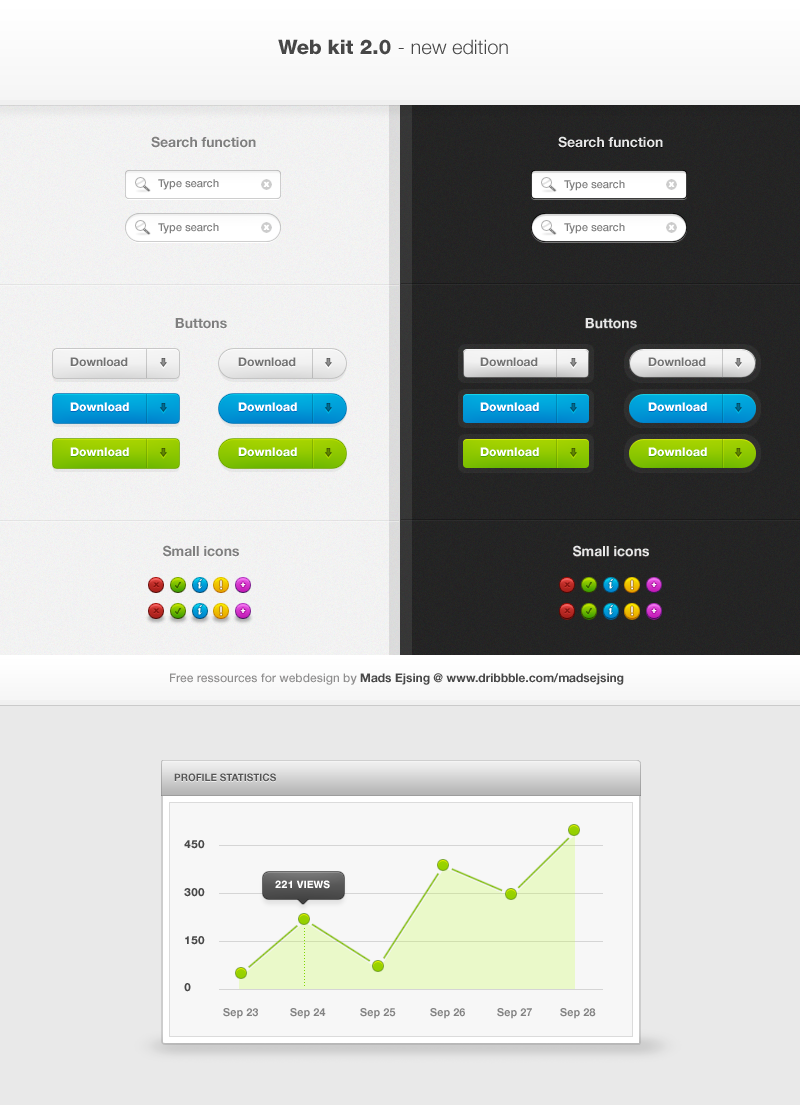
Another personal portfolio piece.Related content


Comments: 28


Looks very awesome  (Smile)")
")
👍: 0 ⏩: 1

Good times, good times. Thanks.
👍: 0 ⏩: 0

Awesome design, rly very good, but... you should fix these technical errors like not-dithered gradients or uncentred text in buttons (menu, search field, ...).
👍: 0 ⏩: 0


I think that you need a little more contrast on the header menu and storage info. The focus on the content areas is very good and I like very much the "application" feeling. Good job
 (Wink)")
👍: 0 ⏩: 0


Yes, the content area ressembles the structure of youtube, indeed.
👍: 0 ⏩: 0

How much does this design costs?
With a small modification i can use this!
E-mail me pls to nimdas at me dot com
Thanks
👍: 0 ⏩: 0

I think the site looks very promising, but at the same time it feels unfinished. It seems like a excellent layout that you just need to tweak around with a while to get the result you're looking for, if you know what I mean. That aside I think the biggest problem the design has is the lack of color and contrast. While the reds provide a neat focus, I think additional lightning could work wonders along with more highlighting of key elements (buttons mainly). You should try adding a semi-transparent (because of the existing header objects) header image / graphics, I think that could help with the tone. Hope that helps.
👍: 0 ⏩: 0


btw u made a spell fault in your signature. its personal webSITE instead of webste
👍: 0 ⏩: 0


nicely done, i like the color scheme and simplicity of it all.
+fav
👍: 0 ⏩: 1