HOME | DD
 elusive — Interface - Aquan

Published: 2007-05-16 15:17:19 +0000 UTC; Views: 11745; Favourites: 76; Downloads: 0
Redirect to original
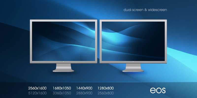
Description
Just trying out some things.*Thanks to *Kwaku for the image for the header image. Looks a lot better already
 (Smile)")
Related content


Comments: 103


")

Nice use of typography in the upper left, and the curves represent waves quite well. However, I would replace the generic image of the two people in the upper right. They don't fit the theme imho.
👍: 0 ⏩: 1

Yeah i'm still debating what would work best there.
👍: 0 ⏩: 0

Looks very aqua-ish! (Obviously)
Well balanced and tastefully designed. Great work!
 (Wink)")
👍: 0 ⏩: 1


")

I have no idea. When i'm asleep I guess. I rarely ever have time these days
")
👍: 0 ⏩: 0


All the text looks readable, and the design looks pretty good. The Header is a bit iffy, but I think you did a great job.
👍: 0 ⏩: 1

it's better , but i still feel the stock does not fit in the header
👍: 0 ⏩: 1
I am not really sure what to use. Leaving it empty doesn't work too well.
👍: 0 ⏩: 1
true , it's i mean it looks good , but i feel it could be better , maybe some buildings , as well as people etc , still very gj
👍: 0 ⏩: 0

you have to learn how to cut out objects from an image. when you this zoom in the image then do the cutting precess. good luck mate. ,)
👍: 0 ⏩: 2
I'll check it again, I noticed that originally too, I think it just resizes off. I'll check it again though on Tuesday at work
👍: 0 ⏩: 0
unless the guy in bg is just one ugly mofo ha ha
👍: 0 ⏩: 1

better version... but the man's face in the bg looks bad cut nice layout
👍: 0 ⏩: 1
Yeah I see that too. I used too different reference pics, i'll have to check it again.
👍: 0 ⏩: 0

I sense something... elusive. Very nice and subtle, i like the 'mood'. Also i like the figures more than the last figure you used.
Great work!
👍: 0 ⏩: 1
haha I didn't like the last figure either
👍: 0 ⏩: 0

footer is also better, good job mate. only the typo on the buttons like "read more" not my thing, you should change them.
👍: 0 ⏩: 1


i like the curvy effect on top and bottom .
simple, professional and cute .
keep it up bro .
👍: 0 ⏩: 1

HAHA, taas löytyy vähän mellikki-elementtejä ")
👍: 0 ⏩: 2

"Fuck, I'm stupid... I thought this was my friend's submission (Finnish guy). That's why the language
Wrong guy.
👍: 0 ⏩: 1

I actually did this on paper first, and have a drawing and didn't reference your design a single time. When you patent bends in shapes let me know.
Also speak English, as Finnish doesn't mask very well.
👍: 0 ⏩: 1
Fuck, I'm stupid... I thought this was my friend's submission (Finnish guy). That's why the language
👍: 0 ⏩: 1
Sorry for being so harsh with my reply, Mellikki.
As *Kwaku put it:
👍: 0 ⏩: 1


yeah, looks a lot better now mate.
👍: 0 ⏩: 0
Agreed, haha. I need a new image, i'm still looking for one.
👍: 0 ⏩: 0
| Next =>