HOME | DD
 elusive — Interface - Aquan

Published: 2007-05-16 15:17:19 +0000 UTC; Views: 11737; Favourites: 76; Downloads: 0
Redirect to original
Description
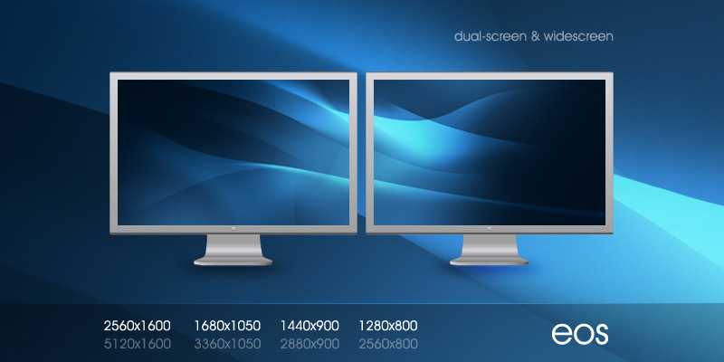
Just trying out some things.*Thanks to *Kwaku for the image for the header image. Looks a lot better already
 (Smile)")
Related content


Comments: 103

I really love the menu and that is why it gets a +fav
👍: 0 ⏩: 1
")

readability, (not good) the body font (9-10px) verdana or tahoma font is only good for copyright on the footer where nobody cares.
but color is good
👍: 0 ⏩: 1

Yeah I got some work to do on this one, I believe.
👍: 0 ⏩: 0


that man in the pic look funny as hell...just chillin, cocked to the side, on the phone and shit...lol
great design
👍: 0 ⏩: 2
 (Wink)")
Yeah that guy is going as soon as I find a replacement. He bothers me
👍: 0 ⏩: 0


great work, although that businessman looks creepy

👍: 0 ⏩: 2
haha, update: he got replaced
👍: 0 ⏩: 0
Yeah he's going as soon as I find a good replacement
👍: 0 ⏩: 0


lookin good, pro , just that photo sux ( of the man )
👍: 0 ⏩: 1
yeah it does suck i'm trying to find a replacement lol
👍: 0 ⏩: 0

nice work except the man with cellphone-he looks like an idiot.
👍: 0 ⏩: 1


There's nothing wrong with the top imho...I like this clear style.
👍: 0 ⏩: 1

That's pretty clean, Adam. Nice job, I just want to see some bigger stuff from you
👍: 0 ⏩: 1


the top part is good, you should use more white in the blue footer. that the footer looks a little bit like the header.
👍: 0 ⏩: 1

Very nice, I like the dots in the header.
But there is really something missing, dunno if its the header. But I think the colors are a bit boring. If you add another bright color it wil be much nicer, try orange or yellow.
But overall looks good, the "wavey" lines are very nice
👍: 0 ⏩: 1
I got rid of the random guy at the top, at least ")
👍: 0 ⏩: 0


sooooooooooooooooooooooo coooooooooooool dude this is totally awesome love it!!! 
👍: 0 ⏩: 1

good job brother really like it.
👍: 0 ⏩: 1


great font used , perfect for such a name imo , as for the top , love it , you even managed to not pixelate the curves , which is something most fuck up , when doing this type of effect
👍: 0 ⏩: 1


| Next =>