HOME | DD
 elusive — Interface - Carbonite
Published: 2006-12-21 01:06:53 +0000 UTC; Views: 6287; Favourites: 40; Downloads: 0
Redirect to original
Description
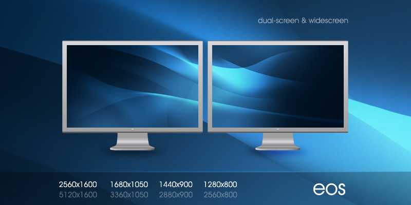
Who didn't see this coming.Related content


Comments: 95

 (Wink)")


The black one is definitely better... but the Style is awesome!
👍: 0 ⏩: 1

Thanks  (Smile)")
👍: 0 ⏩: 0


i prefer the black one, and this needs darker colour below ur logo, more contrast is needed there.
👍: 0 ⏩: 1
I prefer the black one as well. I don't think "Carbonite" will make it far on my list
👍: 0 ⏩: 0

hmm, got mixed feelings
👍: 0 ⏩: 1


A white version ... not too pale this time, looks pretty good!
👍: 0 ⏩: 1

Like everyone's been saying, I perfer the black one, don't get me wrong this looks great, but I tend to go for darker colors. ")
👍: 0 ⏩: 1


Very awesome, er but not as colorful and vivid like your other deviations.
👍: 0 ⏩: 1

I like both. Great work
If you have the time, it would be cool to have a "style switcher" to change between the two... ^_^
👍: 0 ⏩: 0


still is not online..((
btw:its nice,but too big for me..)
👍: 0 ⏩: 1
It'll be online soon enough. The black one at least.
👍: 0 ⏩: 0


Call it Carbolite instead. Description into the name.
Ah, I am far too intrusive.
👍: 0 ⏩: 1
")
")
👍: 0 ⏩: 0

Wow, awesome work there.
It really has the 3D feeling, as you gave rounded corners and the lighting effect.

👍: 0 ⏩: 1

^^ Awesome man lol I like this version best
👍: 0 ⏩: 1

")


i love them both i like white more kinda becousde it looks like a mac xD
👍: 0 ⏩: 1
I figured some what like it
👍: 0 ⏩: 0


| Next =>