HOME | DD
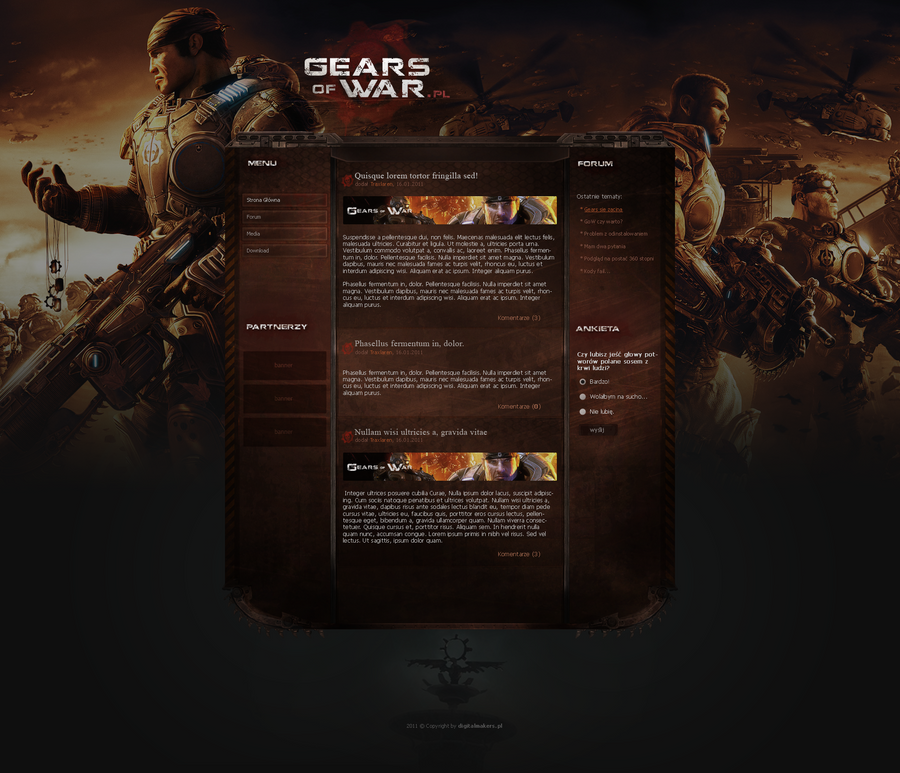
 elusive — Interface - Phantom

Published: 2007-04-11 02:44:11 +0000 UTC; Views: 14565; Favourites: 118; Downloads: 0
Redirect to original
Description
Just screwing around a bit. Maybe a flash site someday? Just for play/practice.*Gears of War is copyright its respective copyright holders.
Microsoft Corporation / Epic Games.
Related content


Comments: 153


I love DARK interfaces, even more if they are with neon's contrast! VERY GOOD NICE JOB
👍: 0 ⏩: 0

Very nice!
But the GoW logo is kinda... iffy.
👍: 0 ⏩: 1


Thanks. Was kind of experimenting with this one
👍: 0 ⏩: 1

another outstanding work,u really do some awsome work here.
i really amire u alot now^^
👍: 0 ⏩: 0

")

I agree about the pixelation here and there,
but otherwise very nice design.
👍: 0 ⏩: 1
Yeah I got screwed over on the pixelation ")
👍: 0 ⏩: 0


Awesome layout! Your blue-green is perfect! Love the shapes
I'd love to see that in Flash!
👍: 0 ⏩: 1
Hey, thanks  (Smile)")
👍: 0 ⏩: 1
Why that?  (Wink)")
👍: 0 ⏩: 0

i can never get bored of ur layouts each r worth more then 100$ awesome job keep it up
👍: 0 ⏩: 1

Love it but that pixelated bottom banner part is a bit of a bother. Could you not lay another pen tool generated shape over it on another layer possibly? Or just brush over the edge pixels for the smoother effect? If it's already been mentioned before then apologies xD;
Thing is the skin is blue but the Gears of War banner is black, it doesn't suit it enough in my eyes but that's just me I think
Well done the interface is really slick and surprisingly manageable, really big thumbs up on this one. Well done man
Hope this comment helped too xD;

👍: 0 ⏩: 1
Yeah I got to check it out. The colour some reason made it look screwed up. I didn't pen the shape though
I need to look at it. The Gears of War thing is going too I think as well. Hmm changes to come!
Thanks for the feedback!
👍: 0 ⏩: 1
No problem looking forward to more
👍: 0 ⏩: 0


Looks nice but i still think you should come up with something more complex for the "neon lights"... well that's my opinion ")
👍: 0 ⏩: 1
I'll see what I can come up with next time
👍: 0 ⏩: 1
try making something that has more depth than the actual bar if you know what i mean.
👍: 0 ⏩: 0


very sexy but the part where the gears of war image is kind pixelated
👍: 0 ⏩: 1
lol im talking about the blue line underneth the image
👍: 0 ⏩: 0

| Next =>