HOME | DD
 elusive — Relic Logo
Published: 2008-08-11 13:46:35 +0000 UTC; Views: 13718; Favourites: 119; Downloads: 0
Redirect to original
Description
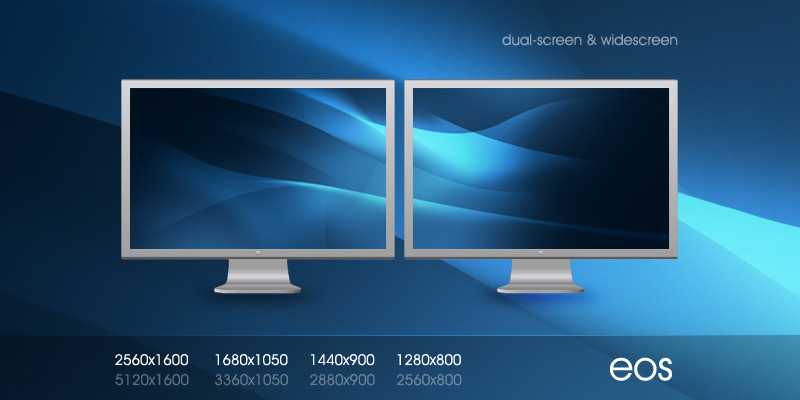
Just a random logo I was playing with. There is also an interface/web design with this, however it will not be released for a few more days while I put some finishing touches on it.Related content


Comments: 54

a tutorial for the sweet rendering for the orb will be so nice to see!
come on!
👍: 0 ⏩: 0


I really love logo-work. This is especially cool... though I'm starting to think that Lime-green is the new Red.
Even so, the design is everything a logo should be: simple, memorable, and communicative.
Pretty awesome.

👍: 0 ⏩: 0


The green one looks nice. But the monochrome ones didnt look that good at all, sorry ;D
👍: 0 ⏩: 0


Awesome. What program did you use? And RGB or CMYK?
👍: 0 ⏩: 1

It's RGB as it's just a toy around. Photoshop CS3.
👍: 0 ⏩: 1
I thought that green was too vivid for CMYK
 (Wink)")
👍: 0 ⏩: 0

You seem to have a healthy fascination with Orbs currently ;
Logo looks pretty cool, green makes it POP off the page beautifully
👍: 0 ⏩: 0


I think the typography needs to be changed to something a little more solid and maybe a little more decorative. Just to mold with the logo a little bit more.
Nice colours
👍: 0 ⏩: 1
I went through like 6 fonts, haha. It's sad really
")
👍: 0 ⏩: 1
Damn...hrmm
Try this one: [link] 
Dont know if it will work, but its got the curves and the straight edges aswell, like the logo. Let me know how you go!
👍: 0 ⏩: 0

great logo man. The font fits perfectly with it also
")
👍: 0 ⏩: 0


yum!
but in the green version (the big one) I feel that the white bits are to 'cut in' they should look more like an indent imho
👍: 0 ⏩: 0


Nice and simple, however it seems that the circular shapes are pixelated...
good job
👍: 0 ⏩: 0


Love this, as well as the simplified versions that can be played off of it. The colour choice is marvelous
👍: 0 ⏩: 0


I did the log and typeface it's a nice clean and corporate look. Good use of positive and negative space as well. Definitely portfolio worthy.
👍: 0 ⏩: 0


These logos are nice, are they part for the Relic Entertainment?
👍: 0 ⏩: 1
No connection. Just so happened to use the same name.
Relic makes bomb games
")
👍: 0 ⏩: 1
Agreed, Dawn Of War is probably one of the best games they created.
👍: 0 ⏩: 1
Happy time in an alien invasion! Hahaha! Relic is perhaps one of the best game producers so far. Probably it could match with Blizzard Entertainment.
👍: 0 ⏩: 0

Hello there. Something unusual from you, a logo
What I think:
* i like the mark. looking at it i can find an 'r', however i dont see an 's'.
* the typography is not good here. Very thin letters and tight kerning make it pretty hard to read (not that it is illegible, but the type treatment is not the most effective one) and nearly impossible if you shrink it to very small sizes.
That was my opinion.  (Smile)")
Keep up the great work, mate!
👍: 0 ⏩: 1
I ended up changing the font, actually, just now. I figured if it's a round logo, why not more round text
👍: 0 ⏩: 0


Really nice, inspirational for logo designers even
👍: 0 ⏩: 0


| Next =>