HOME | DD
 error-message —
The Message
error-message —
The Message

Published: 2007-11-06 19:06:34 +0000 UTC; Views: 12453; Favourites: 299; Downloads: 384
Redirect to original
Description
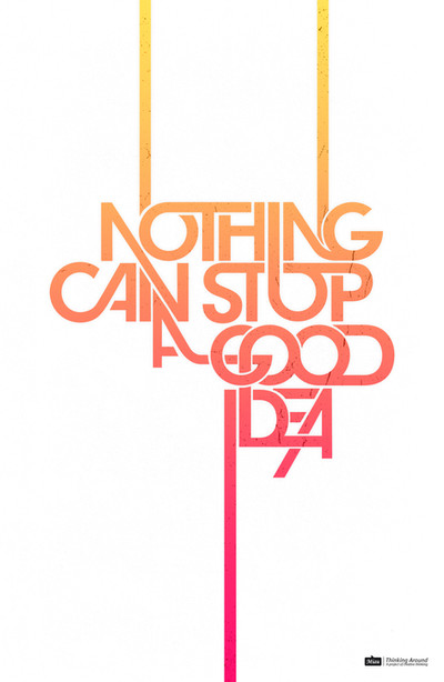
Hello everyone.This is a typographic poster that I made using quark only ( class assignment ). I was heavily inspired by Lizzitsky and decided to do something reminiscent of his style ( or at least try ).
Its a poster celebrating " Artistic Rebelliousness " and it reads as so..
Hi
my name is
Phuq Hugh
I'm an artist
Nice to meet u
Design is my life
Passion is my Marc
Type is my weapon
You've just been killed
Meet you maker
All opposition is indeed useless
Resistance is futile
Blessing to all of mankind.
hope you guys enjoy it as much as I did creating it.
Till we meet ( or design ) again....
error message
Related content


Comments: 165

Hi, I am Teddy. Once you read this you cannot get out. Finish reading this until it is done! As I said, I am Teddy. I am 7 years old. I have no eyes and blood all over my face. I am dead. If you don't send this to at least 12 people I will come to your house at midnight and I'll hide under your bed. When you're asleep, I'll kill you. Don't believe me? Case 1: Patty Buckles Got this e-mail. She doesn't believe in chain letters. Well, Foolish Patty. She was sleeping when her TV started flickering on and off. Now she's not with us anymore. Ha ha patty, Ha ha! You don't want to be like Patty, do you? Case 2: George M. Simon Hates chain mail, but he didn't want to die that night. He sent it to 4 people. Not good enough George. Now, George is in a coma, we don't know if he'll ever wake up. Ha ha George, Ha ha! Now, do you want to be like George? Case 3: Valarie Tyler She got this letter. Another chain letter she thought. Only had 7 people to send to. Well, That night when she was having a shower she saw bloody Mary in the mirror. It was the BIGGEST fright of her life. Valarie is scarred for life. Case 4: Derek Minse This is the final case I'll tell you about. Well, Derek was a smart person. He sent it to 12 people. Later that day, he found a $100.00 bill on the ground. He was premoted to head officer at his job and his girlfriend said yes to his purposal. Now, Katie and him are living happily ever after.The have 2 beautiful children. Send this to at least 12 people or you'll face the consequences. 0 people- You will die tonight 1-6 people- you will be injured 7-11 people- you will get the biggest fright of your life 12 and over- you are safe and will have good fortune! Do What Teddy Says!!!! Hurry, you must send to 12 people before midnigh
👍: 0 ⏩: 0

(BTW I'm not actually laughing, I just always say lol, this was actually an amazing work of art)
👍: 0 ⏩: 0


 - :D")

 (Smile)")

thank you very much.
👍: 0 ⏩: 0

thanks for the comment
👍: 0 ⏩: 0


This was fun to read!
It really shows off just YOU.
My favorite part is the "Type is my weapon. You've just been killed."
Awesome, awesome, awesome.

👍: 0 ⏩: 1
thank you . . . thank you
this was a very fun and playful piece for me.
👍: 0 ⏩: 0

You had me at the Star Trek reference.
And your 'name'  (Wink)")
Nice job!
👍: 0 ⏩: 1
haha . . . thanks a lot
this was a fun piece.
👍: 0 ⏩: 1

Wow, finding typographic pieces in deviant art is quite a rare sight. I like where this piece is going as well.
A bit of criticism (I kind of wrote this out of order so forgive me for any inconsistency):
Perhaps consider moving the characters 'eet' in 'Meet' slightly higher and/or adjust the tracking so that it aligns with the 'M' and the 'U'.
A big problem in this piece is the 'Hi my name is Phuq Hugh' portion of the image. It seems like you tried to force all those elements together and in turn resulted in what appears to be a 'U' or upside down 'A' in the piece and it took me quite a while to understand that it was a sideways "P". What really threw it off were the upside down characters 'HUQ' which in turn made me read the character "P" as an upside down 'A'. I would try to re assemble this portion of the image as I think its a really important part of the text.
In the section where you wrote 'Design is my life Passion is my Marc Type is my weapon You've just been killed' I think an adjustment on the leading would really help you out so that the characters don't get all jumbled up like that, it just makes it slightly annoying to look at.
Another part that bothers me is the 'all opposition is' portion of the piece. I noticed that you neglected to add a space in between 'all' and 'opposition', if you plan to leave it like that then perhaps you could try putting the word 'all' in bold (the typeface appears to be helvetica so I think it would look ok) to indicate that they are two different words but still one element. Currently it just looks like a typo since you added the space between 'opposition' and 'is'. Then I also noticed your attempt to keep the characters kissing each other but by doing so the characters 'iti' appear to form an 'E' on its side or an 'M' of some sort (at least to me anyway). I would recommend adjusting the kerning on those characters just enough to add a space to where it actually reads as 'opposition'. Then the character 's' sort of resembles a backwards 'a' when its kissing the other characters but I think you could get away with leaving it like that since it doesn't affect the readability quite as much for me. And although those small adjustments may (or may not) help, I would recommend getting away from that direction and increase the tracking in that portion of the text.
Then I believe you could go with a different color choice on 'Blessing to all of mankind', at least make it slightly more orange for readability. I would comment on the words 'Nice' and 'Futile' but then I realized this is a poster so a large print would probably make that easier to read.
I suppose this criticism could be ignored if the piece wasn't intended to be typographically correct but since you have a lot of the characters rotated and such it causes the reader to struggle which is a big deal if you're trying to communicate a message. Although if you purposely designed it like this then I suppose that adds a sort of twisted meaning to the portion.
Type is my weapon
You've just been killed
Just realize that even though the rules of design can sometimes be broken, they can't be ignored.
Overall this piece isn't typographically stable as I already mentioned but if you try to fix some of those small elements then perhaps it'll be easier for you to convey your message and even though it may not totally remedy the composition it may add a slightly better foundation for your design.
I see a lot of potential with this and I would recommend remaking it if possible but your efforts in attempting a typographic poster is admirable. Just finding typography on deviant art is really rare and I didn't really want to ignore this piece. I look forward to seeing more from you.
👍: 0 ⏩: 1
I'm almost honor to have received such a long and drawn out critique. Taking so much time to comment on my piece is very much appreciated.
this piece was done in class under a very limited time constrains. the objective was to create a typographic poster while using quarkXpress only. so I was left to render in a very unfamiliar territory. . . but I had a great time doing so! I was thoroughly impressed with the result and all its imperfections, so I decided to share it with everyone else. it pleases me to know that I was able to stop you with the piece and force a comment out of you ( or anyone for that matter ). asking for more is just plain greedy.
thanks again for your time.
👍: 0 ⏩: 0

Showed this to my design class tonight as a wonderful example of a type based poster! It was much appreciated!
👍: 0 ⏩: 1
wow are you serious!?!? I'm speechless . . . thank you so very much.
👍: 0 ⏩: 0

thanks man I'm glad you like.
👍: 0 ⏩: 0

I'm glad you like it. thank you very much for the comment
👍: 0 ⏩: 0

Whats the font you're using there?
Pretty rad.
👍: 0 ⏩: 1
go to dafont.com and search for what's called " Old Black Sans "......I'm pretty sure that's what I ended up using. there also might e a little bit of helvetica as well...... can't remember lol
👍: 0 ⏩: 0

Featured in my weekly Graphic Design roundup: [link]
👍: 0 ⏩: 0

That is some sweet typography design! Everything is extremely well packaged and aesthetically pleasing. I like the variation on the font sizes too. ^^ It really does demonstrate artistic rebelliousness or at least a new way to look at things.
👍: 0 ⏩: 1
thanks a lot. I glad you like the piece. I wish I would've started as young as you were, some of you photos are amazing
👍: 0 ⏩: 1
I'm a big fan of typography. ^^
Aw, thank you. :3
👍: 0 ⏩: 0

thanks a lot. the goal is to keep going from here. stay tuned.
👍: 0 ⏩: 0

deffintly an interesting one, I see a little Lissitzky in there. reminds me of his prouns. Not so much his later work though. maybe even a little bit of "beat the whites..." It's the similar pieces scattered making up a larger organism, for lack of a better term.
👍: 0 ⏩: 1
thanks you for finding the Lizzitsky in my work. I really appreciate it
👍: 0 ⏩: 1
no prob, when thats all i've been learning in one of my classes all semster, its fun to see that El actually left a real mark on "post-modern" society
👍: 0 ⏩: 1
yeah man..... that whole constructivism movement is really intriguing .
👍: 0 ⏩: 0
thanks a lot. welcome to DA. I encourage you to post your work as soon as possible. you could be next
👍: 0 ⏩: 1

i will do but i have some prob to collect them thanks for urs encouragement i m trying
👍: 0 ⏩: 1

thanks for the comment. I really appreciate it. you graffiti is pretty nice
👍: 0 ⏩: 0

Finally a DD thats earned and deserved. I never see graphic designers or typographers getting any glory anymore.
Congrats!
And amazing job man,
I cant wait, I start typography I in just over a month
👍: 0 ⏩: 1
thanks a lot man I appreciate it. I was very lucky to get noticed so early. Hopefully I ( or we ) can continue to represent for the graphic designers out there
👍: 0 ⏩: 1
indeed
noone seems to realize the graphic design, or newly dubbed "visual communication", is everywhere... how silly. haha.
but again, awesome work
👍: 0 ⏩: 0
| Next =>