HOME | DD
 evilrandomguyblah — Red v.2

Published: 2011-03-11 22:25:48 +0000 UTC; Views: 326; Favourites: 4; Downloads: 4
Redirect to original
Description
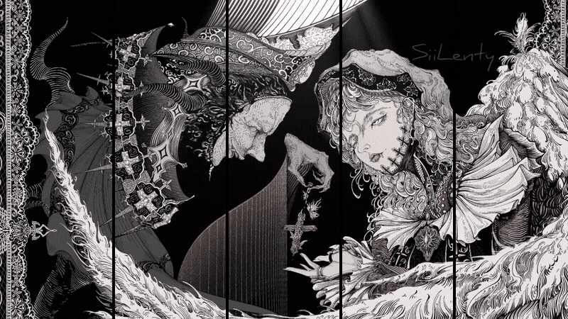
The 'finished' version of: [link]Please tell me which you think is better.
Related content


Comments: 10

I like this one. The sharper lines of the face make a better contrast with the splattered background.
👍: 0 ⏩: 1

Thanks for your opinion. Yeah that was the basic idea of introducing pencil again... really helps me get the sharp lines and details.
👍: 0 ⏩: 0
Thanks for that, mate. Yeah it was an unfinished stage in my working process, has a very contemporary feel due to unfinished nature, Moreau-reminiscent to an extent I suppose. I'll play around with it a lot more in future. Thank you.
👍: 0 ⏩: 1

I think I just don't like the hood.
👍: 0 ⏩: 1
It was originally going to be hair, but I tied it in to Red Riding Hood as I was just about finishing the paint.
👍: 0 ⏩: 1
Not having outlines to bound the imagination made the hair seem a vibrant ripple of red; which I liked.
👍: 0 ⏩: 1
That's a very interesting observation. Thanks for that. See, the development made a lot more sense for me. Here, look: [link]
I initially found the hair really restricting, which was the reason I applied the wash in the first place. Now that I think about it, I guess I kind of backtracked. Thanks for pointing that out.
👍: 0 ⏩: 1
Another thing I can definitely say I noticed and do not like in this version is a bit harder for me to express due to a few (too many hours in waking) language barriers. I'm going to attempt to explain it without sounding like a complete idiot (anymore).
The issue stems from the outline beneath the chin. The hood and hair both turn and face inwards (I'm practically inventing whole words/idioms here and hoping they actually exist), appearing to converge were they to continue going in the direction they are now. This serves to further the sentiment that the painting is more distant/enclosed than it was before adding the outlines.
Anyway, I can honestly say that I kind of like your painting/drawing style and am going to watch you closely (unless you happen to rarely submit stuff, in which case I cannot watch you closely, and might even have trouble remembering who you actually are; I sure hope you aren't like me (now) and only submit something once a few months).
👍: 0 ⏩: 1
You did a pretty good job. Yeah, I get what you mean. I was more focussed on drawing a clear parallel to fables and stories and wasn't worrying about some of the aesthetic elements. Thanks for pointing that out. As I said, playing with ideas. If I didn't think both had their merits I would've only submitted one.
Yeah I was pretty inconsistent with the submissions for a long time, but hopefully I'll have to submit a lot this year since I'm doing Art as one of my subjects and that requires me to work regularly at a high quality.
👍: 0 ⏩: 0