HOME | DD
 FabianMonk — Journal Update 3

Published: 2007-11-12 02:20:09 +0000 UTC; Views: 6905; Favourites: 68; Downloads: 178
Redirect to original
Description
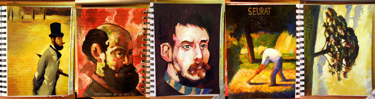
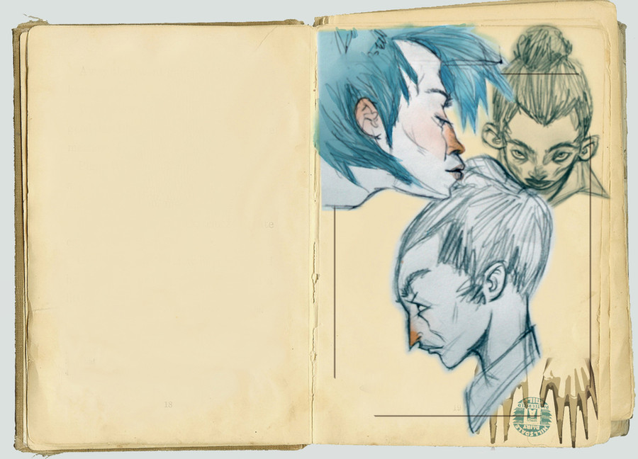
Here's another one. This is actually two weeks worth, since I didn't update the last time around (there were only two artists that time, didn't feel the need to submit just those).Anyway, artists this time are, from left to right, Bridget Riley, Andy Warhol, Quentin Blake, Kerry Phippen, Vincent Van Gogh and Francisco Goya.
Mediums used were pencil, sharpie (jesus, the marker fumes...), watercolors and acrylics. Let me know your thoughts!
Related content


Comments: 42

Pencils, color paints, markers, and even today's fine digital technology are mere tools, creativity lies in the artist which makes him unique^_^
👍: 0 ⏩: 0

the first and the last are my faves; great use of type in the Bridget Riley, i don't think i was expecting any to be there and it keeps drawing my eye back to the page
and the colors in the Goya are wonderful! i love the mix of cold and warm colors, it's as if the person were facing a fire yet his back is left chill to the cold - it really jumps out
 (Smile)")
👍: 0 ⏩: 0


You are extremely talented, I have enjoyed browsing through your portfolio!
👍: 0 ⏩: 0

a rad selection; i quite liked Blake and Van Gogh as a kid ^^,
👍: 0 ⏩: 0

great things here. i like your interpretaion of goya. looks very cool
")
👍: 0 ⏩: 0


Holy crap, your Quentin Blake one just gave me a serious childhood flashback.
Good ol' BFG...
👍: 0 ⏩: 0

The Warhol and Goya ones are amazing.
The composition of the Warhol one is what I like best about it, and the Goya one just has really vibrant colours.
Good work, yo.
👍: 0 ⏩: 0

I never liked Art History at school but you've made me curious about 2 of the ones I don't know:
Bridget Riley and Kerry Phippen.
Let's see if I find that your paintings are better!
👍: 0 ⏩: 1
sorry about this I should have googled it first but...
Your's are better! I really mean it!
👍: 0 ⏩: 1

Trust me, Bridget Riley is someone whose work you have to see the originals of to get the real impression. That tiny A5 copy I did is absolutely nothing compared to what she does. While I am honestly not a huge fan of her work, I did see some of her paintings in an exhibition only recently, and they have a completely different effect in real life. They really warp your mind, and staring at one piece for too long might make you dizzy, haha.
Thanks for the compliment, but my copu doesn't come close to what she achieves with her originals.

👍: 0 ⏩: 1
I'll take your word for it but I really like yours better!
👍: 0 ⏩: 0


i gotta start making my journal look as interesting as yours. your an inspiration mate.
👍: 0 ⏩: 0
goldenavatar [2007-11-12 18:14:37 +0000 UTC]
My thoughts? "I've got to use my drawing journals more often."
👍: 0 ⏩: 0

I love the warhol one, its just so friggin perfect, something you would think he would do himself. The goya reminds me alot of his massacre peice which alot of ppl know him by.I think these are a nice way to get people intrested in these artits to learn more, thanks for the idea, may use it when I get to teach.
👍: 0 ⏩: 0


OMFG Quentin Blake!
These journals of yours are so awesome... I'm jealous that my own classes don't have such cool assignments lol
👍: 0 ⏩: 1
Well I guess the challenge lies in finding ways to make your assignments cool then!
👍: 0 ⏩: 1
hahaha yeah that would help
👍: 0 ⏩: 0
Do you know of Bridget Riley? You might dig her works.
👍: 0 ⏩: 1

ah i know riley. but its not the perspective illusion that turned me on, but the combination with the small letters involved. gives itall the extra kick
👍: 0 ⏩: 0

Very impressive and enjoyable as always.
What size (you can say it in cm I'm a european  (Wink)")
👍: 0 ⏩: 1

That's pretty damn awesome! The Quintin Blake and the Van Gogh ones are especially brilliant. Although I think you could've done a lot more with Andy Warhol.
Looks like you're having a lot of fun with these!
👍: 0 ⏩: 1
Yeah, I had better plans for some of these, but sometimes you gotta cut corners when there's simply not enough time left in the day.
Actually I just wish I had a screen printing press in my room.
👍: 0 ⏩: 0


I love how/where you put the text in each one.
It gives more to it and makes them seem more like images not 'work' as such.
👍: 0 ⏩: 1

might wanna link em vertically? just a thought
👍: 0 ⏩: 1
Not a bad one at that. Next time, Gadget!
👍: 0 ⏩: 0

dude i really love your juornal if some time you think to drop it, tell where jajajaja
👍: 0 ⏩: 1
If I ever were to drop it and lose it I'd set the world on fire, haha. Unless I had already gotten my grade for it. Then I'd just cry a little.
Haha, cheers mate!
👍: 0 ⏩: 1

these lok great monk, you're going to be an art monster when you get out of school!
👍: 0 ⏩: 1

the Warhol is fantastic! very realistic. ever been to his museum here in Pittsburgh?
👍: 0 ⏩: 1
Nah, I don't even know if I've been to Pittsburgh. I'm not a huge Warhol fan, myself, haha. Thanks.
👍: 0 ⏩: 0