HOME | DD
 FabianMonk — Old Blind Man - Step by Step
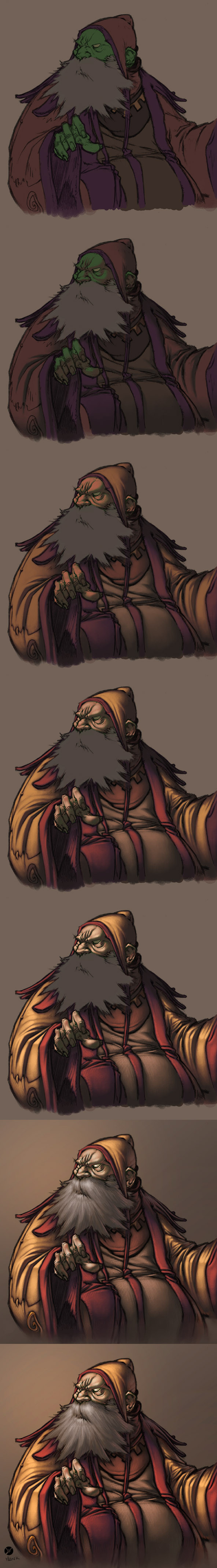
Published: 2005-09-13 13:56:20 +0000 UTC; Views: 84090; Favourites: 1853; Downloads: 5662
Redirect to original
Description
First off! Pencils by the ever amazing Creon!Colors by me.
Some people have been requesting a step by step for some time now, and seeing as how I had nothing better to do yesterday, I whipped this up. Software I used was Photoshop CS, and the brush was a "light textured brush" (or something like that) from the wet media brushes!
General things about this image:
- I layed down relatively dark flats, and one even darker shadow layer underneath the lineart (which I set to multiply this time - usually I use a different method, but it doesn't make a huge difference).
- All the highlights are on a layer above the the lineart (I did a total of 4 layers of highlights, getting progressively lighter/warmer).
- As you can see, I try not to use just dark and light tones of the same color. I don't shade my red with dark red, but with a dark purple/gray. I also don't use only light red for highlights, but I like to stray as far as a bit of orange (not too visible in this one though).
- Yes, the flat color for skintone is green. This is something entirely new to me, and I never tried doing this before now, but I've come to realise that a lot of extremely highly talented painters have a greenish (sometimes even blueish) undertone in the shadows of their skintones. So this was an experiment, and it's not my usual way of doing skintones, but I liked the result and will be sure to play around with it in the future.
- The step by step process for the beard isn't shown, because I totally put all the render on one layer by accident. But the process is exactly the same as for anything else (hatching is does the trick more than anything, here).
- I upped the hue/saturation and brightness/contrast values on the last step.
Feel free to ask questions (as long as I didn't already answer them above - I reserve the right to ridicule you in case you ask why the flat color for his skintone is green, for example).
Cheers!
And I think I'll post a step by step of a less experimental coloring process in the future (allthough I use the techniques and color build-up shown in this one almost all the time).
Related content


Comments: 237


This is phenomenal, I read that you used Photoshop for this, but your execution of this piece makes it look traditional, what would you recommend for brushes?
👍: 0 ⏩: 1

This piece is really ancient, so I use completely different brushes by now.
As far as what I would recommend though - well I would recommend a brush that suits your tastes...
If you want to create the feeling of rough textures and strokes, use a brush with a rough texture. Conversely, if you want smooth strokes use a smoother brush. That's pretty much how I do things most of the time these days.
👍: 0 ⏩: 0


2 things
1. Do you use ( not always but on some parts ) selection tool , on that piece u didnt i see but on other ?
2. Lot your works got some nice texture on it , or i only see there some texture but there isnt  (Smile)")
👍: 0 ⏩: 0

Really really looking forward to trying this out, especially the green skintone, who'da thought?
")
👍: 0 ⏩: 0


This is awesome got a good understanding on just looking at the images. What I do like is how the colours blend so nicely. might try something similar when I get time.
👍: 0 ⏩: 0

I have a question.. Did you start of with a scanned picture of the pencil lines? Or were the lines already done digitally?
I have a pencil sketch and I'm converting it to digital coloring, but I'm kind of lost..
Do I line it again digitally over the pencil lines? Or is there another way..?
👍: 0 ⏩: 1
By now, I actually usually illustrate 100% digitally.
But you can just as well color pencil lines that you scanned. You definitely don't have to draw the lines again, there's a much easier way.
Take a look at this: [link]
👍: 0 ⏩: 1
Hmm.. I use Paint Tool Sai so I'm not sure the same rules apply which are on that tutorial...I'll try to find a way around it.
Thank you so much for the feedback! ^^
👍: 0 ⏩: 1
Oh right, sorry. I'm an idiot. I'm so used to using only Photoshop by now that sometimes I forget that there's other software out there...
My bad, haha.
👍: 0 ⏩: 1
Haha, That's alright! I understand. (:
👍: 0 ⏩: 0

Yeeks I found this aaages ago and lost it! Love...
👍: 0 ⏩: 1
Haha, glad you feel that way upon finding it again!
👍: 0 ⏩: 0

Dark to light, usually its the other way around. Awesome, I had never concieved of doing it this way, thank you.
👍: 0 ⏩: 0

how ur strokes take that papperlike texture :cccc
I LOVEEEEITTTT ur so great jajjaja XD
👍: 0 ⏩: 0

Green skin as an undertone... hmmmm *scratches chin* I need to try this.
👍: 0 ⏩: 0


the green and blue under-painting is much like Maxfield Parrish's work. He would always do a complete monochromatic blue painting before he started in with any additional colors. Actually that's where Parrish Blue comes from.
The piece looks good, I love step by steps they're just fun to look at. It's like watching something come to life. The only thing that bothers me is that the highlight on the inside cuff is too bright. It is causing it to sit on the same plain as the outside of the cuff. I would knock it back just a little.
👍: 0 ⏩: 0

I don't suppose you could provid a link to the line art? or something you think would be good for practice.
👍: 0 ⏩: 1
Well I got the line art for this piece from so you could check that out. I don't think he still has this specific piece up there but actually I'm not at all sure.
As far as other line art... sorry, I don't really have a library of that anymore. DeviantArt is a great place to look though, there are tons of professional illustrators and comic book artists posting their line work. Good luck!
👍: 0 ⏩: 0

Great tutorial! Will definitely have to try this out!

👍: 0 ⏩: 0

what r the brush settings u use man? i can never figure out what cud be the proper setting for painting!
👍: 0 ⏩: 1
I have both flow and opacity set to 100% almost all the time and regulate them with the pen pressure instead.
👍: 0 ⏩: 1


Im also mostly trying to colour from dark to light. But when i put out my colours it tends to end up with sharp edges and very unblended, so in the end i must blend it as if i put light to dark tones. Is it better to use low opacity on the brush? I usually use around 50-60% opacity.
👍: 0 ⏩: 1
There's no universal rule for that. It all depends on what you prefer. I for example have my opacity on 100% almost all the time and regulate it with the pen pressure of the wacom tablet. But really it's all up to you.
Sorry if that's not the answer you were looking for, but I don't know what else to tell you. Try things out, see what works best for you and if it produces satisfying results then you're on your way.
Also, I mean I blend a lot. I'd say like 70% of my painting process is just blending. The key, as far as I've noticed, is not to just blend two colors (between light and dark for example), but to throw a whole range of colors in there and blend those. That will make for some much more interesting imagery.
👍: 0 ⏩: 0


woah mr. santa thing makes me smile
this tutorial was very useful yus indeed
👍: 0 ⏩: 0

I'm confused over how you got the green to turn into peachy skin tone.
I can see bits of the green beneath the peach, did you just put an opaque layer of peach over the green?
And (sorry, just one more question I swear
You did gorgeous work with this by the way
👍: 0 ⏩: 1
Yeah I just painted over the green with a different color.
And wet media brushes are a certain library of brushes that you can load into your current ones in Photoshop. It's one of the default sets of brushes that comes with the program. Just right click anywhere on the canvas, click the little arrow in the top right corner of the box that just appeared and select it from the drop down list. :]
👍: 0 ⏩: 0

supergreat....do u use and textures, as well as a ''textured'' brush? there seems to be a canvasy-look to parts of his outfit, specifically the top of his headgear, and areas of his sleeves (maybe it's just your crosshatching..?)...
either way, thx for the stepbystep
👍: 0 ⏩: 1
A textured brush was involved in this piece, yes...
👍: 0 ⏩: 0

You're probably sick about answering questions about this tutorial, but anyway...
With your shadow layer above the flats, is that a darker shade of green, or a shade of the skin tone that just happens to be darker than the green? I'm going to try it out myself and see what happens, but I'm curious. Do you think the tone used matters much?
Also, did you use a lower opacity when putting those shadows in, or did you just block them in and set to multiply?
Awesome tut and technique though. It took me a while to realise that you still had the lines in the final product rather than taking them out and letting your colouring do the work.
👍: 0 ⏩: 1
Actually the only layer that's set to multiply here is the line art layer. All shadow and highlight layers are on normal. As for the colors, I think that's just a darker, more desaturated version of the base color or something. I honestly don't remember, I don't color like this anymore.
My brush settings are almost always with both Opacity and Flow on 100%.
👍: 0 ⏩: 1
Oooh, I see I read that wrong. I actually set it off multiply anyway because I liked the effect better! That's pretty cool, and I suspect this will be a one and only time I colour like this unless I can't do any better. Just playing around at the moment
I'd love to keep the opacity on 100% and just use pen pressure, unfortunately my Genius tablet is not quite as sensitive as a Wacom ")
Thanks for that though, it's very interesting!
👍: 0 ⏩: 0

This definitely gives me some things to think about... thanks for this.
👍: 0 ⏩: 0
Just hatching. Lots of thin strokes basically.
👍: 0 ⏩: 1

do u use a mouse or like a tablet or something??? i dun hav a tabletttt...
👍: 0 ⏩: 1
I use a Wacom tablet. Intuos 2 6x8.
👍: 0 ⏩: 1
Ohhhh okayy!!hahhah thx.
👍: 0 ⏩: 0


This is great cause' even by showin step by step and not explaining everything I learned a lot form this, Thanks
👍: 0 ⏩: 0

Hum, wet media brush, will have to try that.
Nice seeing this piece develop!
👍: 0 ⏩: 0


Amazing tut dude!
The only thing I was wondering is "How long did it take ya?"
👍: 0 ⏩: 1
I have no idea, by now I have completely forgotten, haha.
Thanks man!
👍: 0 ⏩: 0
| Next =>