HOME | DD
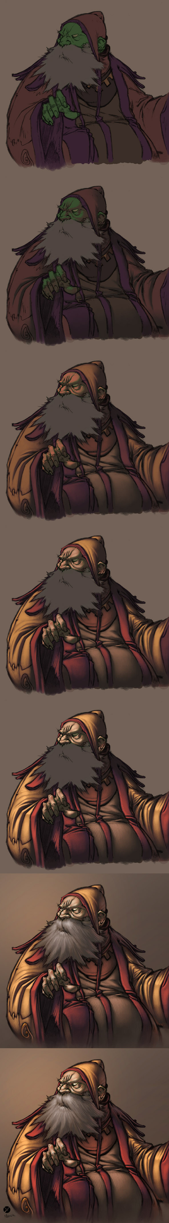
 FabianMonk — Old Blind Man - Step by Step
Published: 2005-09-13 13:56:20 +0000 UTC; Views: 84093; Favourites: 1853; Downloads: 5662
Redirect to original
Description
First off! Pencils by the ever amazing Creon!Colors by me.
Some people have been requesting a step by step for some time now, and seeing as how I had nothing better to do yesterday, I whipped this up. Software I used was Photoshop CS, and the brush was a "light textured brush" (or something like that) from the wet media brushes!
General things about this image:
- I layed down relatively dark flats, and one even darker shadow layer underneath the lineart (which I set to multiply this time - usually I use a different method, but it doesn't make a huge difference).
- All the highlights are on a layer above the the lineart (I did a total of 4 layers of highlights, getting progressively lighter/warmer).
- As you can see, I try not to use just dark and light tones of the same color. I don't shade my red with dark red, but with a dark purple/gray. I also don't use only light red for highlights, but I like to stray as far as a bit of orange (not too visible in this one though).
- Yes, the flat color for skintone is green. This is something entirely new to me, and I never tried doing this before now, but I've come to realise that a lot of extremely highly talented painters have a greenish (sometimes even blueish) undertone in the shadows of their skintones. So this was an experiment, and it's not my usual way of doing skintones, but I liked the result and will be sure to play around with it in the future.
- The step by step process for the beard isn't shown, because I totally put all the render on one layer by accident. But the process is exactly the same as for anything else (hatching is does the trick more than anything, here).
- I upped the hue/saturation and brightness/contrast values on the last step.
Feel free to ask questions (as long as I didn't already answer them above - I reserve the right to ridicule you in case you ask why the flat color for his skintone is green, for example).
Cheers!
And I think I'll post a step by step of a less experimental coloring process in the future (allthough I use the techniques and color build-up shown in this one almost all the time).
Related content


Comments: 237

I am going to have to try this... it's a new coloring style I've honestly never done myself and might be the kick I need to really reach a new point in my work. ^_^ Thanks for putting this up it'll help alot of people I'm sure!
👍: 0 ⏩: 0

Looks very World of Warcraftish. I would not be surprised if he works for Blizzard.
👍: 0 ⏩: 1
 (Smile)")

That's actually brilliant, it's simple but so complicated. I love this style it reminds me of the artworks in the Harry Potter series.

👍: 0 ⏩: 0

Ok wait a second here. Let me get this straight. A) you put the flats UNDERNEITH the lineart, then put the shadows between the lineart and the flats? B) then you put all the consecutive highlights ABOVE the lineart...wtf? So...each highlight is ontop of the other? and you DON'T seperate the colours in their own layer...man that's hard. And you do this in Photoshop....omg...I gotta start using those media brushes....which are located where?
👍: 0 ⏩: 1

You have A and B correct. Except that I do seperate the colors in layers, just not the highlights. The flats, shadows, lineart, and highlights are all on one layer each.
By now I don't use this method any more, I make the flats so dark that I don't need a shadow layer, I just paint straight to the highlights, but that's the jist of it.
Lastly, the wet media brushes are located where all the other brushes are in Photoshop. If you have CS, just right click on the canvas somewhere (while using the brush tool) and then click the small arrow in the top right corner of the dialogue box that opens. A drop down menu should open, and you can select your brushes there. I don't know if this is how to do it in the older versions of PS though, I forgot...
👍: 0 ⏩: 2
I put the highlights where ever I please actually, sometimes underneath the lineart, sometimes on top. If I want the image to look more painted, I paint on top of the lineart, that's the rule of thumb.
As for the brush, I actually don't know which one it is. If it's not the one that I mention in the description, then I have no idea. Totally forgot.
👍: 0 ⏩: 0
lol wow! Ok I saw your Naruto tutorial, is that your new method you were talking about? If so, then is the midtone layer you were talking about ontop of the really dark flats, but under the lineart? As for the media brushes I found them, but can't find the one your refer to. And ya I do have CS lol. Whatever brush you use it really gives that painting feel, I really want to try that but there are too many there. If you could give me the name of it or a similar brush that would be awesome ^__^
👍: 0 ⏩: 0

Nice step by step. It's clear and I love your technique. Awesome. :3;
👍: 0 ⏩: 0

If u may can you explain how you did the shading in the 2nd image? I dont quite understand if you used the darker shadow layer and then erased the main colors or if you added it on top or what. So if you're willing could you try and explain it to me?
(I'm not the sharpest tool in the shed)
👍: 0 ⏩: 1
Well after I put down the flats (first image), I made another new layer inbetween the lineart and flat colors layer. On that layer, I just painted the shadows on top of the flats. I took a darker, slightly differently hued color than the one from the flats and painted the shadows in there how you see them. Hope that helps.
👍: 0 ⏩: 1
Yes it did. Thank you very much for the answer and the most excellent tutorial.
👍: 0 ⏩: 0

That's a really sweet technique you got there. I never thought of using those textured brushes. I'll have to give it a try. Thanks for the tips.
👍: 0 ⏩: 0

Fantastic process you've got here, I shall definitely have to try it. Just one question; About what opacity do you normally keep your brush on while doing the different layers?
👍: 0 ⏩: 1
I always have it set at 100%. I regulate the opactiy of the strokes with the pressure I apply to the tablet.
👍: 0 ⏩: 1

Meow! "Reverse shading", I have to say it really makes for a dramatic picture. Simply amazing.
You are very nice too 
Allright, m' gonna go check you gallery now!

👍: 0 ⏩: 0

Hey, I'd always wondered about that dark undertone thing, especially with the skin! Seeing it done like this is probably the only way I ever would have caught on. Thank you SO MUCH.
👍: 0 ⏩: 0


That is more than a little impressive...I've been looking for a good "skin technique"...and it looks like you've just handed it to me on a silver platter...
👍: 0 ⏩: 1
Yo do you mind telling me how you found this deviation? I'm just curious, because all day long my watch list has been exploding, and this seems to be the deviation must people are faving, and since it didn't get a DD, I'm guessing someone rather prominent member must have faved it or something?
I'm really just curious.
👍: 0 ⏩: 1
Makani drew a very nice picture using this technique, and I know for a fact she has a few hundred watchers. [link]
👍: 0 ⏩: 1
Thanks man, that was probably it right there, haha.
👍: 0 ⏩: 1
woman... (Wink)")
But you're more than welcome.
👍: 0 ⏩: 0

Very helpful!
I use a method quite similar to this..so I will make sure to try it out sometime
")
👍: 0 ⏩: 0

woah...
that might be a little advanced for me right now, but i'd like to give it a shot ")
thanks for taking the time to make this!

👍: 0 ⏩: 0

I never tried dark to light, thanks for taking the time to give me a new way!
👍: 0 ⏩: 0

Well, I must say that many of my questions have been answered. So nice of you to actually respond to all of those questions; however, I'm still a tad bit confused about the whole undertone deal.
I've been trying to undertake the mission of learning it on my own, but without any educational background on art - well, I'm fairly lost. So I guess.... When you have a flat undertone, then you build up color on it with pen pressure on.. is it like.. blending other colors into that undertone?
Does it actually give you a guide to the undertone's complementary colors? *OxO*
Confused.
Basically, what IS the purpose of laying an undertone here?
👍: 0 ⏩: 2
Well if you work in Painter, then depending on which brush you use, the color you apply on top of another color will automatically blend with the underlying color. But that doesn't have anything to do with pen pressure per se. I did this in Photoshop, and there was no automatic blending.
And no, haha, there's no guide to complimentary colors that just pops up. You have to learn that shit yourself. I don't have any educational background to art either, it's just practice. Of course reading up on color theory can help you completely, since that's where you'll learn exactly which colors compliment which, and so on.
Also, the purpose of laying an undertone is so that I've got a flat color to work with that's different from the background. If I immediately started rendering the image, without laying flat colors first, then everything would have the same underlying color, the background color. And if everything has the same underlying color, it gets harder to tell individual shapes apart. Laying flats not only gives you a good idea of the mood you're going to achieve, but also helps in creating clarity.
👍: 0 ⏩: 1
Humm.. In painter, what kind of brush would automatically blend the colors?
👍: 0 ⏩: 1
Most of the oils, watercolors, acryllics, that kind of thing. I don't think chalk or charcoal does. Basically any brush/medium that would blend in real life...
👍: 0 ⏩: 0
and by undertone I mean an underpainting >.>
👍: 0 ⏩: 0

this is amazing even though i know i wont EVER be able to pull it off
👍: 0 ⏩: 0

realy nice job man thanks alot master
👍: 0 ⏩: 0

Do you seperate each new section with a different layer? Or do you do everything in one?
👍: 0 ⏩: 1
I seperate the background, the flat colors, the lineart and the rendering. But the rendering is done entirely on one layer.
👍: 0 ⏩: 0

insane color!!!! so besides the base colors and maybe some blocked in shadows, the majority is crosshatched with color??? and you just keept on building up the highlight?? my biggest problem with color(if i ever finish) is makking lights light and darks dark, also i dont know a ton about color so maybe if i do what you did, instead of using shades of the same color use a greyish color thats a little different(like the greyish-purple you used to shade the red)
do you stick with one layer for the shadows/shade? and just make layers for the light/highlights?\
sorry for all the questions, one more...
...what is the opacity set on your prush??
thanks man!!!
👍: 0 ⏩: 1
Yeah I just keep building up to the highlight. I start with the darkest color and finish with the lightest (on one object/shape/whatever). And I use one layer for all my rendering (in this case for all the highlights). My brush opacity is set to 100%, I control the opacity with the pressure I apply to the surface of the tablet.
No problem dude.
👍: 0 ⏩: 1
one last lil thing acyually two...
so you said that all the highlights are on one layer??
so its possible to set the tablet so that instead of preasure=thickness of stroke, preasure=opacity?? if thats the case ill have to check that out.
👍: 0 ⏩: 1
You can control both the opacity/flow as well as the thickness at the same time. At least that's what I do. To enable pressure sensitivity for opacity/flow, you have to open the brushes tab in the top right corner of PS, and look under the last option there, I forget what it's called. But it's only got two sliders in there, one for opacity and one for flow. You can select "pen pressure" in the drop down menu under each one of those sliders and voila.
And yes, all the highlights are on one layer. Well technically, in this specific case, each highlight was on a different layer, but I only did that so that I could go back and turn them "invisible" one by one to make the step by step progress shots. But usually, I put all my highlights on one layer.
👍: 0 ⏩: 1
oooooooooh okayy, wow youve been a great help!!! thanks for the tips, i better take advantage of it ans start practicing.. thanks agian
👍: 0 ⏩: 0

Your style is pretty easy on the eyes! Im currently trying to experiment with pen pressure as it seems to allow a lot of flexibility. And about the green underlay.. I'm pretty sure HTK does a similar thing but with a bluey-grey colour, at least on some of his CG's. Anyway, thanks for the step by step! I'll give it a go.
👍: 0 ⏩: 0


WoW! I did learn a lot from reading the whole tutorial and all the questions/answers that are written in English..... Thanks man! Too bad I cannot understand the GERMAN ones which apparently also had abundant information in it, ")
👍: 0 ⏩: 0
What is the overall opacity/flow of the brush setting u generally use to color> like this one? Is the brush opacity also controled by pen pressure? ^___^ And do you eye drop a lot to blend between colors? Thanks! (I know these are pretty dump questions and I am also trying different settings myself to experiment...)
👍: 0 ⏩: 1
Opacity and flow are both set to pen pressure.
And I used to eye drop a lot, but nowaday not so much. Depends on how big the surface is I need to blend.
👍: 0 ⏩: 1
So the smaller the surface to be blended is, the less you need to eye-drop? I see that... Usually now you only blend on the very edge of shades... I like this style very much though ^___^
One more thing to follow up: so the small hatching lines are also done with the textured wet-medium brush? Or is it simply the default hard round brush? (Thanks to be so patient with me... I felt like I have asked a ton of questions to you already...
👍: 0 ⏩: 1
The smaller the surface, the less eye-dropper tool, correct. And of course, the quantity of eye-dropping increases if I want a very smooth transition. And everything in this picture is done with the same brush.
👍: 0 ⏩: 1
<= Prev | | Next =>