HOME | DD
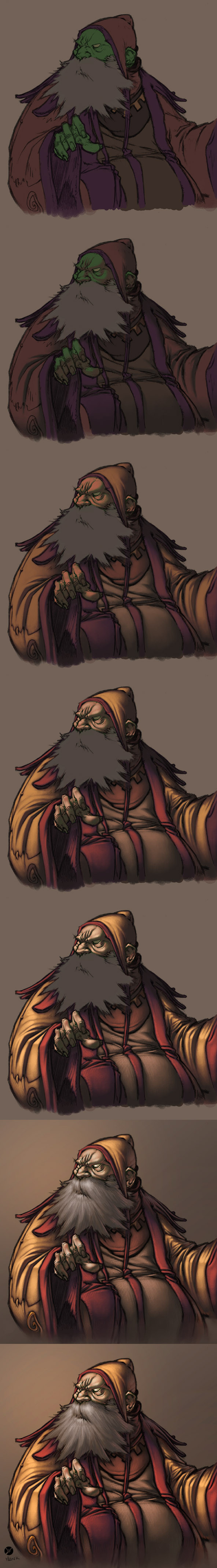
 FabianMonk — Old Blind Man - Step by Step
Published: 2005-09-13 13:56:20 +0000 UTC; Views: 84095; Favourites: 1853; Downloads: 5662
Redirect to original
Description
First off! Pencils by the ever amazing Creon!Colors by me.
Some people have been requesting a step by step for some time now, and seeing as how I had nothing better to do yesterday, I whipped this up. Software I used was Photoshop CS, and the brush was a "light textured brush" (or something like that) from the wet media brushes!
General things about this image:
- I layed down relatively dark flats, and one even darker shadow layer underneath the lineart (which I set to multiply this time - usually I use a different method, but it doesn't make a huge difference).
- All the highlights are on a layer above the the lineart (I did a total of 4 layers of highlights, getting progressively lighter/warmer).
- As you can see, I try not to use just dark and light tones of the same color. I don't shade my red with dark red, but with a dark purple/gray. I also don't use only light red for highlights, but I like to stray as far as a bit of orange (not too visible in this one though).
- Yes, the flat color for skintone is green. This is something entirely new to me, and I never tried doing this before now, but I've come to realise that a lot of extremely highly talented painters have a greenish (sometimes even blueish) undertone in the shadows of their skintones. So this was an experiment, and it's not my usual way of doing skintones, but I liked the result and will be sure to play around with it in the future.
- The step by step process for the beard isn't shown, because I totally put all the render on one layer by accident. But the process is exactly the same as for anything else (hatching is does the trick more than anything, here).
- I upped the hue/saturation and brightness/contrast values on the last step.
Feel free to ask questions (as long as I didn't already answer them above - I reserve the right to ridicule you in case you ask why the flat color for his skintone is green, for example).
Cheers!
And I think I'll post a step by step of a less experimental coloring process in the future (allthough I use the techniques and color build-up shown in this one almost all the time).
Related content


Comments: 237

This is fabulous!!! May I ask what brush you use for colouring? I love the texture it makes, like coloured pencils.
👍: 0 ⏩: 1

Ummm... honestly I forget. I haven't used that brush in ages, this tutorial is pretty old. But if you sift through the previous comments on this deviation, I think other people have asked me that before. Thanks!
👍: 0 ⏩: 1
Excellent! Thank you! Sorry, i'm lazy. I'll have a look later!!

👍: 0 ⏩: 0

How does the green base (skin) affect or come into play? If your brush is set at 100% opacity wouldn't all the green get covered up? Why did you choose to work with green?
👍: 0 ⏩: 1
Since I work with a Wacom tablet, and actually control the opacity with the pen pressure, the 100% opacity thing should be taken with a grain of salt. It's only at 100% if I press down really hard.
And about the green - that was more of an experiment, really. Skintones, in certain environments, have some green tones in them. I just started with green as the base color, it's just one way to get that green tone in there. But this tutorial is really old, nowadays I do things differently anyways.
👍: 0 ⏩: 1

Can you say what things??? PLEASE!!!
👍: 0 ⏩: 1
That would pretty much require an entire new tutorial, and I don't really have the time for that, sorry.
Don't make yourself so dependent though, just play around with the software, just try random things out. Think of it like a puzzle, you'll solve it soon enough if you really want to.
👍: 0 ⏩: 1
Thanks anyway! you are really an inspiration!!
👍: 0 ⏩: 0

thank you. I've been looking for this type of coloring style rather than anime cel shading.
👍: 0 ⏩: 0

I'll definitely be trying this one out! Thank you for putting in the time to make it!
👍: 0 ⏩: 0

Do you use a blending method or just build up the colors?
👍: 0 ⏩: 0

I love this step by step, it was so helpful!
Thank you!!
👍: 0 ⏩: 0

Thank you, thank you, thank you! I'm sure this will come in great handy for me soon. 8D I love the style.
👍: 0 ⏩: 0

Amazing tutorial! I've just finished using it and I gotta say I've never painted a more convincing skintone. 
Thank you so muchly much for sharing this technique!

👍: 0 ⏩: 0

mmm you use photoshop and painter without preferences... great
👍: 0 ⏩: 0

The reason the painters use a blue-ish or greenish shade in their shadows for skintones is because the "rule" is that shadows are often the opposite color of the light's color.
So if you have yellow light streaming in onto your character, you'll need blue-ish/purplish shading.
Of course this gets mixed so much with the skintone that it's hard to notice, but it just gives your characters this extra vivid thing.
I've only started using it myself, recently, but I know all along. =/ Dumb, eh?
Anyway, it looks great, this tut. ^^
👍: 0 ⏩: 0


This is really fantastic! How did you do the lighting in step 3?
👍: 0 ⏩: 1
I painted it with a brush.
👍: 0 ⏩: 1

That turned my brain to shit @_@
👍: 0 ⏩: 0

interesting you chose to start the skin with green. incredible care for detail - this deviation has taught me a lot! thank you x)
👍: 0 ⏩: 0

This tutorial is great! It really comes in useful; I've already used in a drawing. Thanks!
👍: 0 ⏩: 0

great job - especially on the folds
👍: 0 ⏩: 0

I've heard of colourists using layers for highlights and shadows for years now.. what I want to know is, is this method better than just doing each part in one layer (i.e. the face colour in one layer) then using the burn and dodge tool to create shadows and highlights?
👍: 0 ⏩: 1
Well, unless you are insanely experienced and know exactly what you are doing, then I would go ahead and say that yes, doing anything that doesn't involve dodge and burn is better than using doge and burn.
👍: 0 ⏩: 1
Ah I see! Thanks for clearing it up.
👍: 0 ⏩: 0

When you paint, does the background play an important role to your overall peice?
From what I know (and I have no idea if it applies with digital painting), the aspect of the environmental lighting...i've encountered this while rendering in 3D and reading some Andrew Loomis coloring studies -- that it could either degrade the overall saturation level of the highlights you apply? When I paint using Photoshop, I tend to keep the colors of the main object in good relation with the background color.
Thanks.
👍: 0 ⏩: 1
Yeah the background plays an important role. Colors of the background / environment play a major role in the shadows on the objects in the foreground, and as such totally set the mood of the entire piece. A clear blue sky will create blue-ish shadows for example (depends on the reflectivity of the object just HOW blue though - a white shirt for example will have clearly blue shadows, whereas maybe a bright red one will have shadows going towards purple).
I usually try to set the mood of the background before I even begin rendering the figures in the foreground.
👍: 0 ⏩: 1
okay.  (Smile)")
👍: 0 ⏩: 0

I refer to this tutorial all the time, and after experimentation, I found there wasn't a single brush in the wet media brushes that much looked like yours. I think the brush you used looks like the "pastel rough texture" from the dry media brushes. I read through the comments to see if anyone had found which one it was, noticed a couple other people in your comments confused about this too, so I thought I'd mention it when I found it.
And, in reading, I noticed you wondered why all the sudden attention to this piece, it was most likely this piece [link] which mentions and links to your tutorial.
But, anyway, for as long as its been up, thanks for such a useful tutorial!
👍: 0 ⏩: 1
Which version of Photoshop do you use?
Maybe the brush I used is only included in PS CS...
No idea though, I'm not even really sure which brush it was, but I'm pretty sure that I double checked when I wrote the description, so it seems weird that people can't find it.
Anyway, glad you like it, but this tutorial is seriously outdated by now.
👍: 0 ⏩: 1
I use CS2.
I refer to various tutorials, though are there any newer ones you'd recommend?
👍: 0 ⏩: 1
I personally made one newer one with Painter, but the painting technique is the same as the one I use in Photoshop... it's a Naruto step by step somewhere in my gallery.
I don't really refer to either of these two though, the only one I ever refer to is over at steeldolphin.com, in case someone is just starting out. Other than that it's really only studying and practice practice practice.
👍: 0 ⏩: 1
Both tutorials have the same basic principles, flats, middle color, highlights, which is a good place to start for a beginner, nomatter whatever other techniques. Digital media is alot different than normal media, so I have to start somewhere. ")
Thanks for making tutorials!
👍: 0 ⏩: 0


hey, i was checking this out, do you blend between layers? mix up the opacity of the brush at all? anything like that?
👍: 0 ⏩: 1
I blend, but I don't change the opacity of the brush. I basically always have the opacity set at 100%, I control it with the wacom pen pressure. I don't blend inbetween layers though. Unless if by layers you meant the individual layers of highlights; in that case yes I do blend, but you have to pretend that all the highlights are on one layer anyways, because that's what I usually do. I only put them on individual layers here so I could easily do the step by step thing.
👍: 0 ⏩: 0

Wow, you have a very interesting style of digital painting! Thanks for making this tutorial, I'd love to give this a try. You're such a talented artist.
👍: 0 ⏩: 0

Awesome. Really interesting to see the progress of things, and really helpful, even without step by step guidelines.
👍: 0 ⏩: 0

Oo, I like your method. It looks easier than trying to work the other way!
👍: 0 ⏩: 0

this one really helped me!
great job
👍: 0 ⏩: 0


what about the hatching in the beard , how did u do it ????
is it special brush to make it look hairy & how do u blend between colors ???
👍: 0 ⏩: 1
The hatching in the beard is done like any other hatching, with lots of brush strokes. No special brush or blending involved, just lots of individual strokes.
👍: 0 ⏩: 0

oh wow! This helped me a lot! Thanks so much! I love this method at the mo!
👍: 0 ⏩: 0

Oh thank you so much! I believe this will really help me in the future. (If I ever get better at doing lineart first) XD But I do have a question I hope you may answer:
I wouldn't have thought of green being a flat skintone, either. So, say there is a kindof blue-ish light being shone on the face, do you think using a darkish purple color would be a good skin tone, or would you still suggest using the greenish color?
*hopes her question isn't too stupid*

👍: 0 ⏩: 1
That is so entirely up to you, which colors you use.
👍: 0 ⏩: 0

Thanks for the awesome tutorial, the result looks beautiful (though I'm sure you knew that already)! So useful for a beginner in coloring, like myself.
👍: 0 ⏩: 0
| Next =>