HOME | DD
 FabianMonk — Old Blind Man - Step by Step
Published: 2005-09-13 13:56:20 +0000 UTC; Views: 84095; Favourites: 1853; Downloads: 5662
Redirect to original
Description
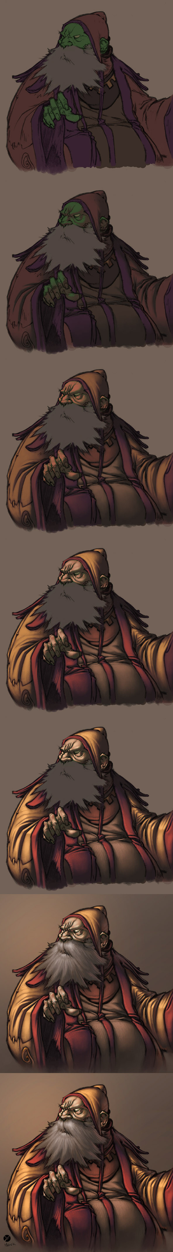
First off! Pencils by the ever amazing Creon!Colors by me.
Some people have been requesting a step by step for some time now, and seeing as how I had nothing better to do yesterday, I whipped this up. Software I used was Photoshop CS, and the brush was a "light textured brush" (or something like that) from the wet media brushes!
General things about this image:
- I layed down relatively dark flats, and one even darker shadow layer underneath the lineart (which I set to multiply this time - usually I use a different method, but it doesn't make a huge difference).
- All the highlights are on a layer above the the lineart (I did a total of 4 layers of highlights, getting progressively lighter/warmer).
- As you can see, I try not to use just dark and light tones of the same color. I don't shade my red with dark red, but with a dark purple/gray. I also don't use only light red for highlights, but I like to stray as far as a bit of orange (not too visible in this one though).
- Yes, the flat color for skintone is green. This is something entirely new to me, and I never tried doing this before now, but I've come to realise that a lot of extremely highly talented painters have a greenish (sometimes even blueish) undertone in the shadows of their skintones. So this was an experiment, and it's not my usual way of doing skintones, but I liked the result and will be sure to play around with it in the future.
- The step by step process for the beard isn't shown, because I totally put all the render on one layer by accident. But the process is exactly the same as for anything else (hatching is does the trick more than anything, here).
- I upped the hue/saturation and brightness/contrast values on the last step.
Feel free to ask questions (as long as I didn't already answer them above - I reserve the right to ridicule you in case you ask why the flat color for his skintone is green, for example).
Cheers!
And I think I'll post a step by step of a less experimental coloring process in the future (allthough I use the techniques and color build-up shown in this one almost all the time).
Related content


Comments: 237

Thanks a lot for the detailed explanation! ^___^
👍: 0 ⏩: 0

what exactly is HATCHING? you said hatching was the trick for the effect on the beard. And when you highlight is that on an OVERLAY layer... like the shading being on a multiply level?
👍: 0 ⏩: 1

Hatching is basically drawing a lot of thin lines next to each other, which roughly follow either the shape of the object, or in this case, the flow of the hair/beard. It's nothing Photoshop specific at all, it's a drawing technique.
Also, there is no overlay used for highlighting, as well as there is no multiply used for shading in this tutorial. All the layers are set to normal (except for the line-art one, that one is multiply but that has absolutely zero to do with the colors/shading/highlighting).
👍: 0 ⏩: 1
Hatching is only used for the last/most high-lighted layer of this drawing, is it? Thanks!
👍: 0 ⏩: 1
No, it's used all over...
whenever I feel it helps the texture.
👍: 0 ⏩: 1
Thanks! When I look carefully again I think I noticed the hatching line traces on other layers... On shrinked images it is not very easy to see but now I get it... Thank you for being so patient in answering questions... You are very helpful ^O^
👍: 0 ⏩: 0


Wow! That is so informative.. you're awesome. X3
👍: 0 ⏩: 0

I got a question.
When you put the lights over the line art do you leave the light layers on normal? In which case you just brush them in and avoid the lines. Or do you change the light layers to something else?
👍: 0 ⏩: 1
Light layers are set to normal and I avoid the lines.
👍: 0 ⏩: 1
awesome thanks for the clarification. Your awesome.
👍: 0 ⏩: 0

Amazing tutorial dude, i like this to solve some questions who i have sometimes... tnks a lot budy.
Cya
👍: 0 ⏩: 0


Holy crap, this is extremely helpful o_o. thank you so much!! *looks over it again*
👍: 0 ⏩: 0

Hey, erstmal big Respekt an das Bild und grundsätzlich an deine Skillz! Me being one of your 345 billion watchers! Kick ass!! ")
Bin selbst noch Rookie wenn es um's Coloring geht, somit mach ich alles eher aus'm Gefühl als routiniert und durchgeplant, so merk ich, dass ich seit längerer Zeit auf der Stelle trete. Mir ist klar, dass es kein Fertig-Rezept sondern nur unendlich viele individuelle Wege gibt, trotzdem würden mich ein paar Sachen interessieren, da ich kein Bock mehr hab auf Stillstand:
- orientierst du dich an Vorlagen, was Lichteinfall angeht? (oder spricht da die Erfahrung aus dir? )
- das gleiche gilt für die Plastizität. Meine Versionen vor Creon's Linearts fielen z.B. brutal flach aus, ihr Pro-Coloristen habt neben euren perfekt gesetzten Lightings noch das Auge, um über die bloße Lineart hinauszusehen und der Figur eine eigenständige Plastizität zu geben, so dass das Coloring total in den Vordergrund rückt und die Lineart nur nebensächlich zu sein scheint (hope you get the idea...). Anyway, gibbet ne Möglichkeit, das zielgerichtet zu üben, ne Technik, ne Denktrick, en Knick in der Optik, ohne es mühevoll durch Abmalen von Profi-Sachen allmählich hinzubekommen (denn durch Abmalen wird man nicht schnell genug schlauer)?
- Eine Dilletanten-Frage zu Photoshop: Ich arbeite mit Painter, dort kann man praktisch wie mit Acryl die Farben beim colorieren auf dem Motiv mischen, sprich fließende Übergänge in jeder Hinsicht. Nun kenne ich von Photoshop nur den Fall, dass, wenn ich über schon colorierte Stellen drüber gehen, entstehen keine Verläufe, sondern die Farbintensität verdoppelt sich. Tja, wie gesagt, bin Rookie, mit welchen Einstellungen arbeitest du für gewöhnlich?
- noch was: wie lange sitzt du täglich vor'm wacom?  (Wink)")
Ok, sorry, das reicht völlig! A serious response von dir wär echt cool, man. Also, greez und weiter viel Erfolg!
👍: 0 ⏩: 1
Hey, wow, danke für den langen Kommentar! Also lass mal versuchen zu beantworten.
1- Nein, ich orientiere mich nie an vorlagen. Keine Ahnung wo ich die überhaupt hernehmen würde, um ehrlich zu sein. Ich stell mir das bild halt innerlich erstmal mit verschiedenen Lichtwinkeln vor, and nehme dann den bei dem ich denke, es sei der passendste.
2- Tut mir leid Mann, wieder hab ich keinen Plan. Ich denke das kommt halt mit der Zeit (ich weiß, die antwort hasst jeder, und aus gutem Grund). Ich denke, schau dir die Bilder von denen an, die du meinst sie machen es richtig, und guck dir deren technik an. In der Regel kann man davon ne Menge lernen - probier halt nur nicht, von den Bildern dirrekt abzumalen. Das limitiert dich selbst ungemein, und hindert dich ein bisschen davon ab, selbst ein originelles Bild zu malen.
3- Ich benutze in Photoshop den normalen Hard Edge Brush, mit Opacity (Deckkraft?) und Flow (keine Ahnung wie das auf Deutsch heißt) auf 100%. Zusätzlich kontrolliere ich Opacity and Flow mit dem ausgeübten Druck auf dem Wacom (kann man in der oberen rechten Ecke unter dem "brushes tab" erledigen. Und dann setze ich in der Regel auch die hardness des brushes runter auf so... 60 bis 80 prozent. Manchmal rauf auf 100, manchmal sogar runter auf 0. Kommt drauf an wie weich ich das objekt/material darstellen will. Wichtig ist, dass der Brush Mode auf Normal steht. Wenn du deinen brushmode auf multiply stellst (zum beispiel) dann kriegst du eben diesen effekt, bei dem sich plötzlich die dunkelheit verdoppelt.
4- viel zu lange, ha ha. Ich messe die Zeit zwar nicht, aber das können schon so 4 bis 5 bis manchmal 6 Stunden sein. Zwischendrin sind in der Regel eine ganze Menge Tetris oder Fress pausen angelegt, aber trotzdem bleib ich verdammt lange (für meinen Geschmack) vor dem PC. Macht halt einfach zu viel Bock.

👍: 0 ⏩: 2

First off, this is extremely helpful and I'm highly appreciative of you taking the time to give us a brief rundown on one of the myriad of possible ways to color. Kudos!
Second, a swift check with babelfish indicates that my suspicions were correct, and that the above comment actually expands on what brushes you used while coloring this. Unfortunately, babelfish sucks and can't properly translate to save its life, so I was hoping you might share a proper translation? Or at least repeat in English what the brush settings were for the benefit of anyone else who happens to read the comments for information?
👍: 0 ⏩: 1
Honestly, I'm really sorry but I don't even remember. This is ancient, my process has changed somewhat over the years...
I'm pretty sure it was just one of Photoshop's default brushes, somewhere in their library... it had a canvas texture built into it I guess?
Sorry I couldn't be of more help, and for replying so late.
Thanks for the comment though!

👍: 0 ⏩: 0
Hey, keine Ursache wegen dem Kommentar, eher danke für die Antwort.
Und kein Problem, dass du keine konkreten Tipps geben kannst, hab ich mir schon gedacht. Das kenn ich selber, wenn es um dieses Thema geht, ist alles relativ und ne Sache der Erfahrung. Kann man nichts machen.
Und noch ein fettes Danke für die Tipps zu PS, hab direkt Bock bekommen.
Ja, das mit der Sucht kennt ja fast jeder, bei mir war es ne Zeit lang die Musik, saß ich nur noch vor’m Rechner und hab beats gebaut
Gruß matin
👍: 0 ⏩: 0

I want your coloring skill... NOW give it! ACK so envious. This will be good reference, for eye candy, and to coloring techs.
👍: 0 ⏩: 0
Your a real nice guy for being so helpful. And I've admired your colors for a while now. A+ and a page of gold stars.
👍: 0 ⏩: 0


its great to get a chance to look under the hood at the high performance engine, to see how it runs!! thanks man, and great work ALWAYS!

👍: 0 ⏩: 0

Why the lights are above the lines!!!
👍: 0 ⏩: 1

This is awesome stuff mate,
instant fav
I just hoped that knowing the techniques would make me as good as you but there is still a huge part called talent needed in the creation of these pieces
oh yes, just one question
why the flat color for his skintone is green?
greets Soulrailer
")
👍: 0 ⏩: 1

haha, still left wondering how the hell you do it.
brilliant stuff.. and it's great to see the progressive steps

👍: 0 ⏩: 0

I keep looking at this for help.. AWESOME! So you color on the layers ABOVE your lines? Am I understanding that right? See, I have my lines over my colors.... Should I not do that?
👍: 0 ⏩: 1
Dude, ha ha. There is no one way to color anything. You do what you feel most comfortable with, follow the processes you know best. After all, if every artist used the same procedure, we'd be getting some very monotonous results.
In this case, all of my highlight layers are above the line-art. My flats and the one shadow layer are underneath. But usually, for example on the DarkStalkers piece, I did all my rendering underneath the lines. If you put your highlights above the lines, it will give the entire image a much more painted aspect.
👍: 0 ⏩: 1
AHhhhhHhhhhhhh.. thank you for that.. I thought you geniuses had one secret formula! lol I salute you for being a great instructor!

👍: 0 ⏩: 0

Looks like you used some cross hatching on the clothing, for texture purposes I am guessing. this is very helpful thanks a bundle.
👍: 0 ⏩: 1
That I did indeed. Very useful for scratches on metal, or cloth texture.
👍: 0 ⏩: 0

Mann, hast dich echt krass entwickelt im letzten Jahr!  (Smile)")
👍: 0 ⏩: 1
Danke Mann! Hab da noch einiges vor mir, aber es ist erfreulich zu hören dass ich schon was erlangt habe.
Wie machen sich die Wellenläufer?
👍: 0 ⏩: 1
Kein Ding. Hast vielleicht noch was vor dir, aber das wird definitiv rockig!
Wellenläufer läuft ganz gut, abgesehen davon dass ich meiner deadline übelst hinterherhinke.
Zumindest finde ich mich langsam in den Stil ein.
👍: 0 ⏩: 0

thanks alot monk..his tutorial was very useful, Im very intrested in trying out that green flat color for the skin tone. cheers
👍: 0 ⏩: 0


great step by step. i have a question about what you actually use. mouse or board? and if board, what type of board is it and size? i just am asking cuz im really thinking of getting one now.
👍: 0 ⏩: 1
I use a Wacom Intuos 2 6x8 tablet.
👍: 0 ⏩: 0

Interesting...I like how you incorporated the green in his skin. Nice touch. I will try it! Thanks ^^
👍: 0 ⏩: 1
Hey, thanks! Always nice to hear.
Maybe next time you draw one of those stunning portraits.
👍: 0 ⏩: 0

very very nicely done as always. You did change your methods (seeing your old "tutorial" with the troll creature). Just wondering, just brushing, no gradient, no selections?
👍: 0 ⏩: 1
Yep, just brush strokes on this.
On bigger and more complicated pin-ups I still use selections however. Makes things easier.
👍: 0 ⏩: 1

YA MAN GREEN....I FRIGGIN LOVE usin green on skin tones. Fuckin aces
👍: 0 ⏩: 0
<= Prev | | Next =>