HOME | DD
 Fairloke — How DeviantART Eclipse should have been

#deviantart #eclipse #share
Published: 2018-11-22 23:22:12 +0000 UTC; Views: 75516; Favourites: 1093; Downloads: 88
Redirect to original
Description
The moment I tested DeviantART Eclipse, I was dissapointed as a result.
For the past two days I've been trying to come up with an idea about how the site's layout update should be.
Here's the journal which inlcudes the creative profiles of people that volunteered to use the template.
My version of DeviantART EclipseFor the past two days I've been trying to come up with an idea about how the site's layout update should be.
Suggestions regarding the Core members' benefits:
Core members should have the ability to customize their background image or colors.
The number of Custom boxes should be 20 instead of 10 for Core Members.
Access to all of the widgets that already existed in this site.
Core members being able to change their username every 3 months.
Suggestions regarding the NON-Core members' benefits:
Non-Core members should have the ability to change the colors of their backgrounds.
Non-Core memebers should be given the right to have at least 1 custom box compared to now that they have non.
Non-Core members should have access to the polls widget.
Non-Core members should have access to the critique feature.
Non-Core members being able to change their username every 6 months.
In addition, the following features would also be included in this version:
Light Mode
Likes button in comments
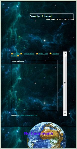
This is the example of my DeviantART Account using my own version of the site's layout.
And here, it's my version compared to the classic layout.
EDIT:
What if this concept of Eclipse had actually the option for users to customize and change the colors of your profile?
Color Palettes
(These colors can also be used in combination like for instance a Red Header and black profile colors with a yellow Font)
I also made a Classic and an Eclipse version of colors.
As far as the Notifications system, it's perfect the way it is now (classic version). It's comfortable and user-friendly. The only change it would have should be the colors to match the new ones.
EDIT: I added Fella in the Blank Version to make the semi-transparent part more obvious.
If you agree with this version of DeviantART Eclipse, please share it in any possible way so that our voices can be heard and for DeviantART to continue being the unique site we all know and love.
I also urge you to use the blank version and add your own information from your own profile and share it with the rest of the members.
If you want to test one of the color palettes instead of the default, here's the link to the sta.sh folder with each one of them separately.
Arrow left sta.sh/22ad2bthv1sy?edit=1 Arrow right
 (Smile)")
Related content


Comments: 682


👍: 6 ⏩: 1

👍: 2 ⏩: 0

👍: 5 ⏩: 0

👍: 4 ⏩: 1
👍: 2 ⏩: 0

👍: 8 ⏩: 0

👍: 7 ⏩: 0

👍: 4 ⏩: 1
👍: 2 ⏩: 2

👍: 1 ⏩: 1
👍: 1 ⏩: 1
👍: 1 ⏩: 1
👍: 1 ⏩: 0
👍: 1 ⏩: 1
👍: 0 ⏩: 0


👍: 2 ⏩: 0


👍: 1 ⏩: 1
👍: 0 ⏩: 1
👍: 1 ⏩: 1
👍: 0 ⏩: 0

👍: 4 ⏩: 1

👍: 0 ⏩: 0

👍: 2 ⏩: 0

👍: 5 ⏩: 0

👍: 1 ⏩: 0

👍: 6 ⏩: 0


This is what it SHOULD have looked like, but no, they want to pander exclusively to mobile users because that's the current web design mentality, streamline everything to appear on mobile phones because they think they'll replace PCs. Yes, that's the ENTIRE reason Eclipse is the way it is, because they want to pander exclusively to mobile users.
👍: 9 ⏩: 0


Facebook is now doing a much similar thing!
👍: 2 ⏩: 0

Well, OBVIOUSLY.
I like this picture you have too.
👍: 4 ⏩: 0

I like it! I like it a lot.
Im hoping the staff will be reworking Eclipse, at least aesthetically, so that some of the old charm and personality of Deviantart won't be lost.
👍: 5 ⏩: 0

This one looks 1,000 times better than what deviantart has eclipse look like. This one is more straight-forward, organized, and more realistic.
I wish/hope deviantart sees this.
👍: 7 ⏩: 1
I totally 100% agree with your statement. Plus, you can customize the background color which promotes creativity for the user. It has the fresh new look while keeping the site functions, that is what you call balanced compromise.
👍: 6 ⏩: 2

👍: 1 ⏩: 0
Do you know what the irony here, if the staff had present this layout that Fairloke shown us in this journal entry from the very beginning that keep the user features, much of this drama would've been avoided. Sadly, some people want to see cookie-cutter formats for everything and for this type of situation is not a good thing.
👍: 2 ⏩: 1
You do have a good point of the irony.
👍: 1 ⏩: 0

This is excellent. A new look while still retaining everything that defines DeviantArt and not an ArtStation knockoff.
👍: 6 ⏩: 0

👍: 3 ⏩: 0

It looks an improved version of the old site. I like it. Pretty stylish.
👍: 2 ⏩: 0
<= Prev | | Next =>