HOME | DD
 Fairloke — How DeviantART Eclipse should have been

#deviantart #eclipse #share
Published: 2018-11-22 23:22:12 +0000 UTC; Views: 75517; Favourites: 1093; Downloads: 88
Redirect to original
Description
The moment I tested DeviantART Eclipse, I was dissapointed as a result.
For the past two days I've been trying to come up with an idea about how the site's layout update should be.
Here's the journal which inlcudes the creative profiles of people that volunteered to use the template.
My version of DeviantART EclipseFor the past two days I've been trying to come up with an idea about how the site's layout update should be.
Suggestions regarding the Core members' benefits:
Core members should have the ability to customize their background image or colors.
The number of Custom boxes should be 20 instead of 10 for Core Members.
Access to all of the widgets that already existed in this site.
Core members being able to change their username every 3 months.
Suggestions regarding the NON-Core members' benefits:
Non-Core members should have the ability to change the colors of their backgrounds.
Non-Core memebers should be given the right to have at least 1 custom box compared to now that they have non.
Non-Core members should have access to the polls widget.
Non-Core members should have access to the critique feature.
Non-Core members being able to change their username every 6 months.
In addition, the following features would also be included in this version:
Light Mode
Likes button in comments
This is the example of my DeviantART Account using my own version of the site's layout.
And here, it's my version compared to the classic layout.
EDIT:
What if this concept of Eclipse had actually the option for users to customize and change the colors of your profile?
Color Palettes
(These colors can also be used in combination like for instance a Red Header and black profile colors with a yellow Font)
I also made a Classic and an Eclipse version of colors.
As far as the Notifications system, it's perfect the way it is now (classic version). It's comfortable and user-friendly. The only change it would have should be the colors to match the new ones.
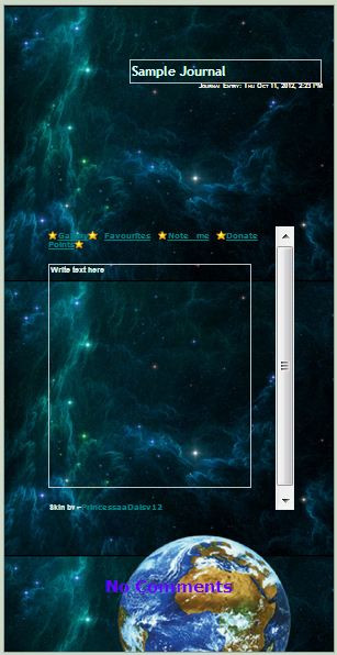
EDIT: I added Fella in the Blank Version to make the semi-transparent part more obvious.
If you agree with this version of DeviantART Eclipse, please share it in any possible way so that our voices can be heard and for DeviantART to continue being the unique site we all know and love.
I also urge you to use the blank version and add your own information from your own profile and share it with the rest of the members.
If you want to test one of the color palettes instead of the default, here's the link to the sta.sh folder with each one of them separately.
Arrow left sta.sh/22ad2bthv1sy?edit=1 Arrow right
Related content


Comments: 682

That actually looks better what about a notification page.
👍: 2 ⏩: 0

Wow, amazing ideas! I love it!
👍: 2 ⏩: 0

👍: 3 ⏩: 0

this design looks great! i'm sure everyone would be content if deviantart offered something like this. the ability to custom and understand what's even happening on the same page and to navigate easily.
👍: 2 ⏩: 0

Oh, this would look nice  (Smile)")
👍: 3 ⏩: 0

that would have made sense but nooooo we get stuck with an ugly mess
👍: 2 ⏩: 0


This looks a hundred percent etter than Eclipse, Eclipse makes me feel unwell and gives me a headache every time I use it so I don't I use the old version since it is better, this design is really good and doesn't give me a headache at all, I don't feel unwell when looking at this, I wish you could have designed the new website. THIS IS AMAZING LOOKING!!!!
👍: 1 ⏩: 0


Man, wished they'd have hired you for the new layout. it looks a million times better.
👍: 2 ⏩: 0


We need them to hire you right now-
👍: 2 ⏩: 0

I need help trying to do d the birthdays.
")
👍: 2 ⏩: 0


THAT'S EXACTLY WHAT I WAS LOOKING FOWARD TO
👍: 1 ⏩: 0

Holy hell this is a whole lot better <3
👍: 1 ⏩: 0


Yes, I want notes to tell me how many notes or how many replies I got.
I think they should replace the comment/reply icon with when someone favorites your work.
I would like to see your design have the colors of the current Gray & Green BG.
👍: 2 ⏩: 1

Thank you.
There's a version of this template with the color palette of Classic deviantART.
👍: 0 ⏩: 1
Cool! I think another cool feature is the ability to upload a custom background and have the fella a bit translucent on said background.
Sadly the people running DA will never see any good ideas.
👍: 2 ⏩: 1

👍: 1 ⏩: 0

This actually looks really cool! Same functionality with an updated design.
👍: 1 ⏩: 0

👍: 2 ⏩: 0


You know.
If they would do this instead, I definitely wouldn't mind.
👍: 1 ⏩: 0

This is far superior to the current itteration of eclipse.
To think DA could have run a competition where users design the site and the users get to choose what's best rather than... whatever they're doing currently
If eclipse remains as lacking as it is in regards to customisation then I can see me not bothering to continue with core.

👍: 5 ⏩: 0

Pretty cool idea, though I think non-core members should be able to set a custom background, similar to how you can set a custom banner on the official eclipse.
👍: 1 ⏩: 0

Ugh I'm sorry but, I'm currently studying web design and believe me that eclipse is way better than this.
If you wanna improve it I'd say less information in the top bar along with the icon, there's just TOO MANY unnecesary info there and it makes it look messy. Deviantart is changing for something more modern and nowdays we need to read less and understand more and this layout won't work.
The "profile, gallery, shop" etc buttons are just too big and I wouldn't place them there, it makes it more messy and confusing because it's a menu, not a part of the user description.
The username and tag line has no space, it's everything too compacted and hard to read, a non-deviantart user would just ignore completely all the info that's there.
Search for references and look professional websites, eclipse is doing better and will get better eventually, is just a wip yet.
Plus there'll be ton of difficulties when coding this template, the text in the description is white and the background a black with lowered opacity that will be lost if the background is black / white or a dark colored drawing plus it'll be extremely hard to choose a drawing that actually combines with all your profile (as I see here the bg image is all the site long) and that'd make loading pages longer too; badges are unnecesary and really old fashioned, no one wants to see them, they doesn't add anything to your profile, it doesn't change anything about you, etc. Unnecesary stuff should be deteled nowdays in websites, they doesn't make anything more than make non-deviantart users confused.
And what if you doesn't want to show your birthdate or your location? That would be empty and will make it look weird.
Plus, where's the "send note" icon? Or even more important, where is the "follow" icon?
Sorry but I just hate ppl that says eclipse is awful and then think this would work better even if it doesn't even have a follow button o m g
👍: 2 ⏩: 3

If you have experience in web design then you would know that Fancy UI (Of The Eclipse Kind) doesn't actually = A better Site and that sites do not need to be completely broken down and rebuilt again to accomplish the things you have mentioned here. Da has been altered repeatedly over the years to improve the interface and rearrange most aspects considered to be obsolete or Junky.
It isn't ideal or even necessary to completely scrap anything on this site especially if your target demographic is opposed to it and the change in question has been proven to be a COMPLETELY worthless, just something to fit some modern design standard. All of that at the cost of MUCH needed functionality too I suppose would be worth mentioning. The people who are building eclipse have made their vision VERY CLEAR to everyone in terms of what they want in the long run so whether its JUST a W.I.P or not this is why people are still actively reacting negatively just based on that. I've used the BEST of the features provided with Eclipse in its current state and they are VERY generic in comparison to what was there before. Thats a HUGE problem for people like me and MANY core users who have invested money into this site for years. It also speaks volumes in terms of what the developers have in mind for this place. It really narrows down to logic too because you have to ask yourself: If the excuse is that this is just a wip and they are actually planning to put all of the features of the past that was removed BACK into Eclipse then what was the overall point of changing ANYTHING to this extent in the first place?
So cleaning up the interface is a completely different area of things since this could all STILL be done to the original UI we already had. In other words in order for your argument here to work you would have to first prove that ALL of the changes you've mentioned ABSOLUTELY CANNOT be done with the old UI. And you cant. So this makes me wonder, why are you actually opposed to the idea of the old UI for? Because going by YOUR reasoning it would simply be that you think Eclipse LOOKS cool because its modern. And that is not a justifiable excuse for this website to change. I also want to point out something else that you've said here:
Deviantart is changing for something more modern and nowdays we need to read less and understand more and this layout won't work.
Thats just the thing: This layout concept which is based on the old UI WOULD work because the old UI HAS and still IS already working 100% perfectly today. It has been for YEARS. When anybody says that something NEEDS to change then that change should happen for a GOOD reason. Not because of bunch of people who have NOTHING else better to do than to tinker with something should mess around with it. Again this all goes back to how absolutely ridiculous it is to completely axe things that have already been working well before. That in place of something new and trending just for fancy looks and Gimmicks. DA was originally designed around a WEBSITE concept NOT a Cell phone application and since there is ALREADY an app for this site, time would be better spent using Eclipse to just build on THAT.
Another thing I have to ask is: How in the world can anybody understand something that they dont read? Do you realize how completely nonsensical that sounds? Sites are designed to be innovative (meaning UNIQUE and ORIGINAL) and offer the BEST features to the user. READING is EVERYTHING that someone should be doing here. Its PART of an artists representation of themselves. Your supposed to go these profiles and escape reality. Thats what being creative is all about. Disappearing into the world of imagination. It sounds alot like YOU dont understand that which I find very interesting since your here telling users how they SHOULD be thinking about all of this. DA has ALWAYS stood out as what it is because of that very reason. Eclipse is not innovative at all. Its a bland total rip off of other sites by design, Artstation being one of them and ontop of that without all of the benefits of artstation. If you get on here and cant read a DAMN thing and are lost and confused (much like people who use Eclipse already are) then it TOTALLY defeats the purpose. And proof that the majority dont want/need the things your mentioning be altered anyway (because its only YOUR opinion and NOT the majority of hard working artists) is how the devs have had to PUT BACK in or LEAVE ALONE the stuff your suggesting be altered. People didnt like the way it was so they spoke on that.
Developers when given feedback from their userbase SHOULD listen to them. After all these are the people WHO MAKE the site what it is. DA is about the artists and without that there IS NO DA. If this site was currently undergoing a TRUE upgrade based on the foundations that have ALREADY been laid out for years (that and ALL of the community feedback) then you probably wouldn't see ANYONE opposed to this.
👍: 6 ⏩: 0
"Ugh I'm sorry but, I'm currently studying web design and believe me that eclipse is way better than this.
If you wanna improve it I'd say less information in the top bar along with the icon, there's just TOO MANY unnecesary info there and it makes it look messy. Deviantart is changing for something more modern and nowdays we need to read less and understand more and this layout won't work."
DeviantART has always been a unique site and there is a reason why so many people preferred it over sites like Tumblr or Twitter. This site is dedicated to artists regardless of their skill level. Many young people have been using this site as an escape from their everyday stressful lives and they were expressing themselves through art and they were sharing it with their friends here and were gaining positive experiences, words of support and criticism. Many artists grew and saw art more maturely and decided to follow it as a profession. I’ve been on this site 10 years and I was a little kid when I first joined using MS Paint and now I am Professional Digital artist and 2D/3D Animator. I love this site and it feels like home. Everything about it has been perfect. Yes, it did need some updated improvements, but Eclipse takes everything that made this site enjoyable away from us. All the information I added already existed on the classic version and it should remain there. Just because they are going for a more modern approach, doesn’t mean that they have to butcher the whole site and it doesn’t mean that “modern” is good. A good example about that is Youtube. This website used to be 100% dedicated to creative creators who could easily decorate their own profiles and express themselves. After Google bought it, everything about Youtube changed. Now it’s bland in terms of interface. No option to change the backgrounds aside from that small banner and no options to change the colors aside from the light and dark theme. Not to mention that after these changes Youtube starting favoring companies,money and greed which resulted in almost the destruction of the Youtubers and smaller channels. Technically, Youtube is not for Youtubers anymore (the original people that it was made for) and the same is happening with DeviantART. I am noticing a pattern here.
They claim they’ve been trying to change DeviantART in favor of mobile users to desktop users the same way Instagram does claiming that most deviants use their mobiles to browse the site according to their statistics. What is interesting though is that just because these statistics do not state that these people who browse the site through mobile do not use their computers. I personally can use the site on the Laptop all day for business purposes, to upload art or simply chat with friends in the community and later lay down and use my phone to browse art for time to pass. There is a great amount of artists here who dedicate their time in the production of Digital Art, Digital Animation and 3-Dimensional art. Such pieces of art require programs that are provided by Adobe or Autodesk and they work only for Computers and NOT for mobiles. This is the same thing that Blizzard Entertainment did when they created the most recent Diablo video game STRICTLY for mobile (the previous games were for PC) and once the fans complained about it, their response was “Don’t you guys have phones?” while disregarding the fact that people spent thousands of dollars in expensive gaming equipment waiting for this game to come out and not expecting it to be strictly for these small screens.
www.youtube.com/watch?v=ly10r6…
This is the mentality that Eclipse developers have.
"The "profile, gallery, shop" etc buttons are just too big and I wouldn't place them there, it makes it more messy and confusing because it's a menu, not a part of the user description."
These buttons were already close to the info box in the classic version. I only put them under the avatar the same way they did in Eclipse, themselves. How is it confusing the moment I put them under the info box in a separated box that is not semi-transparent, implying that it is no part of the info? It’s also interesting that you mention that something here is too big because almost everything in Eclipse is so big and squeezed together to the point of giving the users a claustrophobic feeling, especially in the gallery.
"The username and tag line has no space, it's everything too compacted and hard to read, a non-deviantart user would just ignore completely all the info that's there."
The Tag Line is much smaller in size than the username and it is exactly that way in Eclipse as well as the classic site, so I don’t understand why you feel like this is a problem.
As far as the statement about the non-Deviantart users ignoring the info that is there, I can tell you from personal experience that it is more discouraging to view somebody’s information when it is on a separated TAB like the “About” tab. An artist’s profile is the cover of their book, the gallery is the pages and the art is the story. When you work on a business, everything about you needs to be eye-catching. No sponsor is going to get out of their way to check your information. You have to impress them. This is also the reason me and my partners have been investing on this website, paying core, and animated the figures in our profiles from scratch. We run a studio and ever since I decorated my page the way I did, more and more clients have sent me personal messages for commission deals. This is another issue that Eclipse has. The destruction of customization and the removal of the CSS and HTML codes. They only gave us a smaller Custom Box on the left side of the screen that only allows you to do LIMITED editing in comparison to the older version in which you were more freely.
"Search for references and look professional websites, eclipse is doing better and will get better eventually, is just a wip yet."
I in fact have. And to my surpise Eclipse looks identical to its competitor art site named ArtStation.
Here’s something interesting that I saw another deviant mention before.
According to the law, it's illegal to copy another site’s likeness this. Here's the link: thomasdigital.com/the-legaliti…
Specifically:
To sum up the legalities of copying a website design: You cannot duplicate copyrighted elements such as images, text, or source code. It is illegal to use someone's logo or trademarked material. ... A custom website gives you ownership of your unique design, and another site cannot legally copy it.
"Plus there'll be ton of difficulties when coding this template, the text in the description is white and the background a black with lowered opacity that will be lost if the background is black / white or a dark colored drawing plus it'll be extremely hard to choose a drawing that actually combines with all your profile"
Actually, I was required to take Web Design courses in my University a few semesters back and I had to code my own Webpage using HTML in order to pass the class. I added a transparent box with words on it while having a banner with a background image on the back and the results were very satisfying. It’s actually very easy to code something like this once you study it.
My version would give the user the opportunity to change the colors of the banner, the background’s color (or image if it was meant for core members) and the color of the fonts.
The information text would always remain white, but there would be no strain to the eyes since the semi-transparent box would always be darker than the text itself. A good example of that is the profile that provided using this template.
As you can see, not only did they use the options to change the colors of their personal profile’s interface, but they managed to combine the colors and the background picture in such a harmonic and professional way. Again, you can see that the information texts are pretty clear despite the background of choice due to the semi-transparent dark blue box. Whether it’s hard to choose a drawing or not should be left to the respected artist who decides to decorate their page the way they desire.
"(as I see here the bg image is all the site long) and that'd make loading pages longer too;"
The background image would have a 1920x1080 resolution at max or 700x394. There would also be a cropping option. The background image would not be in a loop and it would not be moving as the user scrolls down. Everything else such as the info, the widgets and the custom boxes would be affected by this action. There would be no significant strain to the memory.
"badges are unnecesary and really old fashioned, no one wants to see them, they doesn't add anything to your profile, it doesn't change anything about you, etc."
Apparently, even the staff disagrees with this statement since they made a specific location on a person’s ID on Eclipse which is dedicated to the badges. The fact that you call them unnecessary and old-fashioned and that nobody wants to see them is a matter of personal opinion. To the rest of the artists here it’s a form of communication to exchange llama badges as rewards or receiving badges as rewards for participating in events. In my opinion, this brings the community together.
"And what if you doesn't want to show your birthdate or your location? That would be empty and will make it look weird."
If the person chooses not show their birthday or location, the options would disappear from the box the same way they do in the current Eclipse layout with the difference being that the “Deviant for # years” would be aligned to the center of the box.
"Plus, where's the "send note" icon? Or even more important, where is the "follow" icon?"
By the “follow” icon you mean the “+Watch” button? People who have the Instagram perspective do not understand that this doesn’t mend well with the artist’s perspective. DeviantART combines the perspective of an ART archive without fully becoming a dedicated social media platform the way that Instagram is. This is what made DeviantART unique and different from all these sites to begin with. It’s a completely different environment from it and the way people express themselves is different.
And to answer to your question, the only reason you do not see the “Send Note”, “Watch” and “Give” buttons is because this template is from the perspective of the user who OWNS the profile, hence is why you see the “Edit Page” button on top right. You cannot +Watch or send a note to yourself.
The buttons from a different user’s perspective would be more like this:
Very similar to their placement on the classic DeviantART interface.
"Sorry but I just hate ppl that says eclipse is awful and then think this would work better even if it doesn't even have a follow button o m g"
You can hate people for having an opinion all you want, but this doesn’t make your biased opinion justified. I have already addressed why your statement is wrong in the previous paragraph.
👍: 4 ⏩: 2

Honestly I just ignored the whole first part because I don't really have time to read a bunch ass of text that wants to make me believe how "lovable" the community is on deviantart and how "bad" the staff is for "forcing us" into their way of thinking lol. We asked for this change, they made a long and detailed poll, we voted, they started doing this, now everyone hates them... weird right?
Just to answer the important points here:
- About the "galery,etc" menu: I meant, making SEPARATED boxes, not all together. Just how eclipse is now, There's a box with your name, icon, etc, and then a separated box under it (with space in between) for the menu. It should be separated for not creating confusion. Plus the menu MUST stay the same on every page you are, if you are in the gallery then the menu should be the same as in the about page, profile, etc. So making them togheter and even leaving some space for the icon doesn't make sense. The old DA layout is the same, they are separated things. I mean, TOTALLY separated things.
- About the name: I meant, the box literally closes 1 px above it making it look compacted and with no space. Both eclipse and the old layout has WAY more space than in this template.
- About the info: I think it's way better than a person likes my drawings instead of reading first my personal information. If they really want to know about WHEN I WAS BORN or WHERE I LIVE then they should totally click on other page. That's nonsense to me honestly and doesn't change anything about my art. If I want to send a professional business my art then I'll make a separated page only for myself with it, I'll NEVER send my social media because it's more personal and it's not professional of me if I send my social media lol. And about the coding, yeah they will include it: Customization, Contrast, Pagination, and Comments
- About the legal stuff: "To sum up the legalities of copying a website design: You cannot duplicate copyrighted elements such as images, text, or source code. It is illegal to use someone's logo or trademarked material. ... A custom website gives you ownership of your unique design, and another site cannot legally copy it."
Do you think the staff just go and copy+paste the whole coding? Images, text and source code ARE NOT DUPLICATED.
Funny fact: How many pages has the same exact menu bar? The only thing that's IDENTICAL is of course your profile bcs it's yours.
Idk even music.youtube.com/ or toyhou.se/ has a really similar menu bar... And correct me if I'm wrong but the fonts aren't even the same.
Facebook, Twitter, Youtube, Amino, etc also uses this cover image thingy (With a lot of other sites...) Behance also has this 2 things (menu and cover image)
So yeah, they could have been more creative with it but they aren't doing anything illegal...
- About coding: Honestly I'd prefer a FULL customization as Toyhouse provides, but Toyhouse has only a small amount of members compared to DeviantART and you'll need to learn CSS, not HTML. And I can't imagine how BAD deviantart will work with a TON of broken coding, because yeah it might be easy but it's hard to do it completely good, even if it works it might be broken and create problems when navigating on the website. I came across ton of profiles with broken coding and your is one of them (custom boxes not being the size you wanted, maybe you see them right but in my computer there's ton of blank space after a image ends, you can easily correct that, just check your coding). Sorry but when entering in your page it takes me several minutes to fully load, leading me to just close your page and not wanting to read anything because it has just TOO MANY gifs, images, text, videos, etc. And did I see a grey text over a dark blue background? (Maybe it didn't finish loading lol) What if a person with slighly blindness tries to see your page? Or a person with colorblindness? They will just get headache and leave immediatly. And PLEASE don't even think on saying those people shouldn't be using art sites.
- About badges: Yeah maybe it's just me, but I love the option to not show them at all in eclipse. I think we should have that option either you like or dislike them. And in your layout it seems like if I don't want them to be shown that box will be almost completely empty.
- About bithday,etc: Then you'll be wasting an entire box (that could be dedicated to putting the watch button) for a "deviant for # years". And honestly I think everything on that box is just unnecesary. The "deviant for # years" should be somewhere in the first box (where there are also ton of unnecesary info), not apart of everything.
- About watch button: Ahh, so, creating yet another useless box and adding more things to html and css? I'd recommend to just do what Deviantart did in both versions (old and new) Adding those buttons in a space where if they aren't visible it doesn't look weird or empty and not creating yet another box for them.
It's weird that suddenly a random new box appears at the top, as I said, menus should stay the same on every page and in this case, if that's what you're going to do at least make the "edit page" on your profile in the same place as that box. It's weird to have 2 different boxes appear in different places.
Adding them near the menu would be perfect just as eclipse is doing. In my opinion the Watch button should be more obvious tho. Just as every watch button on every social media platform and not a small icon in the right corner.
👍: 1 ⏩: 2

I just noticed something.
"And about the coding, yeah they will include it"
The link you provided was saying "However, we will not continue to support HTML/CSS and free coding in Eclipse." It seems like you didn't even read the journal you provided as evidence since it literally contradicted what you just said.
👍: 2 ⏩: 1
FINALLY someone noticed, it also proves how no one is reading my arguments and the links I provide and just telling me "ugh you're biased" "but you don't have a point" etc, etc, that's why I won't be replying anymore
👍: 0 ⏩: 1
Wait, so you put that mistake up there on purpose to prove that people read or don't read your posts? Because no matter how you try to justify it, the link contradicted what you said.
Also, how come you started replying only after I called you out on not replying?
👍: 3 ⏩: 0

"they made a long and detailed poll, we voted, they started doing this, now everyone hates them... weird right?"
Because they didn't do any poll. AT ALL. What are you even talking about? Literally, NO ONE asked for this.
People have been asking them constantly to make a poll about whether or not people want eclipse, and they refuse to do it.
Mainly because they know the vast majority will say they hate it because it's a fundamentally bad site.
Even if We asked for the change(which we didn't) when they make a site as horrible in every way as eclipse, and plan to make it the only option we have the right to be upset.
👍: 2 ⏩: 1
They did before starting with eclipse, the poll was from like +1 year ago. It asked literally EVERYTHING, what features we used on deviantart, which we didn't know existed, what we'd like to see and ofc if we wanted a new website. I remember answering near 50 questions about deviantart and my experience here and they even added spaces where we could write other stuff we wanted, etc.
If you don't believe me here it's some proof: Upcoming Site Changes and Your Involvement (Uploaded on July 3, 2018) and you can even, idk, look at the very first comments for example here: Upcoming Site Changes and Your Involvement where the majority of the users wanted changes, more modern looks, others preferred keeping the layout but making it better, I read someone talking about updating the coding, etc, etc, ofc there are a lot of opinions but most of them wanted some changes and just updating the code to fit some of those changes won't work (old coding, old layout, old looks, deviantart really felt abandoned, entering here for the first time in 2014 felt like visiting an 2007 wesite that you don't know if there was someone still using it, as my personal experience lol and because here no one comments on your things even if you have +500 favs)
And yes you can complain or maybe you can just accept the changes and review eclipse as it is, sharing constructive criticism, giving feedback on things you dislike, bugs, etc and not saying "just throw a website that you've been working for near 3 years (even if we asked for it at first) because I don't like how the wip looks"
👍: 0 ⏩: 1
I joined DA 3 years ago, and literally, none of this ever happened on my end. I didn't find out Wix had anything to do with this until the Day before Yesterday, And my first warning that there was ANY kind of Redesign happening to the site was the announcement of the open beta!
And I'm not the only one. Considering how an overwhelming majority of people will say that they never asked for any of this, it seems like This Little journal they put out was put out in a way where it only existed to a small number of people.
(In comparison to the number of people actually ON DA.)
👍: 2 ⏩: 0

eclipse is an abomination to the website itself
👍: 0 ⏩: 1
Mm do you even know anything about web design? Maybe you're just used to the old dA layout and getting used to a new one is hard for you idk.
And that's not constructive criticism sweetie, people like you only spread hate without having a point.
If you do you should totally send your feedback to make Eclipse better instead of just hating it.
👍: 1 ⏩: 3
VyAdoptables Ok, I get that you are probably educated in web designs but are have you done a business course? A good business will listen to their general users, knowing what the general user wants will help the business thrive. Deviantart is not listening to their general users which could cause the downfall of their sight, see there are a bunch of reasons why people hate eclipse, eclipse isn't very aesthetically pleasing, now you may find it pleasing to look at but you're a 0.1% user because there are millions of users. I've been looking around to see that eclipse is very flawed but not just that it affects users in physical ways. I and a lot of other users have been suffering from head pains when being on eclipse and some have even said they have felt unwell when on eclipse. Now you're allowed to have your own opinions but if deviant art want to appeal to every user then they should listen to their general users to help create something more user friendly. You must always put the customers needs and wants first in a good business.
👍: 1 ⏩: 0

Do you know anything about web design tho? Like sure you "studying" it but like hunny wait til you graduate before you make those claims. I took web design courses in school too, but having an artistic eye and knowing how responsiveness works is a whole other topic.
Web design is much more than just having a mobile/tablet responsive site. This site is not responsive and never will be responsive for PC users going forward with the current Eclipse layout. UI for example on PC, and even mobile, is horrid. The first thing people look at when looking at new sites is how easy it is to find everything. Its... not. At all.
All of the feedback here you've provided is very subjective - like having your drawings first rather than personal info. Just because you don't like it doesn't mean the way its laid out is wrong/not appropriate for websites. It is, its just now how you'd make yours. I actually enjoy (as well do others) all of the personal information on the top bar there. Obviously this is a rough sketch/idea and wouldn't be how it exactly turns out.
👍: 1 ⏩: 0
whatever the hell eclipse is i don't like it. don't call me sweetie. i don't know you.
👍: 1 ⏩: 0

There's a chrome add-on to make youtube non-retarded again, maybe the same can be done with this.
👍: 2 ⏩: 0
<= Prev | | Next =>