HOME | DD
 Fairloke — How DeviantART Eclipse should have been

#deviantart #eclipse #share
Published: 2018-11-22 23:22:12 +0000 UTC; Views: 75518; Favourites: 1093; Downloads: 88
Redirect to original
Description
The moment I tested DeviantART Eclipse, I was dissapointed as a result.
For the past two days I've been trying to come up with an idea about how the site's layout update should be.
Here's the journal which inlcudes the creative profiles of people that volunteered to use the template.
My version of DeviantART EclipseFor the past two days I've been trying to come up with an idea about how the site's layout update should be.
Suggestions regarding the Core members' benefits:
Core members should have the ability to customize their background image or colors.
The number of Custom boxes should be 20 instead of 10 for Core Members.
Access to all of the widgets that already existed in this site.
Core members being able to change their username every 3 months.
Suggestions regarding the NON-Core members' benefits:
Non-Core members should have the ability to change the colors of their backgrounds.
Non-Core memebers should be given the right to have at least 1 custom box compared to now that they have non.
Non-Core members should have access to the polls widget.
Non-Core members should have access to the critique feature.
Non-Core members being able to change their username every 6 months.
In addition, the following features would also be included in this version:
Light Mode
Likes button in comments
This is the example of my DeviantART Account using my own version of the site's layout.
And here, it's my version compared to the classic layout.
EDIT:
What if this concept of Eclipse had actually the option for users to customize and change the colors of your profile?
Color Palettes
(These colors can also be used in combination like for instance a Red Header and black profile colors with a yellow Font)
I also made a Classic and an Eclipse version of colors.
As far as the Notifications system, it's perfect the way it is now (classic version). It's comfortable and user-friendly. The only change it would have should be the colors to match the new ones.
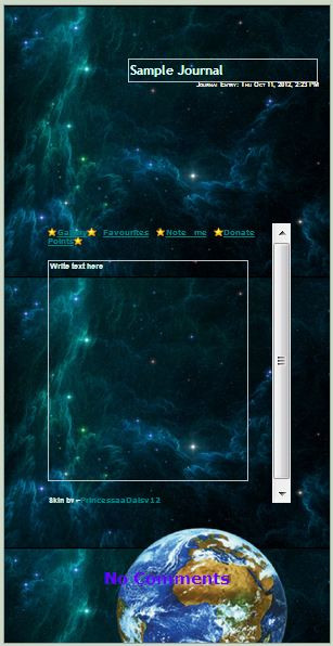
EDIT: I added Fella in the Blank Version to make the semi-transparent part more obvious.
If you agree with this version of DeviantART Eclipse, please share it in any possible way so that our voices can be heard and for DeviantART to continue being the unique site we all know and love.
I also urge you to use the blank version and add your own information from your own profile and share it with the rest of the members.
If you want to test one of the color palettes instead of the default, here's the link to the sta.sh folder with each one of them separately.
Arrow left sta.sh/22ad2bthv1sy?edit=1 Arrow right
 (Smile)")
Related content


Comments: 682

Oh my, I love this! It's awesome! 👌
👍: 1 ⏩: 0

I have to say that this looks a million of times better than what they're showing right now. I mean, sure, I never tried the new eclispe thingy but I could see from other computers - imagining myself as a new person who just found deviantart and doesn't have an account - and I have to say that I felt discouraged by it. It just doesn't look funtional at all and some of the most basic features are all over the place.
If I was DA I would instead show different versions to allow people to vote for the one they liked the most. And in that case I would DEFINITELY vote for this one. It keeps the old look and simplicity of DA while also making it feel knew and fresh.
Still, it's possible they'll manage to make eclipse a little better as everything shown so far is subjected to change but this one would definitely be better for DA in general.
👍: 1 ⏩: 0

Eyup - I'd have approved of this version much more. Especially with customising one's profile colours ")

👍: 1 ⏩: 0

deviantart employ this man right now
thanks.
please save deviantart omg
👍: 2 ⏩: 0

Way better than DA's !!! Did you show this to the staff ?
👍: 3 ⏩: 0

This version actually looks pretty good. I like your version of Eclipse a whole lot better than dA's version.
👍: 3 ⏩: 0

You know what? That's a great idea.
👍: 1 ⏩: 0

This is definitely better than Eclipse... At least this doesn't hurt my eyes and doesn't cause migraines. But the staff still won't listen, though...
👍: 2 ⏩: 0

I think getting rid of indian spam bots (and eventually making fetish content requiring mature tags as well) is more important than changing dA's look. I've never tried eclipse but I guess free users should have more privileges, especially the trivial ones like more stats, polls, critiques, at least one custom box and linking twitter accoutns and other social media accounts if available (except FA, their cookies taste funny).
And more attention to lesser to unknown artists like me. Like <10% of my 98 subs are active and stuff.
👍: 2 ⏩: 0

This is great! It's fun and simple~
👍: 2 ⏩: 0

Wow, this one is much better!

👍: 1 ⏩: 0

If new DA like this I will be happy.
👍: 1 ⏩: 0

I love this :3>
I want this is exist
👍: 1 ⏩: 0

I love it. I forgot fella even existed.
👍: 3 ⏩: 0

This would be SO much easier on the eyes. I would be less likely to leave DA if they listened to you and implemented what you suggest here. I love the different color options, such as your dark version is WAY easier on my eyes and doesn't make me have a migraine. I very much like the Light Blue color as well. I'd be willing to try and learn with your layout (maybe also not have thumbnails the size of dinner plates as well as the folders be on the side instead of in a tablet scroll bar at the top or them just all scrunched together in the gallery where the artwork uploaded is to be going) but I fear they might not listen since they seem dead set of ignoring anything they don't want to hear.
👍: 2 ⏩: 0


i dont even have the option to change
👍: 1 ⏩: 0

OMG, It's a blend of old and new. ;w; It's so nice.
👍: 1 ⏩: 0


im just gonna keep using the old site
unless they end up removing the option to swtich
👍: 1 ⏩: 0

In my opinion we should make a compromise. If many people still love the "old" deviantart and other people love more eclipse, we should have the chance to switch between them. Then we could have "deviantart" (like we know it) and "deviantart eclipse". "Art" means also everyone should take what he likes and how he thinks that's my design world. It would be a mistake to force all people to use eclipse. I heard that many people wants to leave dA if eclipse is standard. That would be terrible and would destory a great plattform. But all in all, eclipse needs improvements. I have to say, I don't like eclipse and I would use the green deviantart version, but I have to admit, that your version of eclipse is much better and has organization. That's what I missed on eclipse the most. Boxes and clear clines are what we need the most. Otherwise it would be a mess. If I have to use eclipse against my will, I would prefer your version than the current eclipse and looks more user-friendly. But I still love the normal version of deviantart and was incomparable with other art websites. I hope we will find a solution with that everyone could be happy.
👍: 1 ⏩: 0

👍: 1 ⏩: 0

It would be great if we could also change our usernames to our past usernames and if we have some sort of page that displays our past usernames to choose or write down the new username
👍: 1 ⏩: 0

team Do you mind taking a look at this and see why this design would be so much better than the horrible design Eclipse currently has and how it would actually KEEP a lot of the current DeviantArt features we love instead of getting rid of them? Especially as far as profile customization goes? Because I feel like if you actually take this design into consideration, you'll have a much better chance at keeping most of your users around longer.
👍: 2 ⏩: 0

👍: 2 ⏩: 0

👍: 2 ⏩: 0

I actually like this one quite a lot
👍: 1 ⏩: 1


Oh please I want this one like, I don't even know at all how the actual eclipse mode works...It doesn't have shout box, twitter box...chat box? that's boring. Some boxes actually just disappear when eclipse mode is on..I don't like it.
👍: 1 ⏩: 0

I would SO use this version of Eclipse because I do NOT support the Eclipse we have. Looking at DeviantArt Eclipse the layouts hurt my eyes, really it's true, I had to take a break from using my computer for a while because my eyes were hurting. If a website makes your eyes feel sore then it's not user friendly. Hopefully DeviantArt finds the time to rub two brain cells together and maybe use what you've made, really great job with this, I love it  (Wink)")
👍: 3 ⏩: 1
Same here. You are not the only one who get problems with eyes. I tried to use the white background instead, but it was like I would see pictures on google. That's boring. ")
👍: 1 ⏩: 1
Glad we're in the same boat here, you and I ")
👍: 0 ⏩: 1
It's just sad, that staff don't care about it, it seems. I can only hope they will improve it or it will be the black time of dA for all.
👍: 0 ⏩: 1
Yeah, if they keep this up they will have no users for this site. Fingers crossed they start caring and improve.
👍: 0 ⏩: 1
Let's hope the best for the future.
👍: 0 ⏩: 1

this looks so comfy, I'm really quite unhappy with eclipse tbh. been trying it for the last few weeks and forgot to turn tit off and have just been ignoring the site bc it's a pain to look at.
shame they don't listen to what anyone actually wants though eh
👍: 2 ⏩: 0

The left upper bio line is still a bit busy for my tastes. But that aside, it looks lightyears beyond what Eclipse has been offering.
👍: 1 ⏩: 1

You're right!
It is creativity and feedback like this that these people desperately need.

👍: 1 ⏩: 0


I LOVE THIS SO MUCH.. I WOULD DEFINITELY USE ECLIPSE !!
👍: 1 ⏩: 0

I love your version so much!
Really combines well what dA wants to do (as in colors and the edgy feel) with what we users want!
👍: 1 ⏩: 1

I really hate the current Eclipse design.
👍: 1 ⏩: 1

It's not user-friendly, unfortunately!
👍: 0 ⏩: 1
Not good at all, very hard to navigate!
👍: 0 ⏩: 1
<= Prev | | Next =>