HOME | DD
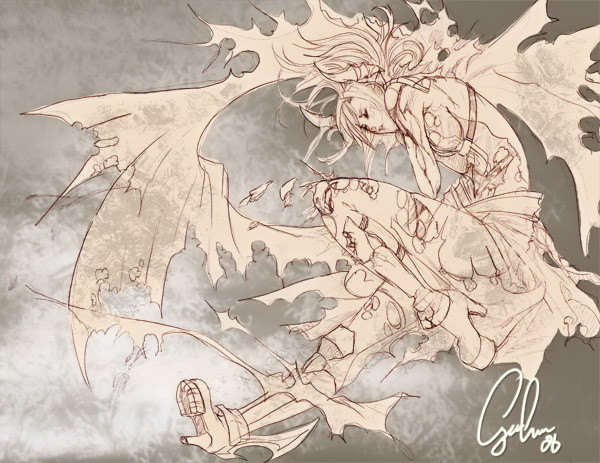
 fallout161 — Flying Without Wind

Published: 2004-09-17 22:34:18 +0000 UTC; Views: 21511; Favourites: 460; Downloads: 10118
Redirect to original
Description
...is hard. At least, to Halcyon. I guess she's rubbing her nose. *shrugs*Teh pic has problems. Feel free to point them out. I spent way too long on this. Several days, on and off.
Pencil sketch and Photoshop 7 / tablet.
Related content


Comments: 127

i love the colors you used in this. The artwork is very niec also and complex. good job!
👍: 0 ⏩: 0

so cute...she`s rubbing her nose
awww
i just love the wings in her hair
oh i wanna eat her


👍: 0 ⏩: 0

Pretty colours, it's kind of dreamy.
The frame really helps it stand out I think.
👍: 0 ⏩: 0


Wow...
Sorry not to have anything more constructive to say...
Wow...
The colouring of the ground gives a very distinct feeling
of hostility and enhances the urge to see her
floating away into the cool sky.

👍: 0 ⏩: 0

three words....... stuning, controled, and creative........
two comments...... the detail is lovely, the colors I love.........
one thought........


👍: 0 ⏩: 0

Oh wow, the detail on the wings is amazing. And yeah, it looks like she's wiping her nose 'cause she's sad or something.
Incredible. Magnifique. Bon *kisses fingers in little 'ok' sign*
...why did I just slip into French??

👍: 0 ⏩: 0

")


very cool, looks fantastic
the face is more obscured than I'd like
plus, is it supposed to look like he's bleeding? I can't tell if those are wires or blood.
👍: 0 ⏩: 0

Looks like it hurt ;__; It's an amazing picture... So blue o_o
👍: 0 ⏩: 0

WOOOW... O_o.... uh, yeah, advanced critique... um.... the only thing I think could POSSIBLY make this pic any cooler is if her left leg was bent as if she were kneeling, with her right leg in the same position it's in now? I dunno, it''s just that her left looks a little small (I'm assuming it's because of the angle ^_^). Anyway, OMG. I love the things on her wings. They remind me of saddles. Wing-saddles, if you will.
...
I'll shut up now...
👍: 0 ⏩: 0


Ah,that is a increadibly great picture.I'm not sure if those 2 words can be used like that,but it's worth a try. I love her wings, she's a really cute character. Great job,dude!*thumbs up*
👍: 0 ⏩: 0

w0w! shes beautiful!! love the colours youve chosen!! great work!
👍: 0 ⏩: 0

my only few comments:
* Is she supposed to have a blue tint to her skin? (I know her hair and wings are blueish and blue-white)
* Feet and hand looks a little off... except her rear foot, it looks REALLY off while her front one looks too big, even for a "wide angle lens" prespective
* Did her Iris' turn white?
* Why/where is her foot cut. there is no bleeing out the bottom, just the top. and the way that she is sitting with her feet out, it would be running out the bottom unless she cut right at the point where the edge of her sturip/boot thingy meets her foot.
👍: 0 ⏩: 0

Uhh.. no to be downfull or anything..but what is she?

👍: 0 ⏩: 0

i love the use of perspective here. the lines on the ground makes ur eyes travel towards halcyon. i like the way she is colored rite now, she does blend a bit into the bg but it still works, lol. i love the detail and clothing. i think the lighting might be a bit screwy on some parts. but it's all good. awesome job btw.
👍: 0 ⏩: 0

O____________O...
I'm sooo amazed!
This is such a great pic! I love your style with all the great detail and the colors you use~ The mix of colors for the ground gives a great feel of style, and Halycon's pose (that's a cool name too^^) is done very well.  (Smile)")


👍: 0 ⏩: 0

this is still a very beautiful pieace despite any little errors it may harbor. Something in it moves me. her expresion along with the colors catch and hold my attention.
Is there any way i could ask of you to have a version to use as a desktop at 1024x768 size? I would really love that! I would understand if you decline...as people have to be careful with art theives, but i assure you that i would use it simply for my personal enjoyment of decorating my computers desktop.
Keep up the excellent work!
👍: 0 ⏩: 0

wad exactly is a tablet?? I always wanted to noe *blink blink*
👍: 0 ⏩: 0

You never seem to amaze me. Your work is absolutely amazing. As a long time fan of your art (since the days of teamARTAIL...oh, the memories), so I am finally glad to express an appreciation for your art by giving a detailed critique. I have already faved this picture, but I will tell you what I have seen in this picture. The first thing I notice is the black and grays in the picture. They stand out against Halcyon's pale hue and feathers. The detail put into the zippers and cargo pockets is amazing. The leather texture the color seems to portray gives a punk rock, sci-fi feel to the piece without disrupting the fantasy aspect of it. I know you love the belts, so I am glad to see you using those generously again. I noticed the detail in the strands of string (I think) entwined around her feathers. Now, the feathers are remarkable. They have the properties of air in the sense that they flow from the "arm" rather than just alligning themselves up orderly. It's almost as if the wings were capes flapping in the wind. Maybe even hairlike. Hal's face remains hidden. It really does look like she's scratching her nose. Either that, or she is about to cry because maybe she fell out of the sky. Or she can't get in the air in the first place. Either way, she is very cute and cuddly. I would throw her in the air and catch her if she fell. ^_^ and the Cap't America/Hawkman temple wings are a nice added touch. The one thing that caught my eye was the proportionality of the feet. I don't know if it was intentionally exaggerrated, but one foot is significantly bigger than the other. Even foreshadowing should not reduce the foot size that much. If I am wrong, please correct me. I actually wish the background had more detail, but I see how you get tired of looking at the same picture after drawing it for so long, so I won't complain. You are a Photoshop genius. Keep up the good work. I'll be commenting on more of your art, so look out for me. BTW, how's the graphic novel/novel coming along? I hope you haven't given up. Anyways. Good luck with your future artwork and completing your commissions. Peace.
👍: 0 ⏩: 0

You're art is absolutely amazing!!!! This is really amazing!!! Keep up the great work!
👍: 0 ⏩: 0

Relationship of figure to ground may need some work, but the contrast of textures and feel to the wings and the leather/metal bits is very nicely done. As is that foot-perspective.
👍: 0 ⏩: 0

Wow. I love everything about this picture. The swooshy watery quality, the simple but dramatic background, and those fantastic wings.
👍: 0 ⏩: 0

99 comments, and 245 favorites?
you got more favorites than comments...damn...
good use of blue
her wings kinda reminds me of hair. I don't know if that's what you were going for or not. In my opinion though, the colors on the bottom doesn't fit so well. I'm speaking of the red/dark orange areas. That's just me though.
Other than that, the Highlights on the grey areas are really great
as a matter of fact, the whole image is great
looking forward to seeing more.
👍: 0 ⏩: 0

The fact that this picture is a bowl full of awesome completely overwhelms any mistakes you think you may have made. I love this pic so much I could cry. I just don't have the money to buy a print of it, but I do adore it.
👍: 0 ⏩: 0

Hmmm....instead of saying just "wow!111 i luff teh wings yo cuz they all fluffi n stuff!!11oneone!" I'll actually offer some (*gasp* From me?) constructive advice.
As always, it's great. It has the usual fallout style of so many feathers and belts, and that has always suited you and goes with whatever art you do. It appears that Halycon's design got a complete overhaul, and includes new hair and new...scantily clad clothing. The pencil sketch seemed to have needed a little more cleaning up, some messy bits clear on a (albeit, very) close look. And, of course....the background. My only true criticism. You have always put your full into each of your works, but your exciting and interesting background seemed to have been absent this time around.
But, maybe this is because you didn't want your (loving) veiwers to focus on the background, but ratehr the outfit, which Halycon sports with a surprising amount of designmanship (not a word, I'm clear on that XD). Strings are tied around the feathers on her elaboarate wings, and the rest of the outfit is a wonder of design and the human brain. Also, there is a part of the outfit that lays crumpled on the floor. But-heres the compliment-it actually looks like it's laying there, and has all the folds and crinkles of a normal piece of clothing.
Other than what has been said above, I loved the pic, as I do many others of yours. The human-like design encoporated with fantasy is something of a wonder and in my opnion is one of your best strengths. My personal rating of the piece is:
//r a t i n g : 89% out of 1oo%.
That 1oo% (not that you really care lol) could have been all yours with a bg, but you deserve everything of that 89%.
👍: 0 ⏩: 0

Holy Fo-Shizzle.. 1. I should have commented sooner.. 2. Cool!
It's a bit different from your usual stuff, but the style is great and the character has your hallmark look.
There's not much to critique.. Seriously, great stuff!
Jimzip
👍: 0 ⏩: 0


the legging things? are really awesome. i love the blue tones. the only thing i would gripe aout (and barely that) is the perspective in the feet...a little odd, but maybe it's me. eh.
the wings want me to
👍: 0 ⏩: 0

Personally, I don't believe there is anything wrong with this picture. The wings and pose are great, and I love how your character is all pouty *pouts along with her/him.* But you have awsome work and don't let anyone tell you otherwise ^^
👍: 0 ⏩: 0


My jaw dropped when I saw this. I couldn't believe how beautiful this looks. But then again, aren't all your works awesome? Anyhoot, I really can't see anything that may be off.
👍: 0 ⏩: 0

...have i mentioned...that i hate you.
If it has problems, i dont want to know what they are.
👍: 0 ⏩: 0

God, this is beautiful. The blues are magnificent.
Please, do tell, what do you use to color? I'm kind of experimenting with what works best as far as coloring goes. I'm not having too much luck in the area of coloring/coloring technique. I suck, to put it blandly. xD;
👍: 0 ⏩: 0

great work, i see some things that resembles that angel guy you were drawing at work, what happen to it?
👍: 0 ⏩: 0


I like it, I think you did a great job! You really did a wonderful job on the colors, they all mix and they're not out of place or anything. They just fit! I love the wings, I love Halcyon! Beautimous! 
👍: 0 ⏩: 0

Nice piccy. I love the blue wings and the leather. The position is wonderful. This piccy is truly cool. I love it to piece. Too bad I'm too poor to buy a print... Nice job!
👍: 0 ⏩: 0

well, i dont what to say except you are an amazing artist. every time i see a new piece by you im in awe. the only reason you sayy there is in perfection is cause the standard and vision you hve already set in your mind. to all of us, its flawless. anyone that tells you differnet has no idea. this is your creation, you are god to it and if you want one green arm and a yellow one than thats how its supose to be. you matt page are a fantastic artist. thank you for sharing your work with the world.
👍: 0 ⏩: 0

the photoshopping looks great, i adore how you put so much detail into each feather~ her wings look like translucent blue-ish plastic too, ish wonderful.
never stop drawing ;3;
👍: 0 ⏩: 0

Aw poor lil thing.. like the shrug-like look and coloring.. perpect.. this looks pretty fresh..
like your style is improving at new level or sunthing.
Or maybe it is becose of the colors
👍: 0 ⏩: 0

forking awesome...
Ireally cannot see any problem with this... I notice a different style of drawing Halycon though... that's what i adore about your work., you never really draw the chars EXACTLY like you did last time...I...there's always another version of them and you will always draw in a new admirer who appreciates that particular style you've created.
Your line art is exquiste...truly exquisite... and the colouring works very well for this.
I've always admired your work and you've impressed me once more. Keep it up man.
👍: 0 ⏩: 0


OMG, that's beautiful! I love how you coloured it, and the pose and the wings! My god the wings! I love wings, and those wings are no exception! I must fav this awesome peace of art work!
👍: 0 ⏩: 0

oh, wow o.o This is just...amazing o.o; *attacks it* If I ever see you at another con and you have an art table, I'm so buying this from you XD
Is this a new version of Halcyon? The almost has the look of a water sprite
Excellent color o.o *in awe* The actual lineart isn't very realistic and more stylized, but I think that looks much better that way :3
👍: 0 ⏩: 0

This is absolutley calming with the blue tones you chose, and the added color of the yellow/orange really brings your attention to all the details.And I adore the leather design of the garb you gave her")

 (Wink)")
👍: 0 ⏩: 0
| Next =>