HOME | DD
 FelixKilldeer — Boogiepop
Published: 2008-11-14 06:37:10 +0000 UTC; Views: 529; Favourites: 8; Downloads: 4
Redirect to original
Description
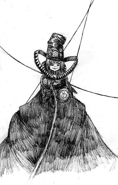
So... I've been watching Boogiepop Phantom recently. I really like how it was done. It feels right. And it reminds me just how much of the novels I've managed to forget over the past five months.Also, it had Shigeyuki Suga working on it, so... Yeah. Anyway.
Two days ago, I downloaded Tremulous . My god, that game is creepy. Especially seeing as I've been playing it late at night.
Though, I don't really like the controls. There are too many commands, many of them are badly placed on the keyboard (How the hell am I supposed to reach "enter" when my right hand is on my mouse and my left covering the WASD/CTRL buttons?), and it uses the mouse for aiming, which, although it is fairly standard for PC shooters, bothers me. A lot.
Also, after an error message displays, you can no longer see the cursor... Which is a problem. Yes.
But, at the same time, it is rather fun to play as a little tiny alien, and zip across the ceiling to the enemy base and drop down on someone's head. Indeed it is.
Anyway, Boogiepop belongs to Kadono Kouhei.
Related content


Comments: 21

this is cool... did you forget that Boogipop phantum never smiles?  (Smile)")
👍: 0 ⏩: 1

Ho ho, thanks.
Well... I was trying to capture its weird half-smile, but I guess I failed.
(Personally, I've always thought that title should have been translated as "Boogiepop Doesn't Laugh", anyway  (Wink)")
👍: 0 ⏩: 0
Thanks
Yeah, one of the nicest things about drawing in pen is the amount of ease with which you can put a lot of detail into the picture--and this was done with a Multiliner, no less. I have yet to work up the courage to try drawing with a real technical pen, but they're even better for details...
👍: 0 ⏩: 1

you´re so talented, so you´ll do great with any pen you choose to use!!!
👍: 0 ⏩: 1

I see exactly what you mean about forgetting the chain but it is quite nice and a bit scary to see a smiling Boogiepop,lol! Nice work.
👍: 0 ⏩: 1

AWESOME! You've done a fantastic job in the lithograph style. This s definitely my favourite! The sense of dimension is astounding. I found that the face looked a little flat when framed by the excellently rendered 3D collar-thingy, but still, the piece as a whole REALLY fits together!
👍: 0 ⏩: 2
Oh, and, thanks for the favourite and watch... I really wish it would show those up at the top.
👍: 0 ⏩: 1
Yeah, I thought that I'd been watching you already. Maybe the dA system did that lapse-y thing it tends to do now and then. Anyway, I'm watching you now!
👍: 0 ⏩: 1
Happens to me more times than I can count. It's a travesty, I do say.
👍: 0 ⏩: 0
Thank you!
Yes, I think I like this one too (Apart from a few mess-ups with the hatching)
Yeah, I'm not sure what to do about the face... You're right about it looking flat. I think maybe I should hatch skin with a .05 or .03 pen (I usually use a .1).
Thanks!
👍: 0 ⏩: 0

Overall, I like this. However, I think the technique is doing it a little bit of disservice. The various amount of strokes and directions makes it a little hard to identify individual elements in some parts (mainly the hat, and the chest areas). It's more a thing of keeping polishing your cross-hatch skills; try to maintain a uniform direction on each "layer" of strokes, also, try to make longer strokes; in the lower part of the trenchcoat it's easy to see where you stopped your strokes, trying to cover a big area with small patches of strokes usually leaves the areas where the patches meet a bit darker than the rest, and it takes away from the final result.
Finally, you could try cleaning your scanned pages a bit more, there are some "stains" from the paper texture left, and it makes the picture look a bit messy.
👍: 0 ⏩: 1
Thanks!
Yeah, I'm rather dissatisfied with the hatching here, too. This is the largest area of hatching I've ever done, and I definitely need to work on stroke continuity (Also, I'm not sure what I was thinking when I started hatching in a different direction across the coat--Big mistake there). Thanks!
Ouch, yes--I just noticed those eraser stains. Thanks for pointing that out
Thanks for the help!

👍: 0 ⏩: 1
")

lol sorry >//< is a good pic
👍: 0 ⏩: 1
That's what I figured you meant

👍: 0 ⏩: 1