HOME | DD
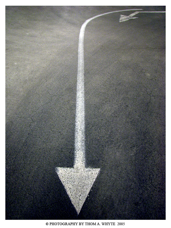
 Fingathing — Directions
Published: 2005-09-12 15:24:36 +0000 UTC; Views: 2396; Favourites: 52; Downloads: 413
Redirect to original
Description
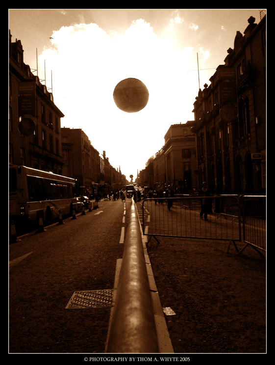
...Related content


Comments: 75

")

may be it was your intention, but I really think this picture can benefit a lot from symmtery (which is a little skewed from where I am looking)
Some type changes with your legal information should also be on the agenda!!!
👍: 0 ⏩: 1

i know what you mean about the symetry, i thought of changing it but then liked the way it was.
what do you mean about type changes with my legal information should be on the agenda?
👍: 0 ⏩: 1
ohhh, I meant you could do some more with how you place your text and the fonts that you choose.
👍: 0 ⏩: 1
 (Smile)")
white san serif text on the lower right corner (inside the photo)
small but very easy to spot!
👍: 0 ⏩: 0

Fantastic work. Love the concept.
👍: 0 ⏩: 1


Faaaaan-tastic.
I love simple things that are still effective
<3 good jorb <3
👍: 0 ⏩: 1


si simple, yea so much tiny detail... ace picture you ng thomsa, i'm most impressed!
👍: 0 ⏩: 1
")


Simple and powerful picture
congratulation !
 (Wink)")
👍: 0 ⏩: 1

wow i really like this...
1 because of the simplyness
2 the colour
3 the perspective
awsome job!!!
it's kinda a new presentation of the signs on the street
👍: 0 ⏩: 1
thank you for the kind words
👍: 0 ⏩: 0

<= Prev |