HOME | DD
 fiveless — Spot the Difference

Published: 2007-07-31 15:58:04 +0000 UTC; Views: 1654; Favourites: 21; Downloads: 69
Redirect to original
Description
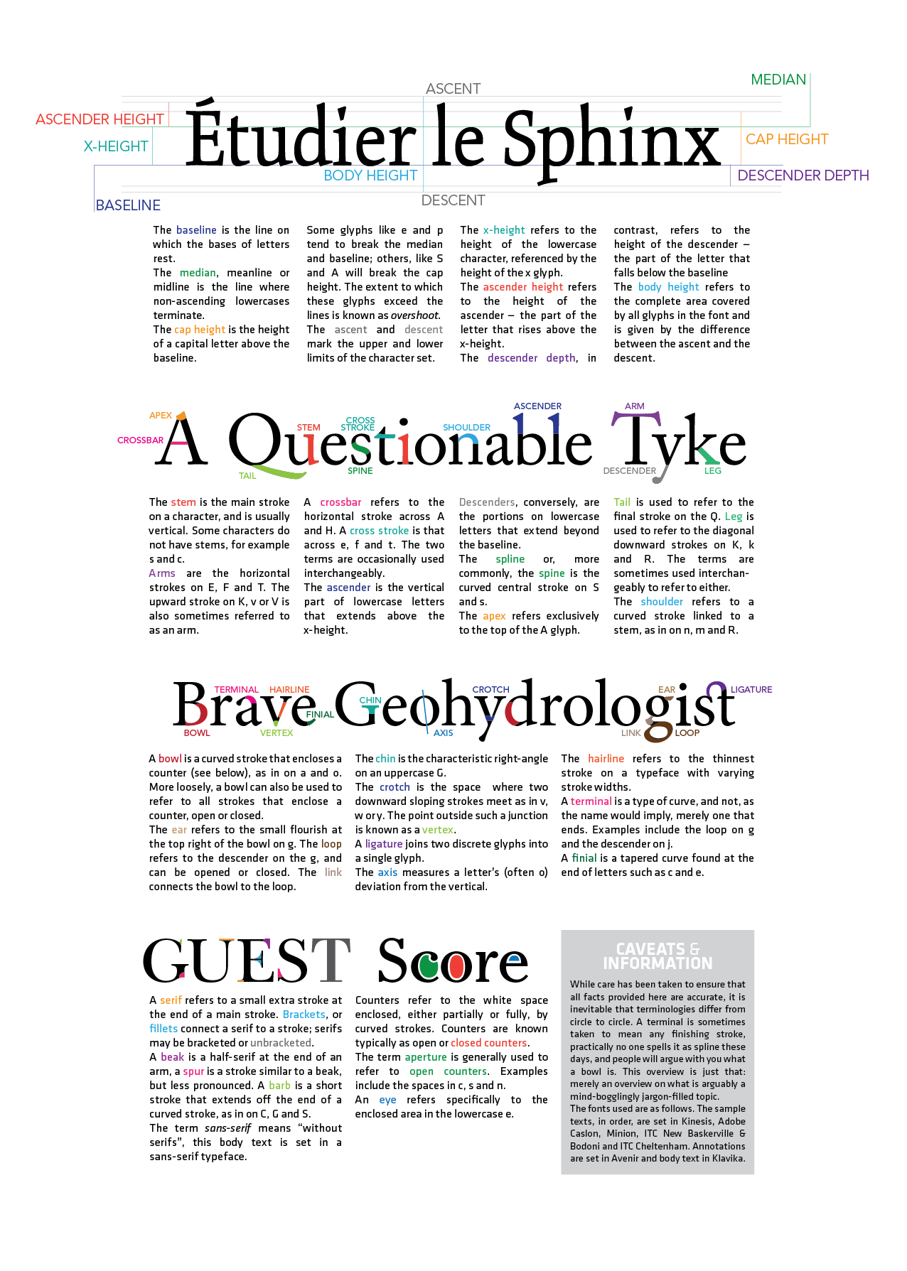
Another try at the same concept I worked at for The Big Debate . But I kind of like this treatment better, it was better thought through here than in my previous piece. No prizes for guessing the fonts used.Might be working on this. Not very favorably disposed to the current layout. Will see!
")
Related content


Comments: 13

I feel clever. 2 years of typography training and I can tell the difference. 
👍: 0 ⏩: 0


love this. is it arial on top and helvetica on the bottom?
👍: 0 ⏩: 1

Heh... for the big words the dark-teal and the light brown words are helvetica, the turquoise and dark brown are arial.
small yellow/orange text is in arial. the font names as they are. "spot the difference" is in helvetica.
they're recognizable especially by the capital "R", arial has a straight tail, helvetica has a curly one
👍: 0 ⏩: 2

Reminds me of the typographic war in thinkingwithtype.com.
They explained the differences with the R of Arial, Helvetic, and Futura.
👍: 0 ⏩: 1
heh yeah. that was quite amusing i remember
")
👍: 0 ⏩: 1
Either ways. I love your work  (Smile)")
At least someone could straighten that out. I've been extremely cautious lately about putting two san serif fonts together--call me anal but my professor will ream my ass.
👍: 0 ⏩: 1
heh thanks (:
same on my side. but then again, if you can't tell much of a difference...
 (Wink)")
👍: 0 ⏩: 0