HOME | DD
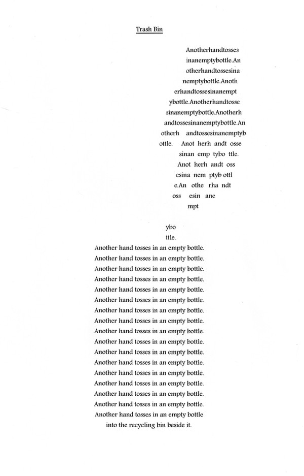
 fllnthblnk — Trash Bin
Published: 2010-09-20 06:21:45 +0000 UTC; Views: 786; Favourites: 17; Downloads: 0
Redirect to original
Description
RECYCLE.At my work we have a recycling bin right next to the trash bins, so you can just toss in plastic bottles and shit. Only few people bother. Most just dump everything in the regular ol' trash bin. It's not that hard, people.
Okay, this poem was originally just the same line repeating until the last one, but then #Writers-Workshop was holding a concrete poetry workshop asking to rework a poem into a concrete one and now voila!
Related content


Comments: 39


Vision
Originality

This is a splendid piece, and a good use of concrete poetry. If the poem was simply a column of lines, it wouldn't be nearly as effective. The image itself is a very well-crafted silhouette, especially considering the difficulty of drawing a hand.
The mantra itself has a good rhythm to it. "Another HAND tosses IN an empty BOTtle" (caps added for emphasis.)
The title, Trash Bin, gets the reader into the frame of mind of the growing problem caused by compiling the repeated small action (throwing away recyclables). As such, the title is integral to the art, as opposed to an after thought, which can be difficult.
Lastly, of course, is the twist at the end. The compilation of small negative actions is actually shown to be a repeated positive action: all these people are recycling! As a result, there's a sense of hope at the end of the poem, as compelling as it is subtle.
Kudos on creating art with simplicity.
👍: 0 ⏩: 0


Thanks for participating in the workshop.
I agree with the comments about it being like a mantra. The concrete form transforms it into an advertisement for recycling and the selected lines become the slogans. Really impressed by how well the hand is formed (I always mess it up when I try it)!
It would have been super cool if you had managed to make a recycling sign on the trash bin too. It really would have become a visual advert with that added on to it -- the language would then be surplus to the image. Hmm! Thought provoking stuff!
 (Smile)")
👍: 0 ⏩: 1

A recycling sign would be freakin' sweet but challenging to implement! I'll have to see if I can do this.
👍: 0 ⏩: 1
")

I love how this has a mantra-ish flow to it; it's exactly what a piece like this needs. The concept is simple yet very effective and well portrayed. I can imagine this being a successful recycling ad campaign, or something.
The only thing I wasn't too sure of was the font. Might it look better all in rounded block capitals? (Or even, all in lower-case?) Not so much for emphasis, but to get the letters more the same size; it might make it look even neater. Although, that said, I like the straight edges you've got at the moment, and it might be difficult to strike a balance between the two. I guess that's a matter of personal preference! (:
👍: 0 ⏩: 0


Love this - everything I had to say has been said already I think...
Awesome shaping of the image: this really stands out from its preview image and makes a visual impact before you even consider the words. I don't think you need to the text in the hand to be that coherent because of the repetition. And I also think the repetition works brilliantly because it's kept to one sentence.
Basically, I have nothing to say except bravo! Wonderful piece
👍: 0 ⏩: 0

Honestly, you never cease to amaze me sometimes.
The hand looks wonderful; how long did it take you to get it right?
The image looks perfect - you did a wonderful job
👍: 0 ⏩: 1
It took me about a half-hour to do the whole thing, I think. The hand here is the second version, actually, as I originally had the space between each word before opting to just squish all the words together. This required having to move all the letters around again, which was a pain, while also contorting my actual hand in front of the screen for a real-life reference!
Thanks for checking this out.
👍: 0 ⏩: 1
I think it looks a lot better than it would've with spaces between the words, especially as the spaces would've looked weird on the fingers.
You're welcome
👍: 0 ⏩: 0

Visually this is compelling just because the hand and garbage can stand out very well. The readability in the hand is close to impossible though. I actually got frustrated when I found out it was just the same phrase written over and over again. In the garbage can the repetition works well visually because it gives it a more structured look. I have to admit though the moment I figured out it was the same line repeated I stopped reading. As an image it works well but lack of readability in the beginning and the lack of some kind of variation, whether it be wording or font changes, didn't help it as a poem. To me it works better as a graphics piece than a poetry piece.
👍: 0 ⏩: 0

Almost Dadaist in flow, but I think the final line brings it back to coherence.
I like it.
👍: 0 ⏩: 0

This is amazing. I love the idea. Great work.
👍: 0 ⏩: 1

Nice idea, executed in a cool way. I think it would not emphasize the meaning of this poem enough if you did use more than the two phrases (as some have suggested). I really like the change in the last line.
👍: 0 ⏩: 1
Glad you think so. Thanks for the comment!
👍: 0 ⏩: 0

I think this would have been stronger had there been two or three more phrases repeated, rather than just the one, with the order varied. It's impressive visually but it doesn't grow in meaning after about the fifth repetition.
👍: 0 ⏩: 1
I beg to differ, I must say, considering the meaning I was intending for this poem.
👍: 0 ⏩: 0


I think the graphic design element of this really drives the message home in a way the repeated words alone might not have. I could easily see this being part of a recycling campaign somewhere. Good job!
👍: 0 ⏩: 0

I love this! I completely agree with the statement in your artist's comments-- it's SO easy and accessible to recycle in most places, but people just don't care to be bothered by it. I really want to take this picture and hang it all around my campus. Nice work!

👍: 0 ⏩: 0

Goofball - still feeling feisty I see.
👍: 0 ⏩: 1
 (Wink)")

I love how you formatted this; it makes the message just pop from the very start.
👍: 0 ⏩: 0

A sad commentary on crusted social mores.
Nicely formatted.
")
👍: 0 ⏩: 0

Gah, I know what you mean. It's also in schools as well and some people don't even realise that there's actually a bin for recycling stuff like that, even though it's clearly marked and has different colours and all that. People's short-sightedness stagger me.
But I like the way you set out the words. It's quite simple and gets the message across well.
👍: 0 ⏩: 0

Ooooh, fantastic piece of concrete poetry, Will!
We had that same problem where I worked. So we left the recycling bin in the same area but moved the garbage cans outside.


👍: 0 ⏩: 2
Oh, and did you ever get people dumping regular trash in those recycling bins OUT OF SHEER SPITE for having moved the trash cans outside?
👍: 0 ⏩: 1
We did the first day, but the custodian was a mean cuss of a woman whose evil eye was known to singe off your eyebrows if you got caught in it. Not very many people dared earn that glare, so we didn't have too many problems with it.
👍: 0 ⏩: 1

Glad you like it, Lili.
👍: 0 ⏩: 0
