HOME | DD

floydworx — Instrument shop layout v2

Published: 2010-02-19 22:46:20 +0000 UTC; Views: 11669; Favourites: 87; Downloads: 455
Redirect to original
Description 
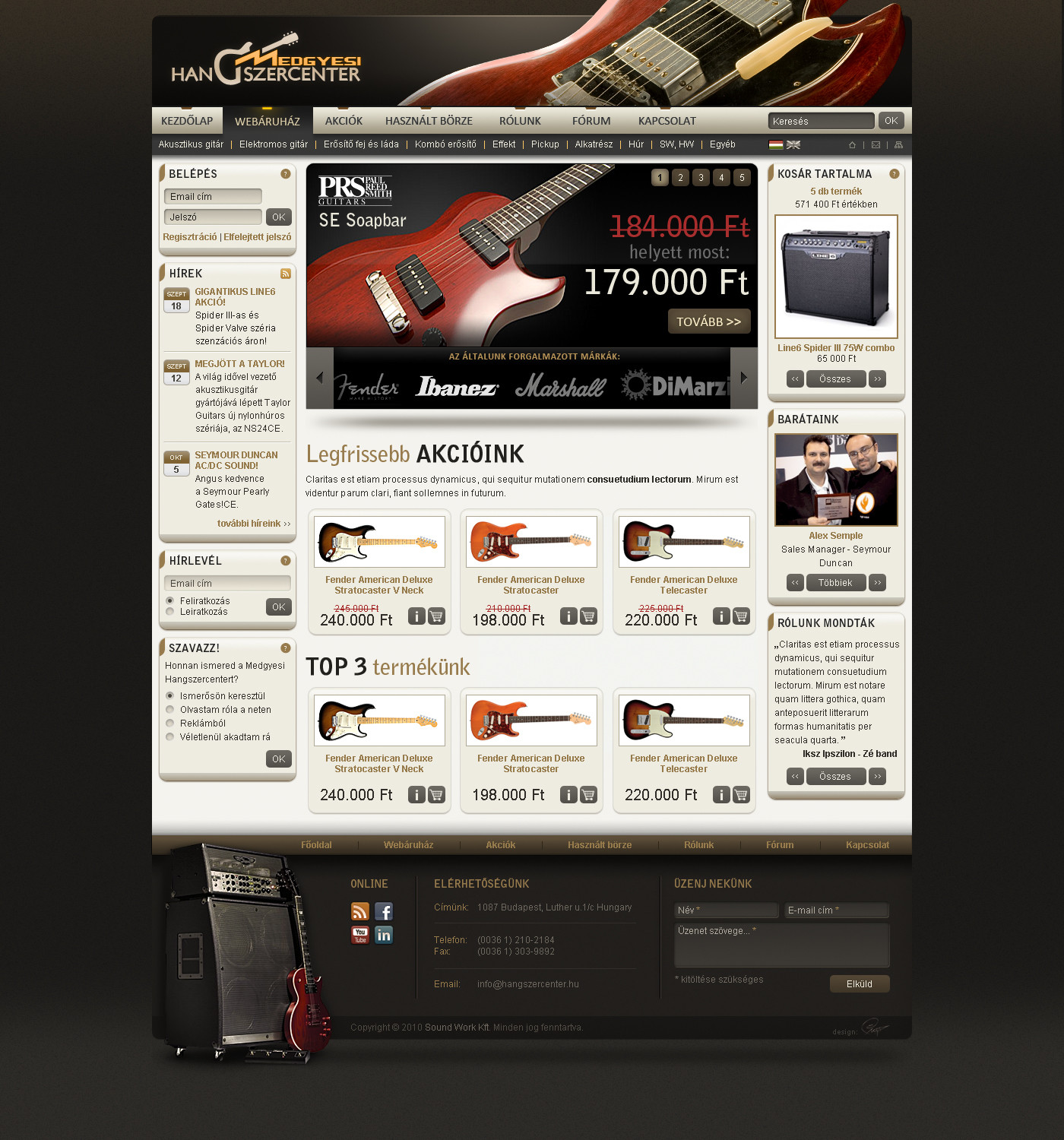
Medgyesi Hangszercenter instrument shop selling mostly guitars and gear. Site and logo design, plan 2.
Plan 1: [link]
Related content
Comments: 34

czujur [2011-04-04 17:04:52 +0000 UTC]

Excellent!

👍: 0 ⏩: 1

floydworx In reply to czujur [2011-05-22 22:14:15 +0000 UTC]

Thanks!

👍: 0 ⏩: 0

kristaps-design [2010-12-14 10:06:55 +0000 UTC]

Looks great, mate.

👍: 0 ⏩: 1

floydworx In reply to kristaps-design [2010-12-14 10:24:05 +0000 UTC]

Thanks!

👍: 0 ⏩: 0

diegoliv [2010-12-07 10:52:05 +0000 UTC]

Very good! I like specially the colors, and the footer. The social icons in the footer have the same color style of the rest of the design, what blends very well.

👍: 0 ⏩: 1

floydworx In reply to diegoliv [2010-12-07 10:55:23 +0000 UTC]

Thanks very much!

👍: 0 ⏩: 0

Fr1end [2010-07-15 19:59:53 +0000 UTC]

Thats rocks

👍: 0 ⏩: 1

floydworx In reply to Fr1end [2010-07-15 20:05:32 +0000 UTC]

Thanks mate :]

👍: 0 ⏩: 0

Felipegm [2010-06-18 13:08:57 +0000 UTC]

Like this layout as well... but this cleaner layout can be easier to use.

👍: 0 ⏩: 1

floydworx In reply to Felipegm [2010-06-19 21:59:16 +0000 UTC]

Thanks, bro!

👍: 0 ⏩: 0

JkHx [2010-06-12 20:57:48 +0000 UTC]

Just .. AMAZING !

👍: 0 ⏩: 1

floydworx In reply to JkHx [2010-06-13 21:25:44 +0000 UTC]

Thanks dude!

👍: 0 ⏩: 0

felipexakal [2010-06-02 23:10:45 +0000 UTC]

OMG! Amazing work dudde!

👍: 0 ⏩: 1

floydworx In reply to felipexakal [2010-06-02 23:17:40 +0000 UTC]

Thanks a lot!

👍: 0 ⏩: 0

Asmodiel [2010-06-02 22:07:58 +0000 UTC]

I find the feeling of V1 much more interesting... maybe you should make v3 with v1+footer of v2 and leave a bit more vertical "whitespace" in the content area...

👍: 0 ⏩: 1

floydworx In reply to Asmodiel [2010-06-02 22:43:45 +0000 UTC]

Yes, you're right, maybe there's gonna be one later, coz this project is idle now.
Thanks!

👍: 0 ⏩: 0

Sibusinho [2010-03-30 08:38:54 +0000 UTC]

Looks really cool, I love the footer! V1 looks cool, too

👍: 0 ⏩: 1

floydworx In reply to Sibusinho [2010-03-30 10:19:04 +0000 UTC]

Thanks a lot!

👍: 0 ⏩: 1

Sibusinho In reply to floydworx [2010-03-30 12:32:17 +0000 UTC]

you're welcome

👍: 0 ⏩: 0

pinkskydesign [2010-03-29 17:55:35 +0000 UTC]

A very good combination of colors! And I just love the footer

👍: 0 ⏩: 1

floydworx In reply to pinkskydesign [2010-03-30 03:27:09 +0000 UTC]

Thank you

👍: 0 ⏩: 0

c-quence [2010-03-29 07:10:23 +0000 UTC]

Awesome design and theme

👍: 0 ⏩: 1

floydworx In reply to c-quence [2010-03-29 11:20:32 +0000 UTC]

Thanks mate!

👍: 0 ⏩: 0

blinka [2010-03-15 14:46:16 +0000 UTC]

Header, footer, menü és színek ügyében ez a terv tetszik jobban, viszont a tartalom elosztását illetően a v1 szimpatikusabb (tényleg elég sok tartalom van, ennél a verziónál nekem is az ugrott be elsőre, hogy zsúfolt). Egyébként hangulatos mind a kettő

👍: 0 ⏩: 1

floydworx In reply to blinka [2010-03-15 20:05:56 +0000 UTC]

Ja, egyetértek a tartalom ügyében . Köszi!

👍: 0 ⏩: 0

XLoviX [2010-02-21 22:26:30 +0000 UTC]

Egy kicsit nekem is zsúfoltnak tűnik, de nagyon szép lett, jól összhangban vannak a színek.
Nice job, keep it up.

👍: 0 ⏩: 1

floydworx In reply to XLoviX [2010-02-21 22:31:23 +0000 UTC]

Ja, nem lett az a kifejezett webkettes szellős oldal . Köszi!

👍: 0 ⏩: 0

k-pax26 [2010-02-20 18:09:25 +0000 UTC]

This is great Perfect top menu, and this colors mmmm

👍: 0 ⏩: 1

floydworx In reply to k-pax26 [2010-02-20 18:19:27 +0000 UTC]

I'm glad you like it!

👍: 0 ⏩: 0

Cholle [2010-02-20 18:00:08 +0000 UTC]

Very interesting solution! Nicely done

👍: 0 ⏩: 1

floydworx In reply to Cholle [2010-02-20 18:02:40 +0000 UTC]

Thanks, mate!

👍: 0 ⏩: 0

floydworx [2010-02-19 23:51:49 +0000 UTC]

Ja, lehet, sajnos ennél még több mindent is ki kellene rá pakolni a kérés szerint, hiába pusztítanám lejjebb a mennyiséget . Köszi!

👍: 0 ⏩: 0

M1LLAH [2010-02-19 23:37:51 +0000 UTC]

Szép munka!

Egy bajom van vele, egy kicsit zsúfoltnak tűnik valahogy a fold feletti rész, túl sok a szöveg és logó, talán ha az "Általunk forgalmazott termékek" nem lennének, vagy kisebbek lennének, nem lenne ilyen érzésem. De mégegyszer: szép munka

👍: 0 ⏩: 1

floydworx In reply to M1LLAH [2010-02-20 18:02:04 +0000 UTC]

Na, sikerült efölé írnom a kommentet ;]

👍: 0 ⏩: 0