HOME | DD
 FreckledAndSpeckled — Color Scheme Tutorial and Tips

Published: 2012-10-14 19:50:50 +0000 UTC; Views: 740; Favourites: 27; Downloads: 5
Redirect to original
Description
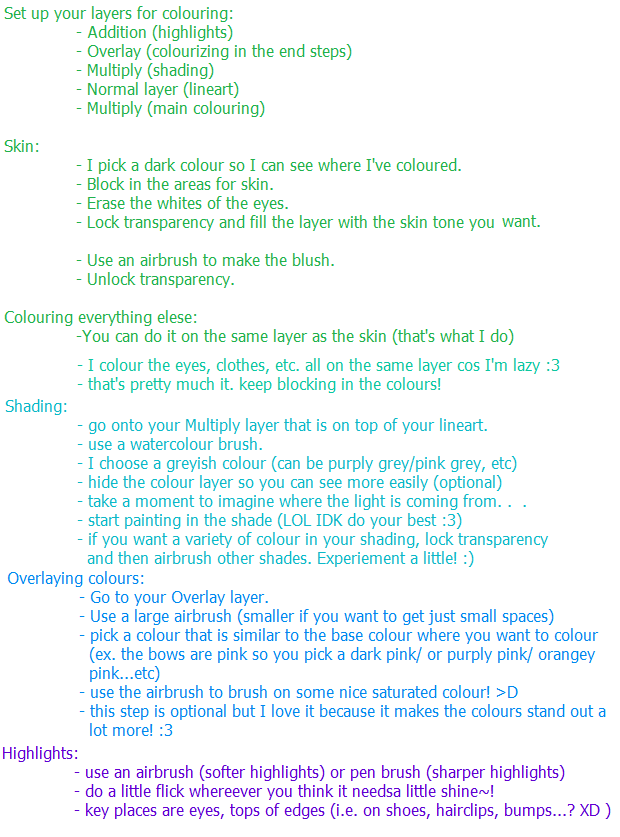
Just some stuff I think of when doing various color schemes. Do not look to this as law or anything, it's not even that detailed or anything. Do what looks right to you. But I mean, there are certain things that really do hurt the eyes, mainly overusing saturated colors. I try to only use them as a highlight, never a major color or with more than one next to each other.But yeah, this is just a bunch of random thoughts but I hope their helpful to someone out there~!
Related content


Comments: 7


You have to choose and make your own.
👍: 0 ⏩: 1
So yeah, just let me know when you're done with that or if you need help. And when you're done, if you could send me the character so far and I can take a look and give some advice.
👍: 0 ⏩: 1
