HOME | DD
 FrozenTheaterD — Akuminlinux Website Preview

Published: 2009-04-17 17:59:12 +0000 UTC; Views: 833; Favourites: 2; Downloads: 15
Redirect to original
Description
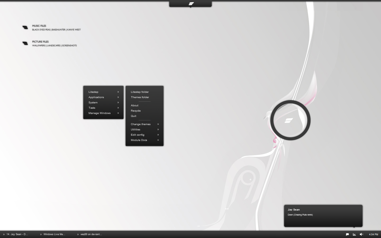
This is a screen from the "learn it" section of our site.Quiet jazzy electronic music grooves in the background (by me). The main part of the site is a single page programmed with java, allowing for the same elegant and fluid interaction found in our OS. Interactions with buttons are intriguing and pleasing. This is my third revision of the site, and you can expect to be wowed by it.
Coming soon, made possible by
Related content


Comments: 4

You know, DanRabbit always is very critical of your works. Always needs to put in the 2 cents. Just something I've noticed.
Site looks great! This would be awesome to do in flash! But Flash vs. basic HTML is up to you really. I would say send it ASAP so i could get started, but it will take at least a week before I can really do anything. I just re-images my HDD with my very own copy of Windows Seven. I would like to take a moment and say; "I LOVE IT!!!!!". Even though it took me an entire 3 days to get it to recognize all my drivers and get online. grr!
So, with that said, it will take a while to load all my original programs on here (adobe design suite and such) and get everything settled down again. You can still send me the resources whenever, but results will come in due time. Like I stated above, a week at max.
Thanks for the mention by the way.
👍: 0 ⏩: 1

Dan approaches computing from a very different standpoint...he tends to value ease of use over visual effect, at least in my opinion. He's the complete opposite of . I'm trying to find a balance in the two elements, so his critiques are useful, though they have caused me to...explode...as I did on my mockup page.
That thing about windows 7 detecting your drivers is epic fail. How am I not surprised?
Eek. be careful. Windows 7's biggest problem right now is filesystem corruption. Back up your stuff!!! Also, tell me about the improvements in 7, since it's supposedly coming out this year and will probably end up being a sort of competition.
I think for now we'll use java, because we need an html web front. If the eps file i send you doesnt work, ill just use my friend's adobe illustrator to convert the file. The doc doesn't actually have layers...I hope that's not a problem. Also, if you decide you want help, Chris can work on the project with you, just tell him what you need done.
By the way, what format do you want the file? Can eps files be manipulated? Do they preserve individual components?
👍: 0 ⏩: 0

Your back button kind of blends in with the rest of the background shapes even though it's red. I would suggest some sort of separating line or using a different icon to remedy that.
Also, The text is a wee bit on the small side. Kind of hard to read for someone with even slightly impaired vision.
One other thing I would suggest is to move the block of text to either center or to the left. There are studies that show, for people who read languages written from left to right, that the right side of a field is a zone of discomfort.
One last thing to add, I would put some images of some sort in there to break it up. It's not that much, but it feels like a lot of text to go through.
Notice: [link]
Large, heavy headings and icons combined with plenty of white space break up the blocks of text so that it doesn't look like there is so much to read.
This page reads a bit more like an essay than an advertisement.
Also, notice the navbar. Icons are placed on the left instead of the right. The font is different. The color is different.
All in all, it's a start.
👍: 0 ⏩: 1
I wouldn't want the back button to be prominent. It will have a static location in the corner of the browser window, and that will make it more noticeable.. As far as the text goes, I'm sacrificing a little bit of intuition for general effect (since you gotta have a balance, right?). The main page begins as an array of shapes arranged holistically as a line. The icons are topics pertaining to akumin that begin to diverge into 2-3 subtopics each, which generally fan out from the original topic visually. What you see above is a subtopic. The contents of each subtopic also fan out, as is the case with the textboxes. The location of the boxes varies, and while this particular instance is a little awkward, it creates a very sophisticated feel. Also, for me to center the text boxes would mean that the user would have to press the back button to select other subtopics. With my setup, the two other darker icons (other subtopics) can be directly selected.
About the text arrangement: I'll be working in a column or 2, which should help greatly. As for the quantity, the arrangement of the site guides the user through points in a certain order. Essentially, you work your way deeper into the akumin experience as you navigate. By this point, the user will have already seen akumin, and considering the intrigue of the site with the music, and you'll be looking for more details. Apple used to implement this amount of depth when they had a smaller market and had to actually try to sell their products (ah, the G4 days...), and we have to do the same thing.
I HATE using the phrase I'm about to use on account of how many times I've heard pompous empty-headed peers use it to mask their lack of true planning, but because akumin is ALL about the experience, I have to say to you
you'll see when it's ready.
👍: 0 ⏩: 0