HOME | DD
 fuzzyzebra —
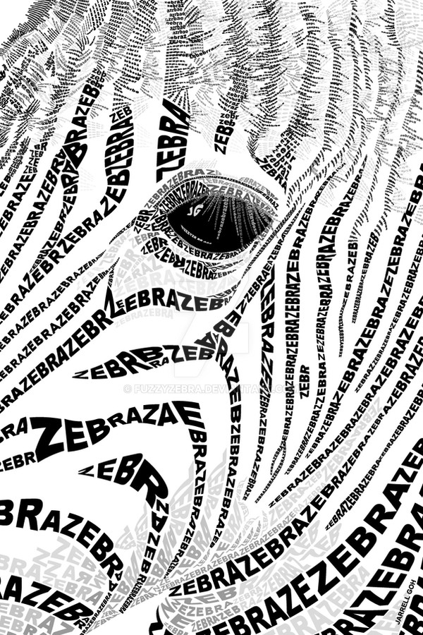
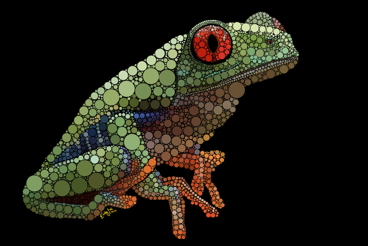
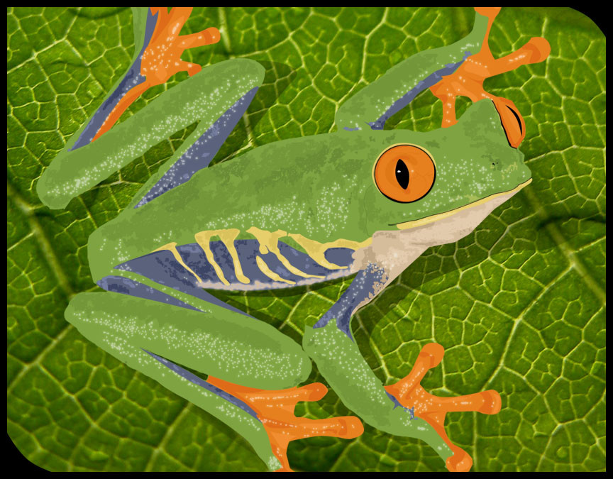
treefrog typography
fuzzyzebra —
treefrog typography

Published: 2007-09-01 14:45:04 +0000 UTC; Views: 39683; Favourites: 636; Downloads: 0
Redirect to original
Description
FINALLY. If this doesn't improve my typing speed three-fold, i don't know what will.Anyways, it's a treefrog! Trying my hardest to make this typography as realistic as possible! Lotsa colours (maybe too many, was a killer to fill each alphabet individually), lotsa textures, and lotsa FUN!
Almost one week of work, hope you'll enjoy it.
(why not full view it to see each alphabet? lol)
4th place in 'Sept07 HoPe FoR textART competition [link]
Other typographic pieces:
Related content


Comments: 279

wow this is amazing
i worship ur patience while doing this peice

👍: 0 ⏩: 1

very impressive. you deserve any attention you get for it.
👍: 0 ⏩: 0

this is amazing.. it looks so real and there is absolutely nothing wrong about it
its just awesome!
👍: 0 ⏩: 0


wow, i've never heard of it - but that's really cool!!
👍: 0 ⏩: 0


wow! unbelievable! how many hours did u spent for this? how did u maintain the shape and the color details?
👍: 0 ⏩: 1

too many! maybe abt one full day total, or more. :\
👍: 0 ⏩: 1

👍: 0 ⏩: 1
lol whoaaa big comment here =] thanks for the thought =]
👍: 0 ⏩: 0

again amazing, love this one more than the zebra, great detail
👍: 0 ⏩: 1

This is very good! Nice colors, good use of typography! I really like this!
👍: 0 ⏩: 0


dang...that is INSANE...so much work...great job
👍: 0 ⏩: 0

It's quite good!
Definitely not something I would have the patience for, though I do really like your other one better because you play more with the distortion of the word rather than repeating tiny, tiny letters - that begins to bridge the gap between type and bitmapping. Maybe a mix of both styles would send it to a new level.
But really it's very good, I'm just giving out feedback. The shading is pretty much on the mark!
👍: 0 ⏩: 1
yup i really agree, dun feel bad!
i very much prefer a more "abstract" feel to an art piece. i dun really like realism. i was like "oh crap this aint what i'd thought it'll turn out like" when i was halfway through... lesson learnt! NEVER EVER WORK with size 6 font on A3. ")
👍: 0 ⏩: 1
lol, yea, that could be quite tedious.
I'll have to send you a link once I get back around to updating my stuff. ^_^
👍: 0 ⏩: 0

This is just insane!Very very very cool!How much do I have to beg and such for a tut on how you did it?
👍: 0 ⏩: 0

Hello! :waves: Thank you for posting you work on my forum, and to show i really appreciate it i've featured you on my journal Show Me Da Animamals
👍: 0 ⏩: 0

wow thats fantastic how you did all that..i hate to ask it, but can it be..brighter?
")
👍: 0 ⏩: 0

omg you are so amazing i would never have the patients to do something like that!
👍: 0 ⏩: 0

oh wow! i haven't seen a lot of typography, this is really nice! it looks time consuming lol, but i think it was worth it, it looks really realistic
=]
👍: 0 ⏩: 0

holy shit, i passed this a few times and didn't realise it wasn't a photo it looks very realistic, great job
👍: 0 ⏩: 0

.... wow. Thats pretty incredible! 
👍: 0 ⏩: 0

I don't know how you did this. It is the work of a genius. 
👍: 0 ⏩: 0


I'm in typography and I currently find it uninteresting, but this is amazing. I thought it was a drawing untill I fullviewd it. I can tell something like this would have demanded a lot of attention and you did such a great job. The frog is very realistic looking indeed.
My typography teacher doesn't like DA and doesn't like the new "up start" "arts" such as fantasy, anime, etc. But I feel I have to show him this. I really would like to know what he thinks of it. Do you know of any other people on DA who do typography art?
👍: 0 ⏩: 1
lol wow, thx! sure, i'd like to see what your teacher thinks too  (Smile)")
hmm... abt others in typography, im nt too sure, but u can always browse around in the typography section of DA, there are some people there you might like to chekc out
👍: 0 ⏩: 1
I showed it to my teacher and he and I are both wondering how you did it, though he found the frog less interesting than I did. He's really biased when it comes to DA for some reason
I did check out some other typography works, but I didn't find any like yours
")
👍: 0 ⏩: 0


Oh wow that is COOL. Someone did a mona lisa like this... only it was drawn using a type-writer in horizontal words... I saw it on my art teacher's wall back when I was in highschool... it was awesome.
👍: 0 ⏩: 0

lol, that's so awesome, the leave's text seems like it's painted, while the frog looks like it was all text color!
quick question though, why's the eye on the frog full red when the rest is typography?
anyhow, i love it, brilliant must've took you forever!!
👍: 0 ⏩: 1
lol! well to answer, i did try to do i in lettering as well, but when its done that way the alphabets make this huge mess with the holes and spacings and it looks like the frog would be suffering from some mutated form of cataracts or sumthing.. cloudy, bumby, uneven weird eyes.. 
👍: 0 ⏩: 1
yeah, makes perfect sence.
Great job man <3
you're like my idol
👍: 0 ⏩: 1
LOL! well thx lots :\
👍: 0 ⏩: 0

soo cool!!! love this!! 
👍: 0 ⏩: 0


How long did this take you? This is amazing!
👍: 0 ⏩: 0

Oh my god, that is terrific typo. Great job!
👍: 0 ⏩: 0

Damn! This must have been a lot of work! Really, great. 

👍: 0 ⏩: 0

Again amazing work! I mistook this as a photograph first ")
👍: 0 ⏩: 0

This one is very impressive.
L. Spiro
👍: 0 ⏩: 0

dude I thought that was real.
👍: 0 ⏩: 0

Amazing work, I've seen nothing like this before. Must take a heck of a lot of patience to make this!!
By the way, may I kiss the frog and see if he becomes a prince
 (Wink)")
👍: 0 ⏩: 0

Wow this type of art blows my mind. I can't image having the patience to do something like this, great work!
👍: 0 ⏩: 0


👍: 0 ⏩: 1
<= Prev | | Next =>