HOME | DD
 g30dud3 — Design Reload

Published: 2007-05-07 20:32:40 +0000 UTC; Views: 26468; Favourites: 173; Downloads: 15
Redirect to original
Description
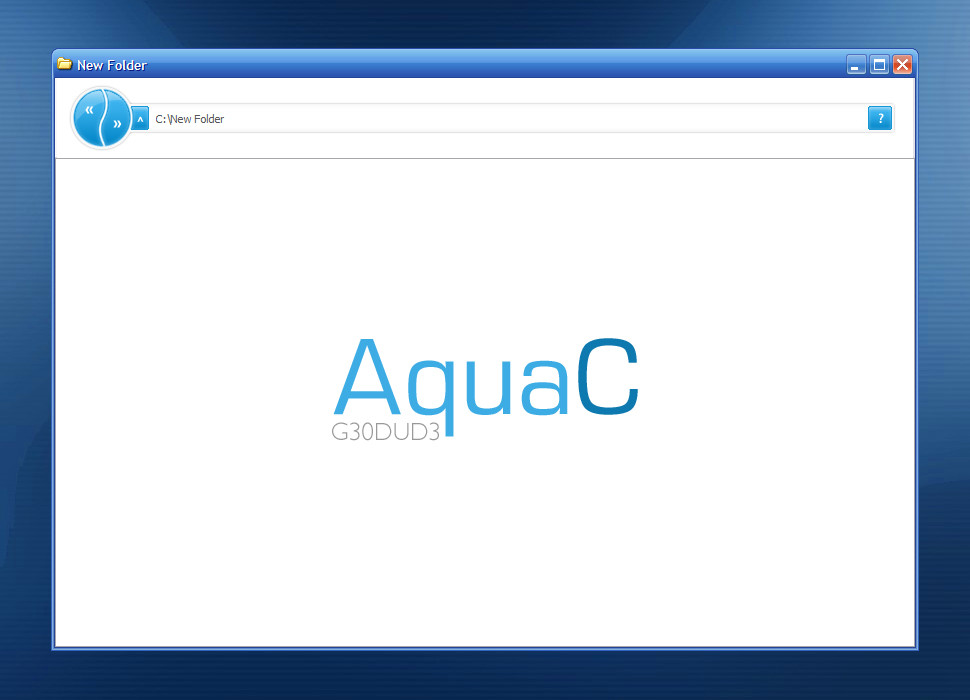
Title: Design ReloadedClient: Personal Practise
Application(s): Photoshop CS2
Comment: I had an idea about a fictional design community. I generally make practise designs for personal portfolios or indeed design companies, but I think this is different to my usual style - more professional. And by the way, I don't submit the designs I make for actual clients to dA.
Fav
 if you like
 ")
Update: Swapped the logo and slogan. Removed some of the horizontal lines.
Update2: I SHOULD REDO THIS
Related content


Comments: 68


very very nice mate keep it up.
check my recent work tooOO


👍: 0 ⏩: 0


")

nice i like this , have you got any link to dowload this ?
👍: 0 ⏩: 0


the color combination is great, and i just love the simplicity and clarity of it!
👍: 0 ⏩: 0

I think this design in perfect this way, the light blue color fits perfectly with the white and the dark blue.
keep it this way my man, it's perfect!
10/10 +fav
👍: 0 ⏩: 0

I think you can go multiple ways with this site... all three simply having to do with how much of which color to show.
The first way is to simply use the white and lighter blue part of the design.
The second way is to simply use the lighter blue and dark blue part of the design. Though, I would work on making the light blue part of the design more geometric to match the dark blue part, or make the the dark blue portion more ogranic to match the light blue part.
The third way is to include all three colors. But I would use just enough of the white area at the top to include the navigation. Using two different logos makes things look inconsistent when it comes to branding the site. I like the broad white area at the bottom, but I am unsure why you put the logo there a second time. And like my "second way" (posted above this paragraph), I would work to make the light blue and dark blue portions of the design match each other better.
I really like the cleanliness of design, though
👍: 0 ⏩: 0

top half is just amazing, but this dark blue section seems to be a bit chaotic. still i'm amazed by the top part (;
👍: 0 ⏩: 0


This is really really great! Best submission i've seen in quite a while!
👍: 0 ⏩: 0


its nice but i agree that you should use another font.. it just doesnt fit
👍: 0 ⏩: 1

Which pieces of text do you think looks wrong?
👍: 0 ⏩: 1
imo the the titles in content dont look good
👍: 0 ⏩: 0

I like it, not gonna give any C&C cause all the points I was gonna say have already been said
👍: 0 ⏩: 0

Decent template. Not really feeling the light blue, but the dark blue looks really nice.
Also I don't really like those scanlines, but that's a question of taste.
About the accesibility, I don't think you have a problem with that, the layout is accessible enough
Keep it up!
👍: 0 ⏩: 1
Yeah, I guess it is a question of taste. Thanks
👍: 0 ⏩: 0

nice color sheme mate  (Wink)")
really cool ... keep it up .
👍: 0 ⏩: 1


awesome work m8
very attractive good color choise love it
check out my new work [link]

👍: 0 ⏩: 1

👍: 0 ⏩: 1


Nice, but is uses too many time an fancy font.
It could be problem to make everything using image - "antiaccessibility".
👍: 0 ⏩: 1
Thanks, and I agree.. most time designers overlook accessibility issues. I guess it would have to have a text-only version.
For the websites I actually code, I'd usually do this anyway
👍: 0 ⏩: 0


yeah, so u still didnt change the light blue but add something on it so it doesnt look blank and hurt ppl's eyes
if i were u, i will put 1-px-white line border for the image box.. believe me, the image will stand out more
 (Smile)")
👍: 0 ⏩: 1
Thanks. About the borders, I agree it would make it stand out more, but I tried every kind of border and i couldn't make one work, especially on the dark blue background which the thumbs are on.
I'll think about it
👍: 0 ⏩: 0

I like it, i don't know if you changed the light blue, but i like the whole concept. Would you tell me wich program did you used to do it? I'm having some troubles to do one myself...
👍: 0 ⏩: 0

Thanks
👍: 0 ⏩: 0

| Next =>