HOME | DD
 g30dud3 — Design Reload

Published: 2007-05-07 20:32:40 +0000 UTC; Views: 26468; Favourites: 173; Downloads: 15
Redirect to original
Description
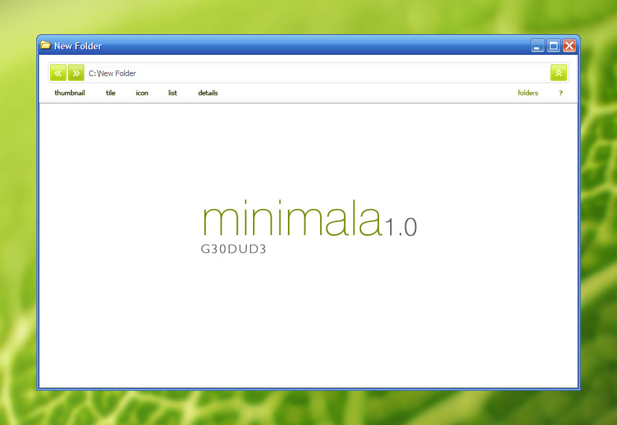
Title: Design ReloadedClient: Personal Practise
Application(s): Photoshop CS2
Comment: I had an idea about a fictional design community. I generally make practise designs for personal portfolios or indeed design companies, but I think this is different to my usual style - more professional. And by the way, I don't submit the designs I make for actual clients to dA.
Fav
 if you like
 ")
Update: Swapped the logo and slogan. Removed some of the horizontal lines.
Update2: I SHOULD REDO THIS
Related content


Comments: 68

Ok, thanks for the critique everyone! I think the general consensus is that the header is too big and too light (although it doesn't seem so light to me:-/ ).
I agree there was room for improvement.. tweaked a few things here and there and I think its better now, so I'll be updating it later
 (Smile)")
👍: 0 ⏩: 0


I like it, but the part under the header its too light, hurts my eyes. and the header is too big.
👍: 0 ⏩: 0

really nice work .. love the smooth clean style and the colors
👍: 0 ⏩: 1

honestly, i would scroll down to hide the white background until half of the light blue background..
because i feel that it looks nicer like that..
hope u get what i mean
👍: 0 ⏩: 0

i agree with arcticTransfuse: 
at first i thought it was because i'm wearing glasses but now i'm pretty confident it's because of the flare effect which you have achieved by choosing those colors in the upper part of the design. if you eliminate or substitute or at least dim either the lighter blue or the "almost" white part i would find it more pleasing.

p.s. the home nav link is really close to being unreadable.
well those are my thoughts.
oops... almost forgot to mention, i like your idea but there's space for improvment.

 (Wink)")
👍: 0 ⏩: 0
arcticTransfuse [2007-05-07 21:03:34 +0000 UTC]
The lighter blue is literally hurting my eyes.
Dim it down a bit.
Also, not fond of the typography... The rounded font doesn't seem to fit too well (except in the logo) and the content font seems spaced too far...
It's good, but needs some polishing.
")
👍: 0 ⏩: 0

Great job! I love the color choices and the content is very well organized. can I ask what font is that you used for the "Design. Reloaded." ?
👍: 0 ⏩: 1
Thanks, the font is Kabel ([link] )
👍: 0 ⏩: 0
<= Prev |