HOME | DD
 gauravpatel — Origo

Published: 2004-07-19 13:45:49 +0000 UTC; Views: 219; Favourites: 0; Downloads: 80
Redirect to original
Description
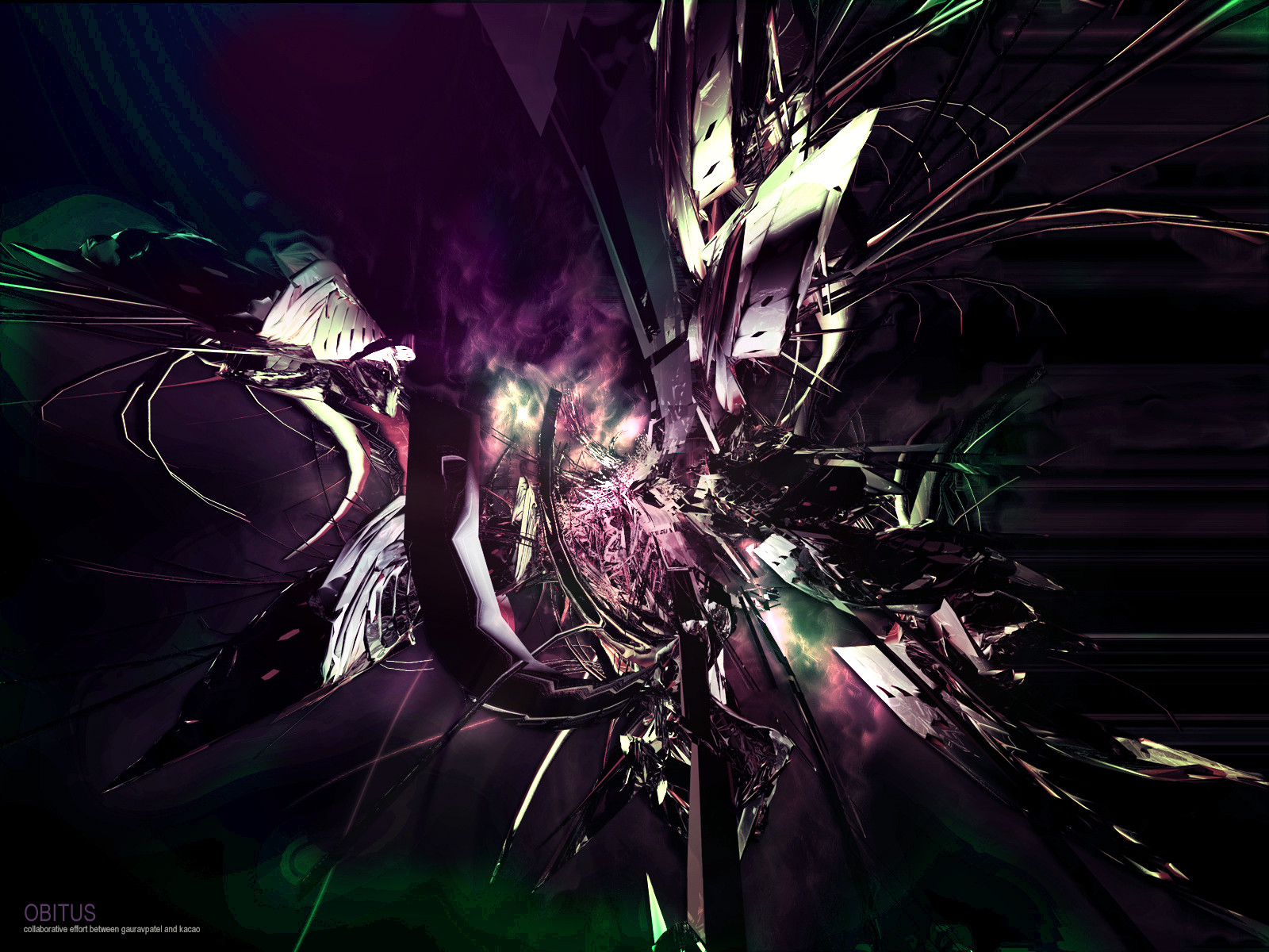
origo -inis f. [origin , source, beginning; an ancestor].Experimental piece. Not much to say apart from I gave up at the end, and just rushed it. So, um yeah. plenty of comments and criticism please.
Thanks to `snowmask for help and advice.
Related content


Comments: 34

i think that as usual the textures are amazing, and you've used the negative space really well. the colours though, i find questionable. at times, they go together really well, like the blue-grey at the top, the green-grey in the back, and the white really go together and create this perfect calm atmosphere around the whole piece, but the pruple around the continents is too bright. (i'm just calling the colours by their basic name and not getting colours like "aqua" and "fuschia" and whatnot) i admit it really helps "push up" the continents, but it doesn't seem to fit in the whole colour scheme. it's too bright and too vivid, whereas the colours you used before are not. it doesn't really go with the paleness thing you have going on in the piece, and i'm sorry that i'm so vague in this comment. blame it on the coffee. but, i think that's the only thing i really don't like, and that's why i didn't comment at first, since everybody was talking about the colour scheme, and how much they loved it, but that purple was to me really clashing with the whole "effect" (for lack of a better term) that you managed to sustain throughtout the whole piece. that's the only thing i can say i don't like in this. apart from that, it's really pretty cool, especially how you circled those two locations. it's always so much more to the artist and to the viewer when the artist relates the art to themselves. hard to explain, and if not explained properly, can be hard to understand, but when an artist relates or devotes something in his art, or in the whole piece, or devotes a whole piece to something he's passionate about, it really shows, and it makes the art so much more, and the viewer can see "the so much more"

👍: 0 ⏩: 0

why the lil circle around gujarat/kutch???accidental \ intentional?
👍: 0 ⏩: 2

Intentional. That's where I originate from.
👍: 0 ⏩: 0


I hope you choke on your Big Mac.
")
👍: 0 ⏩: 1

Lucky I don't like McDonalds then.
")
👍: 0 ⏩: 0

You have done an amazing work with the coloring and the textures!
did ya sharpen the arrow edges as mistress katie said?
she is right , they are a bit blurred..
But ,dang, it i like this very much! I swear!
and dont give me the link >.<
👍: 0 ⏩: 1
I forgot to do the arrows! I shall do them now.
👍: 0 ⏩: 1


That's not Arabia, dude.
(lol i tried to make a joke based on what we said before and then i thought oh shit is that where arab land is and so then i googled and found out that you were indeed talking about india and then i was like oh shi better make that comment anyway.)
I am tied on whether or not to like the blurry outlines on the map thingy...but it's like 3D, so I like it. At first, I thought my eyes fucked up. So if that happens to anyone else, then you've played a little joke on them!
dude wait... did you mark pakistan on the map?
what
YOU LIEKED TO ME
(i like this, don't change it.  (Smile)")
")
👍: 0 ⏩: 1
It's a little village in the north west part of India, and I was joking about the Arabian thing!
Thanks for the comment ho.


👍: 0 ⏩: 0

Beautiful. Loving the colour scheme, like Keith said, but moreso because it was that ghastly purple to begin with.
The arrows though... they look kinda blurry =\ Maybe sharpen the edges a lil bit?
👍: 0 ⏩: 1
I shall get on it!
Thanks missy. <3
👍: 0 ⏩: 0
")
[link] - I'll kill you next time!
👍: 0 ⏩: 1

EhYa!! Please don't!!
Right... so. I'm liking the colour choices, they don't stand out too much and really make a calming, if a bit crazy on the eyes image. I'm not really feeling how the top just jumps over a solid line and changes style to the bottom though, just seems like two different pieces stuck together.
The map is nice though, but i'm not getting the arrows and stuff, they don't seem subtle enough in my eyes.
Better?
👍: 0 ⏩: 1
Much, now do that to everyone else!
👍: 0 ⏩: 1
Ok, i'll try. But my +devwatch is huge. O_o A lot of long comments to do.
 (Wink)")
👍: 0 ⏩: 1

")

love the texture
you have to tell me where u got that world map pattern!!! =\ i cant find a decent one anywhere
👍: 0 ⏩: 0

It's nice, a bit plain and empty perhaps. and I don't get the meaning.
But it's nice.
👍: 0 ⏩: 0

I love the texturing at the bottom, the soft grunge is awesome. And im really loving the outline of the earth. This is wonderful, teach me
👍: 0 ⏩: 0

nice visually but i feel the message of a transition between 2 places needs to be emphasised more
👍: 0 ⏩: 0

Liking the top part,nice forms and colors used,keep it up
👍: 0 ⏩: 0


Its nice and simple, and I like the color scheme used, dont think anything else would match well, nor cutting some out.
very nice man.
👍: 0 ⏩: 0