HOME | DD
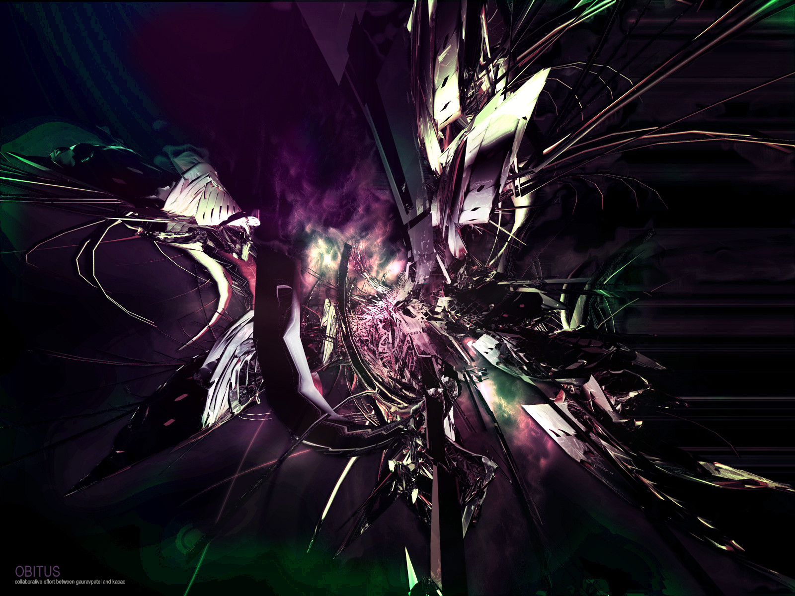
 gauravpatel — Solar Combustion

Published: 2004-06-28 16:23:50 +0000 UTC; Views: 227; Favourites: 0; Downloads: 103
Redirect to original
Description
Terragen stock used: [link] by *alyn for ~TerraStock .I wasn't sure if this belonged here as I used stock. If it is in the wrong gallery, then just tell me.
This is the first time ever I have done anything like this, so... plently of criticism please!
Related content


Comments: 22


")

That is magnificent. Gotta give you props for this pic bro.
👍: 0 ⏩: 0

I like it, but it seems as too much attention is drawn to the edges of the thing, instead of the burst of color. Maybe cropping it a little would help? I dont know...
Nice work anyway
 (Wink)")
👍: 0 ⏩: 0


hey man.
this is stunning. i don't know much about technique and style when it comes to galaxies and this style of art, but i can definately tell you that i find it completely breath taking. like the start of a new day - a new dawn being born, with the pinkish lights flowing straight across. very eye-catching. kinda reminds me of fairy floss, but yea, all clouds remind me of fairy floss.
nice work dude! you gonna do another one? i think this is a style that you should definately keep at!!
-cheryl.
👍: 0 ⏩: 0

i like it but I dont see it as a final piece....seems like its missing something.....the focal point's only taking a quarter of the canvas which in my opinion is very well made....upper's part's I think is overdone with star cloning.
👍: 0 ⏩: 0

Looking at the original makes me glad you used a part of the stock. The mountain is well cropped to the left leaving much space on the right for all the luminace to show itsself because you did a splendid work on it. I really enjoyed the smooth ending of the combustion to the rest of the piece without an intense difference in contrast , so it doesn't make it disturbing to the eyes. Also a bautiful composition of colors, the mixing is spectacular. Great work on the lighting and I must credit you for the stars which are partially lightened since the combustion is not really intense.
I am totally out of my field , so I'll just shut my mouth now 
I can say , though , that for your first try is an amazing work dear!

👍: 0 ⏩: 0

...stunning
amazing use of brushes -i love the stars, too

👍: 0 ⏩: 0

looks really cool. a bit empty perhaps but that can be easily helped.
this work is sized 1096x1360 - almost a square. bad idea. would look MUCH better if it was perhaps 700x1300 and the blend between the 'land' and the STARS was to be at 2/3 down... so that the upper 2/3 are stars and the lower 1/3 is the land. the color is perfect... perhaps a bit more contrast on the land and the font used to make the title also rockz...
a very good experiment.


👍: 0 ⏩: 0

looks really good. love the colors used and all. and lovely new avatar also 
👍: 0 ⏩: 0

Maybe removing or lowering the opacity on those grey multiply layer ( I think ) clouds? And also removing that streak of stretched brushing. You could highlight the ridge as well so it interacts with the Terragen better.
Hope that helps. :]
👍: 0 ⏩: 0

Fuck yeah. The pink shit still reminds me of a space orgasm...shoulda called it that. (but your title for it is still very cool)
Well done, very ambient and real. Gotta love that little star on the right, glowing with allll its might! ^_^
👍: 0 ⏩: 0

wow.
i'll comment on this piece now and not when i do your gallery, because it's just, beautiful.
the thing that i love with sci fi art, is that the titles indicate strength, power, might and destruction, but the pieces themselves are so calming and beautiful.
they're just very peaceful to look at, and apart from that being very pleasing to see, it's very interesting too. they seem to have their own sort of 'violence', a calm violence, though it sounds weird, that's what i feel. like so much is happening, but yet, you still feel so calm. no matter what colours; whether they use red and yellow and orange, and gold, which are known to make statements, or blue and purple and green, it doesn't matter, because you still get the calm, relaxing feeling from it.
this piece is no different. i love the little clouds almost, of dust. they remind me of the time i use to mess around in paint. they do however look very beautiful, and enhance the whole fantasy feeling in this piece, which, by the way is very strong. interesting choice of colours. i've never seen a sci fi piece use greens, pinks, purples and black as i have in this one. as i said before, the fantasy feeling in this piece is very strong, and the colours you chose reinforce and add to that feeling.
the black adds an eerie calm to the whole piece, almost a silencing calmness, that is usually only noticed on the onset of the night. and then, the title comes into play, and everything sort of clicks, and makes sense. i like the fog, which gives the whole ominous feeling again.
the snow and the moss/grass don't really add to the weird calm or the magic, that much, but still, very nice job on them. just something very nice to look at, and shows your effort in doing the whole thing.
if anything, i would say a bigger explosion, since it is solar combustion, but maybe, it's the end or the beginning of the combustion and then it fits just fine.
i think ppl like *alyn could give you more advice on this, i'm just telling you what i saw and liked, and one line about what i thought you could change.
very nice job overall.
 (Smile)")
👍: 0 ⏩: 1


I think its perfect wonderful colours. Great concept. BUt actualy in some sense it feels like the sky is missing something
👍: 0 ⏩: 0

I wanted something soothing and pleasing but at the same time I was trying to make it as powerful without overdoing it. What do you suggest?
Oh, and thanks for the comment.
👍: 0 ⏩: 0