HOME | DD
 GavinMichelli — Improvement?

Published: 2011-05-07 05:47:16 +0000 UTC; Views: 1901; Favourites: 31; Downloads: 0
Redirect to original
Description
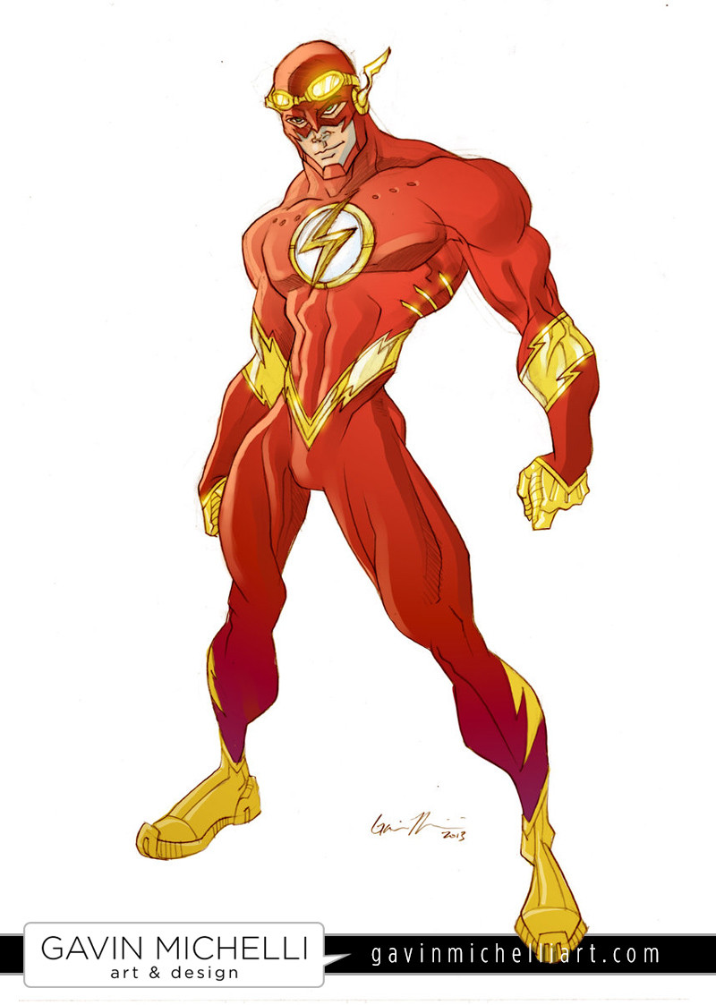
To be honest, I think I like the color scheme I chose 4 years ago . Opinions?
EDIT: So far, 13 people prefer the 2007 one, and 6 people prefer 2011. Interesting...
Related content


Comments: 74

yes you made a very positive improvement. Your colors now are much more better than before, the anatomy is now much more realistic than before.
Your doing very well keep up the good work
 (Smile)")
👍: 0 ⏩: 1

Thank you very much! There are a lot of people who prefer the older one, but hopefully I've improved overall as an artist. It's a little depressing to think that, in some people's eyes, I've actually gotten worse over the years.
👍: 0 ⏩: 1
Well people who prefer the older one that's ok because the older one wasn't bad, that's a matter of choice.
An people who think you've gotten worse must be blind or are just trying to make you feel bad. Don't let them get to you people can be hurtful, just keep up your good work because it's really good
👍: 0 ⏩: 0
So you like the new one better?
👍: 0 ⏩: 1

no as they both look relatively the same i mean there are some difference but just not enough to really be majorly noticeable.
👍: 0 ⏩: 0

I like the old one better too.But i've always been impressed with lots of detail anyway.
👍: 0 ⏩: 1
Yeah, I used to draw every single muscle fiber on every muscle
 (Wink)")
👍: 0 ⏩: 1
Your not the only one buddy.
👍: 0 ⏩: 0

The new flash is just to bright a red. I like the darker red, like Wally's recent flash costume was. Almost burgundy.
👍: 0 ⏩: 1
Yeah, it looks more like the old Flash tv show.
👍: 0 ⏩: 1

I'm getting a lot of that, actually. Most people just prefer the darker colors, but there are also a lot of people who miss the way I used to draw anatomy. Definitely something I'm going to take into consideration in the future.
👍: 0 ⏩: 1
")

2011 version's red is oversaturated. Just dim it a bit or make it darker, it'll look good
👍: 0 ⏩: 1
Yeah, I think I agree. The darker red has more richness and depth.
👍: 0 ⏩: 0

I like them both...guess that doesn't really answer your overall question but that is my opinion.
👍: 0 ⏩: 1
Actually, I like that answer
👍: 0 ⏩: 0

I'd have to say the older version... The style of it has a more appealing look, in my opinion anyway
👍: 0 ⏩: 1
Yeah, I think it has a little more personality, even though some of the technical stuff isn't on point. Some of the charm got lost.
👍: 0 ⏩: 0

Well, the anatomy now looks a bit more "real," which I like.
👍: 0 ⏩: 1
Yeah, I used to exaggerate it a lot more. I'm starting to wonder whether or not I should return to that style.
👍: 0 ⏩: 0
<= Prev |