HOME | DD
 GavinMichelli — Improvement?

Published: 2011-05-07 05:47:16 +0000 UTC; Views: 1901; Favourites: 31; Downloads: 0
Redirect to original
Description
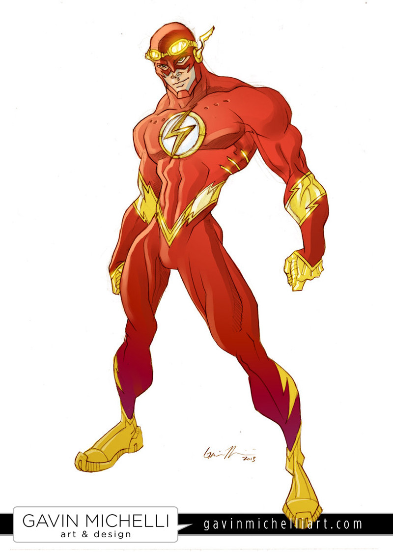
To be honest, I think I like the color scheme I chose 4 years ago . Opinions?
EDIT: So far, 13 people prefer the 2007 one, and 6 people prefer 2011. Interesting...
Related content


Comments: 74

Baaaahahahahahaha it's for easy "flashing"

👍: 0 ⏩: 0

Heh, 2007 is winning by a landslide. I've started re-incorporating some of my old musculature techniques into my newer pieces, so hopefully that will help me out.
👍: 0 ⏩: 1

In my opinion the 2007 is more "alive" than the 2011. Though the 2011's lights and shades gives it a better 3D feeling for the figure .. I think the key is somewhere between the middle. Use the 2007 style with the lights and shades of 2011! But off course that's just my opinion.. I love'em both. Well If I had to choose I'd slighty bend towards the 2007 one.
👍: 0 ⏩: 1
Since I posted this, I've definitely started to re-incorporate my old style a lot more. You're right, I think I was getting a little too stiff with my figure drawing.
👍: 0 ⏩: 0
Heh, most people do! I've actually changed my style up a bit to re-introduce techniques that I was using then. I think I'm starting to reach a happy medium.
👍: 0 ⏩: 1

yeah its always good to experiment with different styles i go back and forth with airbrush and hard line coloring
👍: 0 ⏩: 0


LOL, that does seem to be the consensus...
👍: 0 ⏩: 0


dude... you know that 2007 flash is my fave work of yours and still is... dont think the 2011 version even compares in terms of detail, anatomical style, character and color! but since you only asked about the color scheme, i still love the old version... even in my own works, i tend to like the results with my muted and dark deep tones than the overly bright and saturated tones. but thats juz me.
👍: 0 ⏩: 1
Actually, the overwhelming response that I'm getting is that people prefer the old one. Almost everyone prefers the more muted tones, but some people even like the actual drawing better.
👍: 0 ⏩: 1
I too like the actual drawing as well but since you asked only about the color...  (Wink)")
👍: 0 ⏩: 0

Honestly, there is a lot more interesting stuff going on in the older version. The anatomical exaggeration is a minor detail. The coloring technique and and muscle details are better in the old version. It almost looks like two completely different artists drew them.
👍: 0 ⏩: 1
Heh, I guess you could say that. I'm definitely in a different frame of mind these days. I guess the changes that I've undergone personally show up in my art. Thanks for the insight, man
👍: 0 ⏩: 0


I like the 2007 version more, mate. But both are cool
👍: 0 ⏩: 1
My english is crappy like... it's crappy ")
👍: 0 ⏩: 1
I didn't even realize English wasn't your first language, so it must be pretty damn good!
👍: 0 ⏩: 0

I prefer the darker colors of the 2007 one, as they're less eye-assaulting. I also llike that your shading seemed to be more gradual , and it made everything seem less angular. Aside from color and shading, I prefer the overall style of 2011. It's much more realistic (and, to be frank, it feels to me much less "empty space? let's throw in some more muscles!") and human in proportion and all that stuff. Costume-wise, I like both of them a lot. I think I'll say the 2011's costume is my favorite, as I like the futre-y look of it (although the stuff like the three holes and the three... breathing things are confusing unless The Flash is a cyborg).
Therefore, I like the newest one better!
")
👍: 0 ⏩: 1
Wow, that's a pretty thorough comparison! Thank you very much for sharing your thoughts. A lot of what you said really rings true, and I'll definitely keep your words in mind while working on future pieces. Thanks again!
👍: 0 ⏩: 0

The more current pic is more anatomically correct but less heroic. I prefer the older color scheme as well. The newer pic is a bit too bright.
👍: 0 ⏩: 1
That seems to be the general consensus. I'm really glad I posted this; all of these comments will help me out a lot in deciding what I need to improve on (or really, what I need to return to).
👍: 0 ⏩: 1

Color scheme from 4yrs ago looks better but he is too skinny in that one.
👍: 0 ⏩: 0

Naw, the one on the left is more solid, I like the color and design of the suit better, I like the lightning elements better on the one on the right though.
👍: 0 ⏩: 1
Really? You mean like how the lighning looks 3d, instead of flat? Or are you talking about the cut and shape of the lightning?
👍: 0 ⏩: 1
I am talking about its 3D appearance.
👍: 0 ⏩: 1
Ah, I see. Thanks for the input!
👍: 0 ⏩: 0

I really like 2007 more. I like that style of coloring better, and the colors.
👍: 0 ⏩: 1
You like a smoother, more airbrushed look?
👍: 0 ⏩: 1
Yes, I prefer a painterly style over crisper cell-shading colors. That's not to say I dislike the newer version, just between the two I like the older one.
👍: 0 ⏩: 0

i like 2007 better. seems to be warmer and have more realistic weight. the color style in 2011 feels like he's "glowing" a bit to much. the old model seems more painterly and grittier, which i enjoy more.
👍: 0 ⏩: 1
Thanks for weighing in, man! I appreciate the input!
👍: 0 ⏩: 0


So which one do you like better?
👍: 0 ⏩: 1
You like it old school, huh?
👍: 0 ⏩: 1

Thanks! I've definitely become less concerned with drawing each individual muscle over the years.
👍: 0 ⏩: 0

i like the 2011 a lot more, but I think it can be a lil darker on the suit, but it still shows better contrast and shade  (Smile)")
👍: 0 ⏩: 1
Nice observations! I totally agree. I appreciate you taking the time to give me a few thoughts.
👍: 0 ⏩: 1
| Next =>