HOME | DD
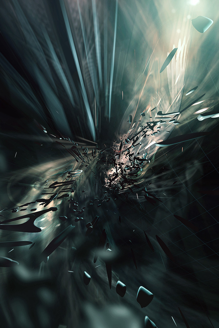
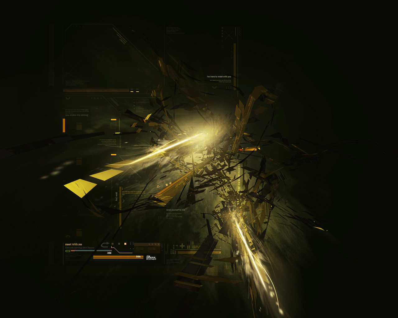
 Genesis-Orbit — Angel Of Life
Published: 2009-09-29 00:30:17 +0000 UTC; Views: 2995; Favourites: 65; Downloads: 212
Redirect to original
Description
Now if I could do commissions like this for a living, man alive that would be super cool. My good friend Janice who you can find here requested this way way back in 2006 and I made a promise to her that I would get it done. As you can see, she's not very active on dA anymore, but I haven't seen her in a few months because we're out of college, however I'll be seeing her this Wednesday. Now a little about the piece. She said, simply make something in your style except make it kind of revolved around angels (since she loves angels). Hopefully you can spot the wing in this (Wink)") Hope you all like!
Hope you all like!
Related content


Comments: 37

 (Smile) - :)")

I noticed the bunch of A's in perspective. Quite awesome piece dude!! I love it.
👍: 0 ⏩: 1


Great work man. I love your post work, fantastic composition...everything flows beautifully. We should collab some time
")
👍: 0 ⏩: 1

Thanks a lot brother, and yeah sure
")
👍: 0 ⏩: 0


This peice of art is fantastic & your art overall more fantastic! X3
I really love this style, it gives me a good feeling to it :3
👍: 0 ⏩: 1
Thanks a lot man, appreciate it!
👍: 0 ⏩: 1

Great work keith, awesome depth, lighting & render. only thing is that the text stands out too much, it distracts me a little too much from the awesomeness of the piece. I'd just leave it away or size it down alot for her version at least.
👍: 0 ⏩: 2
Oh and I edited it fyi lol.
👍: 0 ⏩: 1
I've been a bit unsure too, but I do think it can do without. Text always seems to take the personal side of the piece out, especially if it's not incorporated well.
👍: 0 ⏩: 0


really sick, as someone already said, great depther here
👍: 0 ⏩: 1
I tried really hard on this one lol.
👍: 0 ⏩: 0


The depth here is really great, as well as the lighting. Awesome work, dude. ^^b
👍: 0 ⏩: 1


Oh, out of curiosity, were some of the shapes that are coming at the view suppose to look like letters, because I keep seeing A's, O's and T's and I try and see if I can read something in it
👍: 0 ⏩: 1
Hahahaha, no you're right, they were letters, I just tried a different way to make a render this time and instead of splines I used letters. I was listening to a song so I just blurted out a line from the song and made a render out of it xD
👍: 0 ⏩: 0