HOME | DD
 Genesis-Orbit — Into The Orbit

Published: 2006-06-24 05:59:31 +0000 UTC; Views: 5004; Favourites: 110; Downloads: 782
Redirect to original
Description
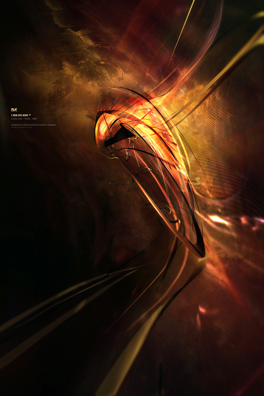
I was going to submit this to Konvulse's next pack, but I kind of screwed up the meaning becuase it was an abstract interpretation of something and I kind of missed the meaning by a little bit due to my stupidity, I'll submit it now. I still think it's a cool abstract, and I hope you do too (Smile)")
Related content


Comments: 50


")

Thanks bro. Hey remember when we did that colab and we were thinking of doing a 2nd version? Wanna try doing that?
👍: 0 ⏩: 1

when i have time man....so busy
")
👍: 0 ⏩: 0


Do you have a 2d pack that I can use? Those techs are awesome..Great piece too
👍: 0 ⏩: 1
Nah sorry man, I do tech new every time.
👍: 0 ⏩: 0


OMG 10 times better on my lcd screen. now its not so dark. it looks good and the quality as well. glad i faved it.
👍: 0 ⏩: 0

Awesome as always, man!!!
I <3 this piece
XD
I'll have to disagree with alot of people here, I don't think it's too dark, maybe it's thier monitors?
lol
The suttle color is great
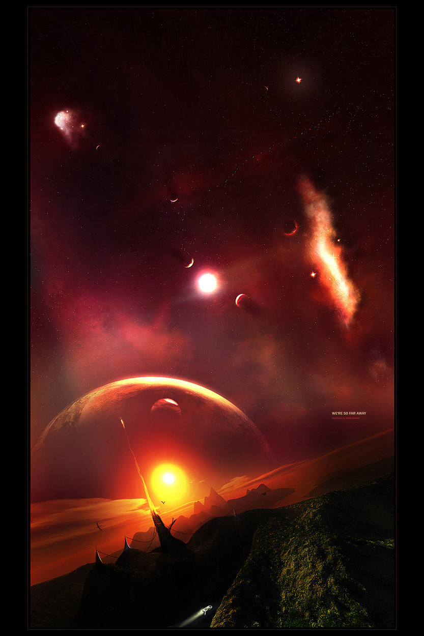
I like this piece alot more than aot of the other 3D pieces I've looked at, mainly because it's not an explosion. lol. It feels like the space around it is being sucked in, much more unique, and also cooler.
XD
Only complaint are the 3 blue triangle like things on the far right of the picture, they seem to arract too much attention to themselves. Other than that I can't find anything bad to say!
Awesome job man!
::fav::
👍: 0 ⏩: 0

Cool abstract doesn't even begin to describe it. This piece is awesome.
👍: 0 ⏩: 0
looks awesome man, i dont kno if its the monitor im on, but it looks liek its a bit low quality in the middle and on someother places. ill keep it in my message box and check it on my lcd screen. looks good man, ill 
👍: 0 ⏩: 0

It's a little dark, maybe lighten it a little?
Or maybe that was what you were going for, I dunno. 
👍: 0 ⏩: 0


I've never liked the tech stuff d:
but the render and postwork is sweet (:
👍: 0 ⏩: 1
I love 2d, it's amazing if you can do it right lol
👍: 0 ⏩: 0

Man your jamming now. I really like your new work bro. This is slick. This is the kind of wp I like. I wish it were 1280x1024...hint hint.
 (Wink)")
👍: 0 ⏩: 1
It was a small render I'm afraid, no original size in this one
👍: 0 ⏩: 0

Very nice. I love how the darkness becomes a slight brighther also.
👍: 0 ⏩: 0


love the dark feeling wiht the soft atmosphere. and the postwork is nice.
👍: 0 ⏩: 0


very nice
what was the missed meaning btw? the art pack?

👍: 0 ⏩: 1
It was a very conceptual peice, well it was supposed to be. Well pretty much I grasped the meaning of what I was supposed to be interpretating, but what I was showing you...I could have done a better job making that relation so I just decided to not submit it
👍: 0 ⏩: 0


the shadowed overtones rock! reminds me of final fantasy the spirits within...the image of an imploding star
👍: 0 ⏩: 1
Do you have an image of the spirits within thing? I'd love to see it
👍: 0 ⏩: 1
i'm really sorry...i can't find my dvd 

")
👍: 0 ⏩: 0

holy mack keith... that's awesome. Cool render and focus point. nice colors and postwork! It looks like the viewer is in a SpaceCraft with Head-Up Display, pretty cool. Faved!
👍: 0 ⏩: 0


not feeling it much, but I love your 2d work. On a side note, I absolutely loved the photos you submitted, the concepts were spot on.
👍: 0 ⏩: 2
Awesome lol, glad you think so
👍: 0 ⏩: 0


yeah this is wicked man - again 2d is really good in this one - change in text colours is 
👍: 0 ⏩: 0


")

yes a bit dark, but colors rock, also 2d is very cool.
👍: 0 ⏩: 0
