HOME | DD

Genesis-Orbit — No One

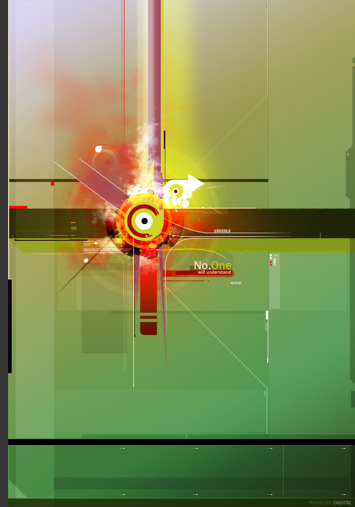
Published: 2006-03-19 07:59:30 +0000 UTC; Views: 991; Favourites: 30; Downloads: 330
Redirect to original
Description There is nothing to understand about it.

This is for the people that don't understand abstract art; the people who think art is bullcrap becuase people can make concepts that are stupid and get mad when people think it's genious. We all at once felt the pain you have.
Related content
Comments: 36

TheRealWazzar [2006-11-13 06:57:14 +0000 UTC]

Ah yes. Something for the anti-conceptuals like me

👍: 0 ⏩: 0

drin-chan [2006-06-20 03:06:23 +0000 UTC]

i like the touch of purple you put in it, gives it character i think......+favs

👍: 0 ⏩: 0

lunadementare [2006-06-18 09:16:15 +0000 UTC]

I like it.

👍: 0 ⏩: 0

A91 [2006-05-22 20:57:39 +0000 UTC]


JUST AMAZING ?!!

👍: 0 ⏩: 1

Genesis-Orbit In reply to A91 [2006-05-22 21:26:10 +0000 UTC]

Thanks, you forgot to add the fav though lol

👍: 0 ⏩: 1

A91 In reply to Genesis-Orbit [2006-05-22 21:36:29 +0000 UTC]

kkkkkkkkkkkkk

really
add it now

👍: 0 ⏩: 1

Genesis-Orbit In reply to A91 [2006-05-22 21:56:39 +0000 UTC]

That's better lol jk, thanks bud

👍: 0 ⏩: 0

inf3rn0gfx [2006-03-25 10:54:26 +0000 UTC]

^^ as long as it looks great, does it really need to mean anything

👍: 0 ⏩: 0

SnipySnob [2006-03-22 20:10:51 +0000 UTC]

looks awesome, nice job. you made green and red match 0.o

👍: 0 ⏩: 0

Gunner678 [2006-03-22 20:03:56 +0000 UTC]

Really like that your trying new things-and doing great with em.

👍: 0 ⏩: 0

ZenmaruQuaddra [2006-03-20 21:42:20 +0000 UTC]

Cooool.

👍: 0 ⏩: 0

shftfrm [2006-03-20 13:34:19 +0000 UTC]

nice colors and background but I think it's too flat. the red-explosion shape should look more 3d.

👍: 0 ⏩: 0

couleur [2006-03-20 10:45:23 +0000 UTC]

I only like the background

👍: 0 ⏩: 0

S0-Fresh [2006-03-20 01:39:32 +0000 UTC]

now this is nice

The brushing almost gives the illusion of combustion wll done

👍: 0 ⏩: 0

Sacrificor [2006-03-19 22:44:36 +0000 UTC]

I love it!
Nothing else to say about it.

Oh wait, yes. I love the colors.

👍: 0 ⏩: 0

rwalby9 [2006-03-19 18:46:08 +0000 UTC]

This is pretty good but I think there could have been more done to it around the focal.

👍: 0 ⏩: 0

coolmarvin [2006-03-19 17:54:12 +0000 UTC]

Amazing. I like the way the colours all change in the middle

👍: 0 ⏩: 0

videa [2006-03-19 16:57:48 +0000 UTC]

sexy

👍: 0 ⏩: 1

Genesis-Orbit In reply to videa [2006-03-25 07:42:37 +0000 UTC]

This kind of reminds me of your style for some reason

👍: 0 ⏩: 0

televasious [2006-03-19 16:54:07 +0000 UTC]

woah... cool

👍: 0 ⏩: 0

kosmosforextreme [2006-03-19 15:28:45 +0000 UTC]

The way you used desaturated colors is amazing! But your typography really impresses me.

👍: 0 ⏩: 0

horaciophd [2006-03-19 14:57:18 +0000 UTC]

great typo

👍: 0 ⏩: 0

1ALPHA1 [2006-03-19 14:55:37 +0000 UTC]

i like it, and good use of colors also..

👍: 0 ⏩: 0

Crash1-TK [2006-03-19 14:53:13 +0000 UTC]

Love it man, long time.

👍: 0 ⏩: 0

gfx-ACro [2006-03-19 13:57:24 +0000 UTC]

Very nice colors.

👍: 0 ⏩: 0

ekaF [2006-03-19 13:24:48 +0000 UTC]

nice one man!

👍: 0 ⏩: 0

destil1 [2006-03-19 12:54:42 +0000 UTC]

Good stuff, my only crit would be the type, but i'm always like that

👍: 0 ⏩: 0

Reusol [2006-03-19 12:49:00 +0000 UTC]

<3

👍: 0 ⏩: 0

Brandonc1 [2006-03-19 12:39:27 +0000 UTC]

very nice bro

👍: 0 ⏩: 0

R-psyco-R [2006-03-19 10:54:44 +0000 UTC]

woaw looks like a nice vector to me
good work


greetz

👍: 0 ⏩: 0

PvtWaffles [2006-03-19 09:31:52 +0000 UTC]

awesome. nice brushing/colors, i love your work.

👍: 0 ⏩: 0

rivalxs [2006-03-19 08:45:11 +0000 UTC]

nice 2d work man

👍: 0 ⏩: 0

Heretic-SZ [2006-03-19 08:23:43 +0000 UTC]

mmm...2d

👍: 0 ⏩: 0

vamp-lord [2006-03-19 08:20:19 +0000 UTC]

pretty nice keith looks old skool to me <3 the 2d

👍: 0 ⏩: 0

VahagByurat [2006-03-19 08:18:05 +0000 UTC]

nice 2d neg on the brushing

👍: 0 ⏩: 0

BordomBeThyName [2006-03-19 08:04:11 +0000 UTC]

man, I love things that dont make sense...

👍: 0 ⏩: 0