HOME | DD
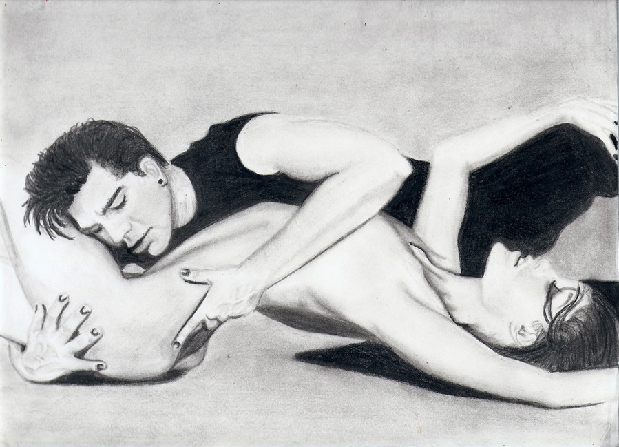
 giglebox — Cirque

Published: 2010-09-21 05:02:33 +0000 UTC; Views: 4107; Favourites: 92; Downloads: 56
Redirect to original
Description
Inspired by a stunning image created by a DA friend [link] While it's obvious I'm still quite a novice at drawing certain aspects of this drawing seem to have come through quite nicely for me. Some proportions appear to be off but I think this piece actually helped me to get more involved with my shading. before this I had been very light handed. I was able to apply it a little harder to this one.
What do you think?

Related content


Comments: 72

I really like the drawing. The pose is interesting and your lines are solid. As far has some advice goes, I think the drawing is a bit grey. I would step up to some 6b for some of your darker areas. It looks to me like you used only one shade of pencil, and I think using multiple shades will really make your drawings pop. All in all great drawing keep it up.
👍: 0 ⏩: 0
Well I really like the drawing. I think the form is good. The pose is interesting. My only advice would be that its a bit to grey. Adding some more darks would make this really pop. Maybe like some 6b line work around her palm and foot and in her hair.
👍: 0 ⏩: 0

Featured here:
[link]
You can show your support by 
👍: 0 ⏩: 0


looks nice overall.. but those legs are way off i think they look way short and the feet look way small.. but it can be just what i see but overall it looks good
👍: 0 ⏩: 0


I really like the position of women, that seems very dynamic, but i'm not very convinced about the proportions. despite the position it is clear that the leg is too short compared to the arms: the leg should be almost twice as long.
the drapery is nice, but it was worked more, with more shadows and lights.
I like the shadows of the whole body, but the shadow on her back seems like a stain: should be blend better. also the background should be blend better. hair give a very good sense of dynamism, and i love it.
Overall, I really liked the impact and the subject, but this type of drawings - in my opinion - is really beautiful if it's technically perfect.
you've good quality and talent, but surely you still need experiment.
👍: 0 ⏩: 0

Nice representation of the original - which is in my Fave's.
👍: 0 ⏩: 0

amazing 
👍: 0 ⏩: 0


Overall - Good job and nice improvement.
P.S. - This is just what I feel about your work, and there aint a scene where it all has to be true.
Good day,
Ashwin
👍: 0 ⏩: 0

This is wonderful.
I love how you shaded her body, all the shadows look very realistic. But it seems the shadows on the cloth are lacking. Shouldn't the part wrapped around her knee be darker since (judging by the light on her back) the light source is coming from above?
👍: 0 ⏩: 0

the sahding is great!! the resting arm is giving the leg a run for its money lengthwise but i belive its because the leg is disproportionate from knee to ankle is far too short.
the curvature of her body is overall nicely done and the shading is near perfect in my opinion
 (Smile)")
👍: 0 ⏩: 0


wonderful!
love the softness of the entire drawing.
good job!
👍: 0 ⏩: 0

Wonderful.... fantastic shading and lighting on every part!! looks perfect!!
👍: 0 ⏩: 0

Wow, I love this. The pose is just so elegant-- there's nothing i can say that can explain how epic this is!
👍: 0 ⏩: 0

I think the shading is spot on, but you should look more into proportion, it looks like to fit the leg on the page you have made it shorter that it should be, which is something I do a lot. Even if you think something will fit on a page and then nearing the end of the drawing you realise it doesnt, dont try to squish it in, just draw to the edge of the page. Hope it helps (=
👍: 0 ⏩: 0

Went and looked at the original--in my opinion the dangling leg is too short, and the first finger of the outstretched hand shouldn't be bent too much. I like the milky whiteness of the light on the back, but I think you should blur the boundary between that patch and the rest of the body to make the transition a little smoother.
Her hair is very nicely shaded, just that I think in proportion to the body the head should be a little smaller. The shading on the dark areas looks great and overall, it's a nice drawing.
")
👍: 0 ⏩: 0

You have mentioned in your comments already some of the weak spots. The proportions are a little off, although it isn't glaringly obvious. Overall the piece is very well done, you do seem to have a light touch, not really a bad thing. The shadows on the body are good. My biggest suggestion would be that the figure as a whole seems to have an "aura" around it. Other than that you have done a very fine job on this.
👍: 0 ⏩: 0


A very challenging pose, and you aren't moving backwards in terms of value (the strength of light or dark in shades) You can still go further though  (Wink)")
I've also noticed that her legs are a far too small, further disproportioned by a somewhat large head. I don't know how you go about drawing figures, but making a light skeleton could help prevent such issues in the future. Also, do you sit very close to the paper when you are drawing? I've noticed that if I sit fairly close my drawing get's more easily distorted, and what looked all right when I drew it becomes wrong when I look at it from further away. Especially in a skeleton and sketch up phase it's wise to get some distance, or even hold it up in a mirror to see the reflection to catch mistakes early on, when they are easier to change
👍: 0 ⏩: 1

Actually when I draw I am sitting right in line with my drawing... very up close. Maybe that is where I am going wrong. Because unbelievably, I did not notice the disproportioned leg until I had completed this piece. Great advice, thanks so much.
👍: 0 ⏩: 1

Overall, a great job. It looks fantastic. ^^
The lower part of the curtain looks great, but the shading on the top is a bit off. With the weight of a person holding onto it, the lines/shading would be taught and straighter.
The person looks pretty good, but the shading might be just a bit dark. Her hair, however, looks fabulous. ^^ Her left leg looks great, but the wrinkles on her heel have a bit too much contrast, making them more prominent.
Both hands look great.
Her right leg looks a tad bit short and the shading on the right foot looks a bit off. Same with her left shoulder.
Fantastic piece. You should be very proud. ^^
👍: 0 ⏩: 1
Thank you very much, I appreciate your advice.
👍: 0 ⏩: 1

Shading, excellent!!! Legs, a bit scrawny at the calves. The arm touching the leg is also a bit small. Usually when you draw limbs, lengthen them after you draw them. That's what I always have to do. For some reason, we all tend to draw the arms and legs too short, the eyes too large, and the forehead almost nonexistent. Is a mystery. . .
👍: 0 ⏩: 1
Yeah, I really fell short, no pun intended, on the leg!
")
👍: 0 ⏩: 1

The deep shadows are a really nice touch; however, the lowest leg does seem too short. I also like the soft shades on the skin and the hair. I would recommend easing the transition between light to dark on the one side, and I would take the eye out from the hair. Where her jaw is, the eye feels too far forward. Overall, nicely done, and the image comes out well. It might be a good idea to put a mature tag on it too, just in case.
👍: 0 ⏩: 1

This is very well done; you've obviously spent a lot of time on this. You've taken the unusual light on the original on to make it seem very... atmospheric (only I know what I mean by this ^^)
In terms of improving, I would say that the bottom leg should be longer, not only because it's like that in the original, but because it makes a nice line across the body, along with the arm. I would even suggest exaggerating this, if you were drawing from an image with shorter legs, just to make that gorgeous line.
The hair looks fantastic, but slightly out of place. It works here quite well, but in similar pieces, you might want to consider blurring it to fit the smoothness which you've done very well on the rest of the body.
The fabric she's hanging on looks a bit too dark in places. The shadows are well done, but where the hand is holding on, they are probably too dark. Also, her shoulder looks almost as light as her back, so could be darkened, maybe.
But that was really stretching "feedback" to come up with those points. This is very professionally done, with lots of things that the original doesn't have which make it so stunning to look at. Keep it up ^^
👍: 0 ⏩: 1
Thank you very much for your thorough critique. The length of the leg really frustrated me after completing this piece. Wish I would've noticed that when I started it!
👍: 0 ⏩: 1

I think this is a wonderful drawing.
You accomplished the shading really well. I especially like the contrast between the soft and cell shading. And the darker shading really works well.
Furthermore, the anatomy looks quite well to me. It may be hard to tell if they are entirely right because of the artistic pose.
All in all I like the special feeling of this wonderful drawing.^^
👍: 0 ⏩: 1


The shading is good... but the anatomy isn't perfect... you'd mainly notice that her stretched out leg is a little short... Good job but there's yet a long road ahead.
👍: 0 ⏩: 1
I noticed the proportion of the leg to the body when it was a little too late to deviate! It was like a dagger to the heart!! LOL Well not quite that dramatic.... but it ticked me off. LOL
👍: 0 ⏩: 0

very nice work, but don't forget about your background. the background is a very important but often overlooked aspect of your drawing. it serves more than one purpose. build it up darker for more contrast against your highlights, and it will also erase your outlines on her body, making her more 3 dimensional and realistic. I think that's all it needs really, it's very well done, i really like it. is this charcoal?
👍: 0 ⏩: 1
This was graphite, not charcoal. Thank you very much, I will pay more attention to the background detail next time!
👍: 0 ⏩: 0


This is positively gorgeous picture. I would love to draw this well with pencil.
👍: 0 ⏩: 1
Just keep playing around with shapes and textures.. I'm sure you could do it!
👍: 0 ⏩: 0
| Next =>