HOME | DD
 GinkgoWerkstatt — Red Revolution

#custom #newspaper #sidebars #ginkgografix #journaldesign #journalskin #redrevolution #thewrittenrevolution #journallayout
Published: 2014-09-30 09:11:58 +0000 UTC; Views: 1426; Favourites: 24; Downloads: 0
Redirect to original
Description
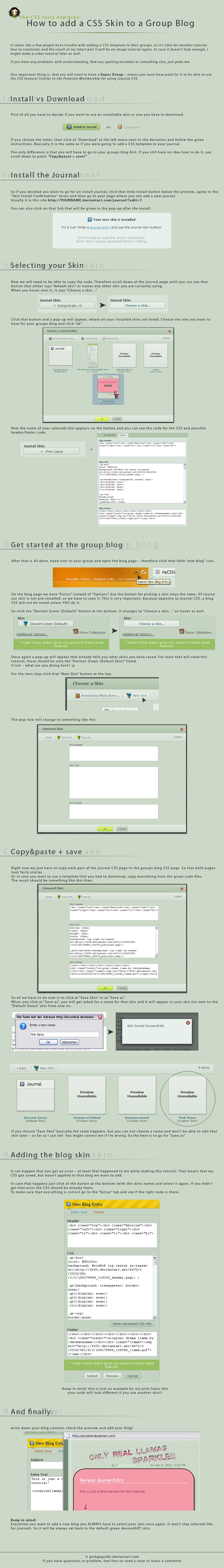
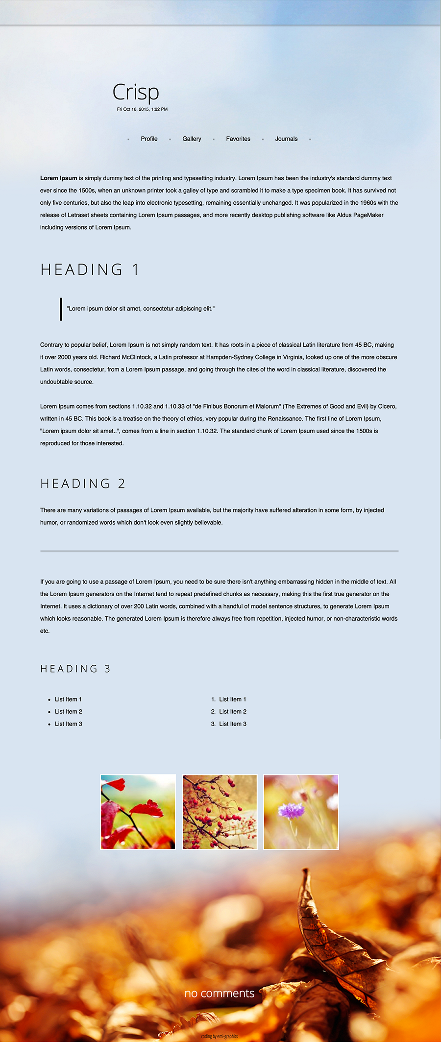
Custom Journal Skin forRequested was a newspaper like skin for every day usage.
For the 'mobile' version the sidebars have been removed and replaced with a simple menu with the links of the right sidebar.
 Can be seen in action at the group.
---
Paper texture from subtlepatterns.com
Splatters by ro-stock
If you have any questions read my F.A.Q. or ask me.
Related content


Comments: 40

Mega late comment, but this is a gorgeous skin! I'm usually not a big fan of black and red because it usually makes the design too dark, but the design here is light and elegant. 
👍: 0 ⏩: 1

Thanks!
Usually I am not a fan of black and red either - imo they just don't work that well together, but this was really fun to work on.
👍: 0 ⏩: 0

Oooo, love this, the texturing is so sleek, and you made a mobile version!
👍: 0 ⏩: 1
The header made me do it! I was too lazy to figure out a solution for the sidebars for smaller resolutions. A mobile version seemed the more simple way of doing it. First time ever I did that.

👍: 0 ⏩: 1
I've never optimized anything for mobiles. But now, I own one, so maybe there is a reason to ;D
👍: 0 ⏩: 1
I know how to do it, but it always seems to be so much effort. As a person who doesn't use her phone to browse the internet, I always ignored anything mobile so far. Sooner or later you have to face it though.
👍: 0 ⏩: 1
And with screens being so much bigger, surfing dA does not seem like such an appalling idea.

👍: 0 ⏩: 1

Everything about this looks so neat and fits the group and theme so well, I think
Well done


👍: 0 ⏩: 1
That's nice to hear, thank you!

👍: 0 ⏩: 0


 (Smile)")


This looks nice. The background pattern especially, though simple, gives it an aged look. However, the blood spatter around "the words are the spark" could have done, in my opinion, being more sparse where the big splotches are concerned; maybe weighed them to one sight, leaving out either the ones on the right or those on the left in order to emphasise the message as opposed to diverting the attention from the message. The banners are nicely done, however, a texture would have gone a long way here. All in all they are a good addition as the header might have looked too empty. There is a thing as too much white space.
Kudos on the mobile!
👍: 0 ⏩: 2
Thanks.
Saw you already got an answer to most of this. Regarding the banners: my first draft was with a texture, but imo it didn't work that nicely. Except for the background there is no other texture used on that skin and without the banners match the headlines more. And it was done with CSS only, with a textured background it would have required to use images for the bottom parts as well. Tried to avoid images whenever possible.
👍: 0 ⏩: 1
I see. If you already tried, then I assume your final result is what you saw works best, and that's really all anyone can do. Also, to underline it, I do think it is a quite beautiful skin and nicely done in terms of coding.
👍: 0 ⏩: 1
I think sometimes it is also a 'mood-thing'. One day you think it looks ok, the next one you don't like it anymore.
Thanks again, nice to hear!

👍: 0 ⏩: 1
I like to think of it as detaching oneself from one's own work. The longer you let something sit without giving it another thought, the more "alien" it will look, as if someone else had created it. In my experience, the distance helps to make important choices. Also, you grow with every piece of work you do, so naturally yesterday's work doesn't look as good as today's. Oh, and the mood thing. That too. ")
👍: 0 ⏩: 1
Yeah, when I am really unsure about things I put the project aside for a few hours/days. Always the best you can do, when you don't know who to finish something or feel stuck with your design.
Aww
👍: 0 ⏩: 0


As for the banners, I dunno. On theWrittenRevolution 's front page the banner does have a texture, but we felt like we wanted a simple looking skin and too much texture ruins that.
👍: 0 ⏩: 1
Ah, I see.
Not an intricate texture, mind you. A design should not take away focus from the text if the design is not meant to be the focus. Just strikes me as a bit off-balance - two solid color chunks on textured background, flanking the texture-heaviest part of the skin. In any case, I don't mean to offend. Just things I caught when looking at it.
👍: 0 ⏩: 1
(: no offense taken at all!
What kind of texture would you give the banners, if it were up to you?
👍: 0 ⏩: 1
None. Further up ginkgo explained the lack of texture and I find myself agreeing. If she tried and found it lacking, she, as the creator, will have known best, is what I think.
👍: 0 ⏩: 1


Officially my first tag.
")
👍: 0 ⏩: 1

👍: 0 ⏩: 1
I forgot to do it D:
👍: 0 ⏩: 1
Can I just insert it at the skin footer, before the last ?
👍: 0 ⏩: 1
That will look weird. I just tried it with this code:
.credit {
bottom: -50px;
font-size: 10px;
position: absolute;
right: 0;}
You could play around with the bottom and right value to move it around (in case you like it at a different position).
And for the HTML
👍: 0 ⏩: 1