HOME | DD
 GinoDrone — Superman Redesign 3

Published: 2010-12-19 18:29:26 +0000 UTC; Views: 15898; Favourites: 188; Downloads: 705
Redirect to original
Description
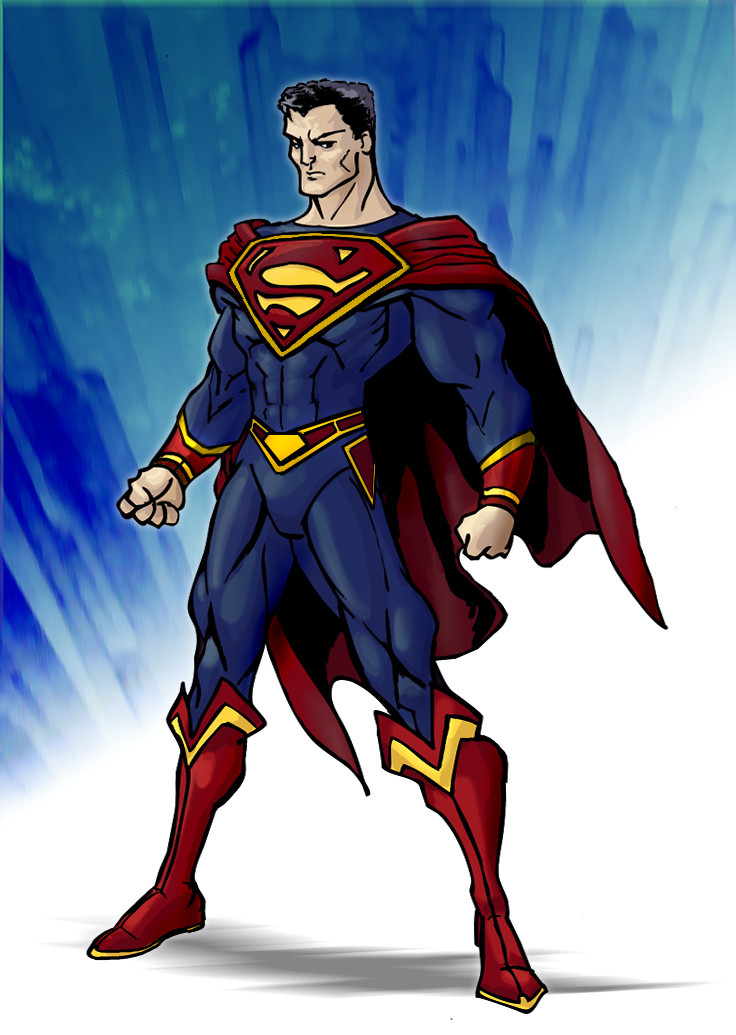
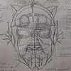
Here's a comicbooky version of the suit.... I tried to go for a more regal look, with a navy blue and gold piping.Related content


Comments: 14

I like this its way better than what superman is wearing now he basically looks like pre new 52 superboy
👍: 0 ⏩: 1

thanks! I have a few more ideas i want to try.
👍: 0 ⏩: 0


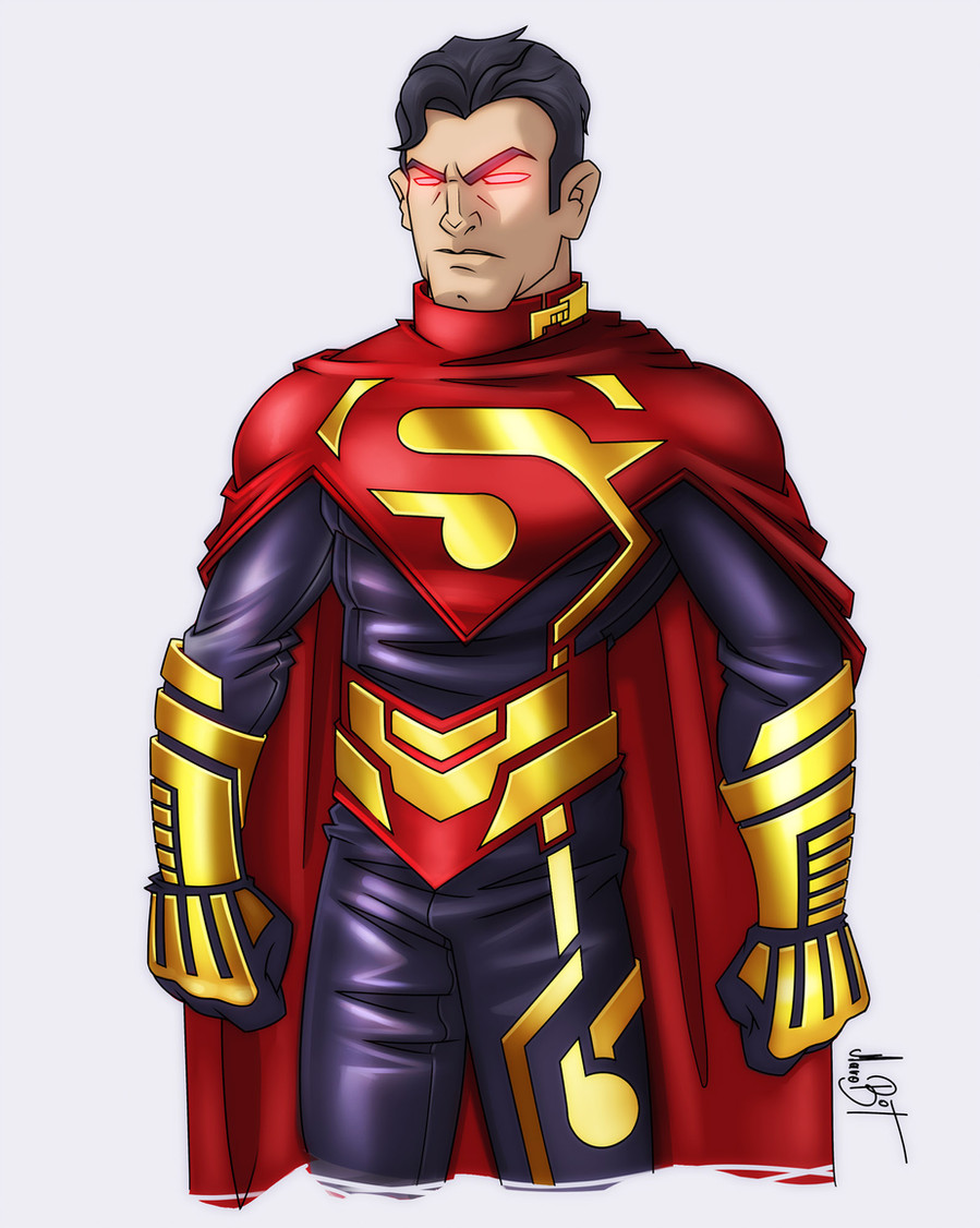
This is a scarier kryptonian, someone who is tired of waiting for humanity to mature -- well done!
👍: 0 ⏩: 1

well that's the thing... It sort of reminds me of the character in general...almost like this is an alternate design for him rather than supes... it just seems like it would fit hyperions character better.
👍: 0 ⏩: 1
I don't really agree, but that's cool.
I think Supes and every hero with speedos on the outside of their uniform needs a revamp.
This design polarizes people, either they really love it or they hate it.
IMO I think it sticks pretty close to the original just adding pants and hyper designed pockets on the side while darkening both the red and blue.
The yellow piping is there to breakup the dark colors that would become neutral in low light.
I dunno it just made sense to me.
People get attached to the original designs, It's a hard thing to redo something that's burned into people's skulls. I guess thta's what makes it fun for me.
👍: 0 ⏩: 2

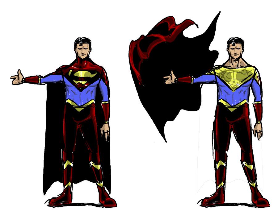
in my opinion trunks only work if you have enough of the same color on the top of the body to offset them and balance the amount of color, it is why batman can pull off trunks, because of his mask balancing the the large block of black that are his trunks.
👍: 0 ⏩: 0
Oh I agree on the perspective. I mean you can check out my supes redesign too. Its the most recent thing on my gallery actually.
I think it's just something about the cape position and gold piping that strike me more as a hyperion look. They look sort of like hey were inspired from a portrayal of a greco roman deity... and thats kind of something that makes me think of hyperion. More of the above humanity outlook... clark strikes me as a combo of alien and humble farmboy, despite being essentially perfect.
👍: 0 ⏩: 1
Yeah I wanted to make him more "godlike"...
I checked your design out. Great from the waist up!
👍: 0 ⏩: 1
Yeah "godlike just strikes me as more of a hyperion thing... but Ive honestly not read superman since like the mid 90's
👍: 0 ⏩: 0