HOME | DD
 Gogs87 — Happy Swordfish

Published: 2014-04-15 19:10:13 +0000 UTC; Views: 322; Favourites: 22; Downloads: 0
Redirect to original
Related content


Comments: 9

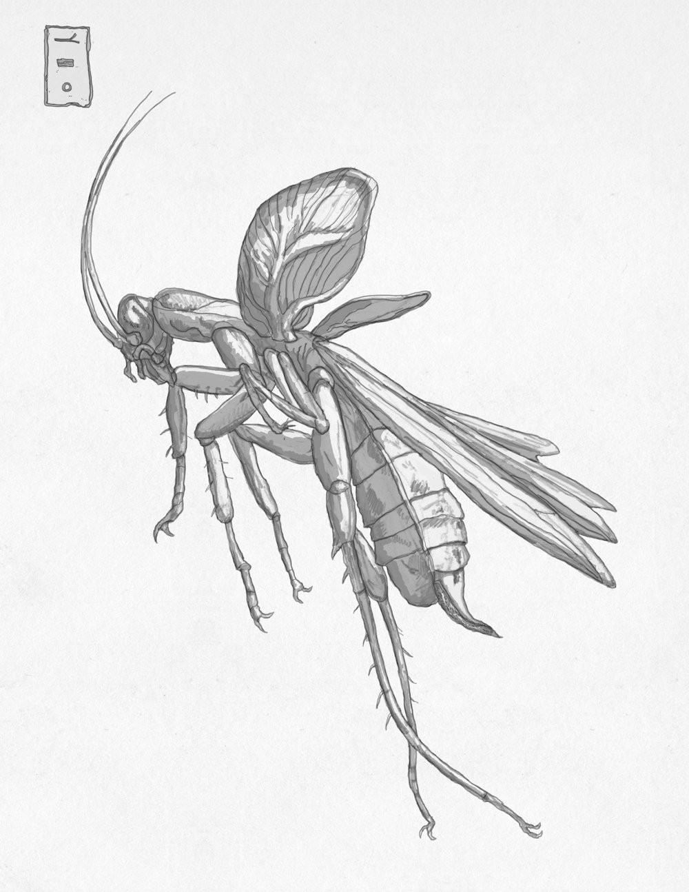
Very nicely handled. Looks like an old Japanese Silk painting or print.
Brush inked outlines?
👍: 0 ⏩: 1

I love these comments and thank you for that. I work exclusively with HB pencil but different constraint. Drawings look so due to lighting and strong contrasts, because I do not have a quality scanner so I have to take pictures.
👍: 0 ⏩: 1
I think the pictures are great - no problem with showing the work this way.
My one suggestion is to incorporate a softer graphite, or ink, or charcoal for cores, caves, outline weights and such - because the narrow range of HB on modeled forms can make them (the forms) look "mushy." By mushy I mean when tones blend instead of separate. The HB makes it difficult to separate them when that is your intention.
👍: 0 ⏩: 1
I fully agree with you, I'm still new at it (I always draw but I want to raise it to a higher level, although not that my drawings look like photographs, I wish it was just a nice drawing) and I appreciate this advice. I agree with you that the drawings were okay but definitely need to work on shading and more.
Thank you for your constructive advice, I appreciate
Sorry for my bad english.
 (Wink)")
👍: 0 ⏩: 1
You're English is PERFECT, my friend.
I was not aware that this is new to you. This is surprising. In that case I will venture one more piece of advise.
Since your line work is very good, already, it would be to your benefit to work on shading, yes? But in this way, particularly - do exercises in drawing that emphasize contrast. Do this by spotting, by indicating features with spot shadows, only, no tones or lines . . . just spots. Some call the effect "orthographic lighting."
The key to contrast is to think in terms of separating. This differs from drawing in tone, where the key is to think in terms of blending.
Blending on one hand; separating on the other. Develop ways to do this with facility. Ink wash and dry brush is a good way to practice blending (low contrast). Straight from the bottle, undiluted, is the best way to practice separating (high contrast).
👍: 0 ⏩: 1
Thank you for the excellent and useful advice, this will definitely help me to improve my drawings
 (Smile)")
👍: 0 ⏩: 1
No problem. I'm happy to help. (And I can't keep my big mouth shut! haha.)
So many artist's in Croatia. , who has just left for 8 months to work on a cruise ship, , putting the drawing on hold while he prepares for his license test for teaching art, and who has temporarily abandoned his artwork to chase some girl - he may even be getting married! And now you, whom it has been my honor to meet!
👍: 0 ⏩: 1
Haha, I love it when someone talks a lot but only when he knows he's talking about, and you certainly know. We really have a talented Croatian artists and thank you for giving me pointed to some of them.
👍: 0 ⏩: 1
