HOME | DD
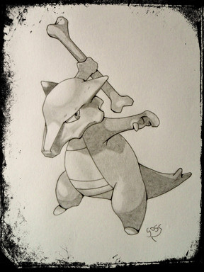
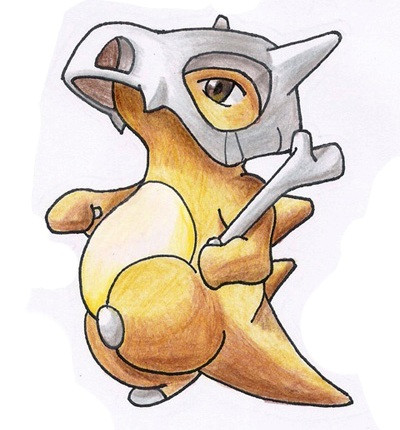
 Gogs87 — Sunny Lizard

Published: 2014-06-27 05:40:37 +0000 UTC; Views: 389; Favourites: 20; Downloads: 0
Redirect to original
Related content
Comments: 9

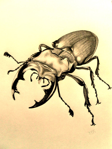
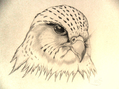
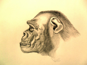
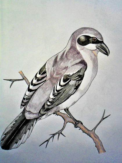
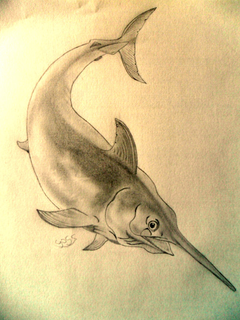
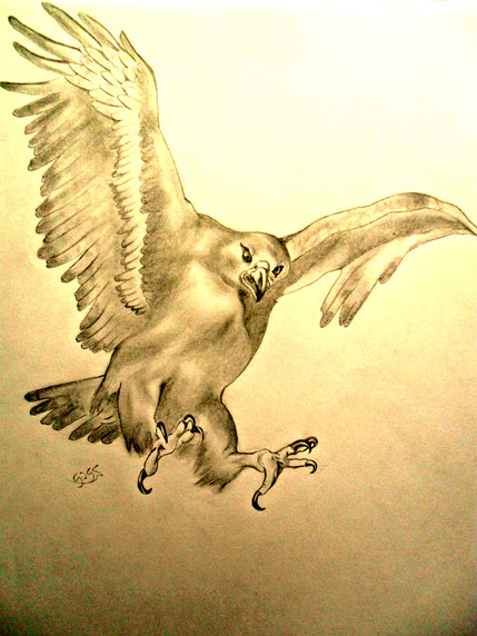
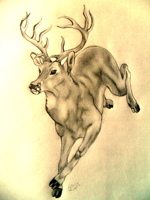
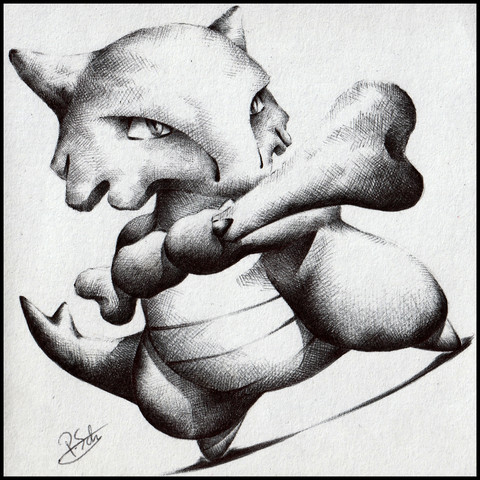
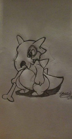
Tonal scheme is gray on gray, which makes for a weak impression. Use black and white for emphatic contrasts to 1) frame the center of interest, 2) mark areas of interest, and 3) lead the eye through the composition.
Consider schemes as: white on black, black on white, gray and black on white, gray and white on black, and black and white on gray.
Consider expanding the tonal range of your media (H-B) and using ink for emphasis.
Consider using a toothier paper
Consider eliminating the use of blending techniques with stomps, torts, tissue or finger.
Finally, dwell on the meaning of line, tone and spot. Don't use one if another will better serve a purpose. (Here the lines of the lizard create a flat (2D) shape on the paper. A 3D representation is better served by broken outline using tone and spot and complete breaks in the line.)
👍: 0 ⏩: 1

This is another old picture, but I'm working currently on a drawing with which I am quite happy where I apply exactly what you just mentioned. Of course it's not perfect since it will be my first drawing in such a way, but I think you will see a big difference compared to this date. I agree that these pictures all turns out somehow to one ton. This is partly due to the fact that I used only HB pencil. Now I use 2H, HB, 4B and tech pencil.Thanks!
👍: 0 ⏩: 1

Thank you so much, you've made my day with your beautiful comment
👍: 0 ⏩: 0
