HOME | DD
 gppr — Elf

#elf #darkhair #portrait
Published: 2008-11-23 16:57:34 +0000 UTC; Views: 2985; Favourites: 87; Downloads: 0
Redirect to original
Description
...Related content


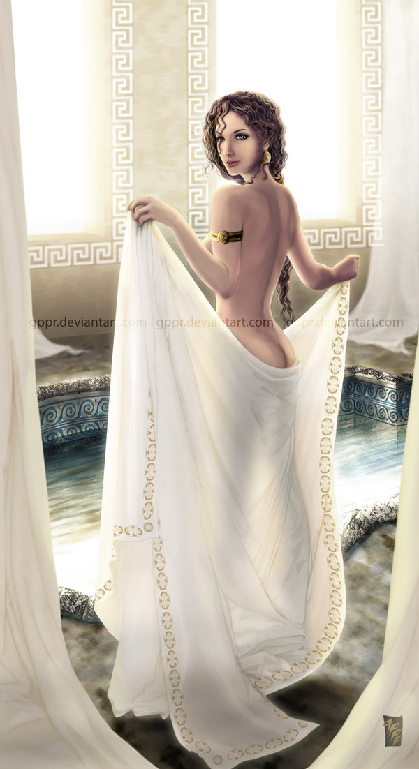


Comments: 84

2 hrs. I'd say. I'm slow... ")
Yes, you should totally try it! It's much fun.
👍: 0 ⏩: 1


Ooh, very nice! I think it looks great. I don't notice much unevenness beyond what would be expected from the shadows, and the shadows look fine.
The features look good to me. I think he would look good if the bridge of his nose was a bit sharper and didn't jut from his face so much, but that's purely a personal preference. I love those tattoos.
The only thing I can even remotely see is that his skin could use some detail and texturing. It kinda looks airbrushed right now.
👍: 0 ⏩: 1
Thank you very much for your great input. It seems there's an agreement regarding the nose. I will work on that. I'm a little uncertain as if it's just the upper part of the bridge (close to the eyebrows) or the whole length of it?
I agree with you that the skin should have more pores, as well.
👍: 0 ⏩: 1
I think it's mostly just the upper portion that needs work.
👍: 0 ⏩: 0

I only have a few criticisms: firstly, the nose needs more definition because the face looks a bit flat. Second, the hair needs more shape, because at this point it looks like an array of different-colored individual strands. It is good to add that kind of detail, but don't overdo it. Other than that - FABULOUS!

👍: 0 ⏩: 1
Thank you very much for your feedback. About the definition, do you think that emphasizing an outline for the nose would be enough? (No lines, but more contrast between the tones so that there is a visual division?) Or is the shape wrong?
I will work on adding more volume to the hair. I see what you mean about the strands.
👍: 0 ⏩: 1
That would definately work. Make it seem more 3-d. The shape isn't wrong at all.
👍: 0 ⏩: 0

Wow, this is amazing! ")
My favourite part of this piece is the eyes. Unimaginably well done. Not only are they beautiful and glowing with intriguing colour and light, but you've managed to give them life — there seems to be an intense gaze. I can't put my finger on the emotion, but it's there, believe me. 
The tones look really good, especially with how you've made them look like they're part of the face, by matching the shape and interacting with the shadows in an interesting manner. Before I fullviewed, I thought you were missing the one on my bottom right, but nope, it's there. Really cool lighting.
The shadows are very cool, and really give the character of dark and dangerous, especially because of the darkness surrounding the light. The hair looks good, too, but the strands of hair that go against the rest on my left look kind of strange. I think you should move them to fit with the contours of the face.
shadows
hair

👍: 0 ⏩: 1
Thank you very much for the detailed feedback! I will work to correct the things you have pointed out.

👍: 0 ⏩: 1

I think you did a really good job on this! I can tell you put a lot of effort into the details the little textures and the like.
That said, there are things to improve. Aren't there always?
The first thing I noticed is that it feels just a little bit flat! Particularly around the brow area and especially the nose. Fixing the "bridge" of the nose so that it rounds out more so than goes flat would help, I think.
Next, I think the hair needs a bit more volume. You have it resting almost immediately next to the top of the skull. I think it's shaped correctly, but it shouldn't follow the outline perfectly. I would also work on the hair line just a little bit. Putting definition into those areas can really add an aspect of realism. ^^
The only other thing that's kind of bugging me is just the ear. It feels too tiny, particularly for an "elf" type of character. I think it'd look better if you made it a little bit and also maybe raised it up just a bit.
Good luck and great job with the speed painting! I could never do something like that. XD
👍: 0 ⏩: 2
Thank you for your feedback! Someone else (outside DA) mentioned the bridge of his nose being flat. Do I need to "sink" it around the eyebrows area? Is that what you mean? Or do you mean the whole upper part of the bridge, making it curved? Should the tip of the nose stay where it is? I will add more hair and correct how it comes out of the skull, thank you for pointing this out to me as well as for the suggestion regarding the ear.
👍: 0 ⏩: 1
No worries at all
What I meant by the brow area is that the upper bridge of the nose is a bit wide (and it looks flat). This then affects the rest of the forehead.
I think you could fix it by adding more shadows right along the bridge between the eyes and also "poofing" the ridge just above the eyebrows out a bit.
[link]
Random image of Ewan McGregor that google search turned up XD ... anyhow, see if you can't get the ridge to be just a smidge more pronounced than it is and I think that'll solve the problem.  (Smile)")
The eyes are sunken in enough.. I don't think that's the problem.
👍: 0 ⏩: 1
Thank you so much for clarifying this for me. The example is perfect. I think I see what you mean now.
👍: 0 ⏩: 1
Yay
👍: 0 ⏩: 0
Edit grammar:
" more rather than going flat "
"a little bit bigger"
XD
👍: 0 ⏩: 0

It looks great. I'f just add some more flow to hair and darken the shadows on the face. Good work.
👍: 0 ⏩: 1
Thank you very much for your feedback!
👍: 0 ⏩: 0

ok first of i think ur wrong saying its not perfect cause it is^^ its gorgiouse n who ever its modeled after if way hot lol. but i love the lighting on his face n in a way it reminds me of watching from afar as if hes n love with someone but knows there love could never be so he just gazes from afar secretly admireing her n watcheing over her. he would be a fantasic charcter fr a story.^^ anyways very much so love this peice of art.
👍: 0 ⏩: 1
Thank you very much for the kind comment and for adding this to your faves!
👍: 0 ⏩: 0

Ahhh, G is back and with a picture!!! Missed your art so much
Really like how this guy looks, so interesting and unusual! Just like you've said, elfish and at the same time dangerous.. very interesting character
Is there any story behind him?
 (Wink)")
👍: 0 ⏩: 1
Thank you, muchly, Sim.
No story, really, just came out from my wild imagination. I think he looks a little aboriginal, because I've been looking at a few aboriginal-themed things lately; and a little elfish, well, because elvish things are always on my mind... heehee.
👍: 0 ⏩: 1
Wooo
Like in your example
👍: 0 ⏩: 0

Really cool looking. I see what InFlaamess says, I think you might remedy it by adding a bid of darker color to where the cheek dips into the nose. This will make the higher part of the cheek stand out more than the rest and will make the nose pop out. Great highlight on the nose.
👍: 0 ⏩: 1
Thank you very much for your advice, Adena.
👍: 0 ⏩: 0

very nice for a speed painting, but like they say, practice makes perfect, so keep up the good work
👍: 0 ⏩: 1

It seems to me that the face is flat. Nose has a light from ,even if the light falls from right
keep practise
👍: 0 ⏩: 1
Thank for your feedback, InFlaamess! And I most certainly will keep practicing.
👍: 0 ⏩: 0

<= Prev |