HOME | DD
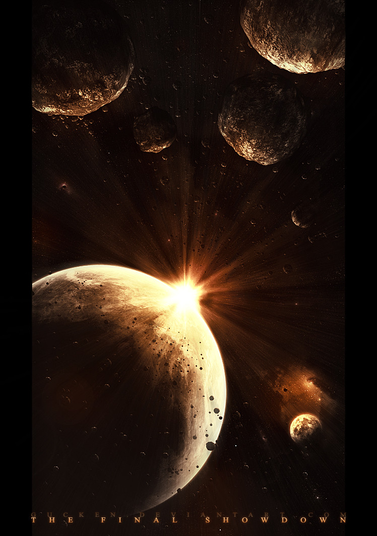
 gucken — The Final Showdown
Published: 2006-12-09 19:10:29 +0000 UTC; Views: 27202; Favourites: 384; Downloads: 702
Redirect to original
Description
 Follow me!
[link]
[link]
_____________________________________
EDIT: 9/14/07
This deviation will be soon one year old.

I like this piece a lot somehow, and so Ive decided to clean it up and retouch it.
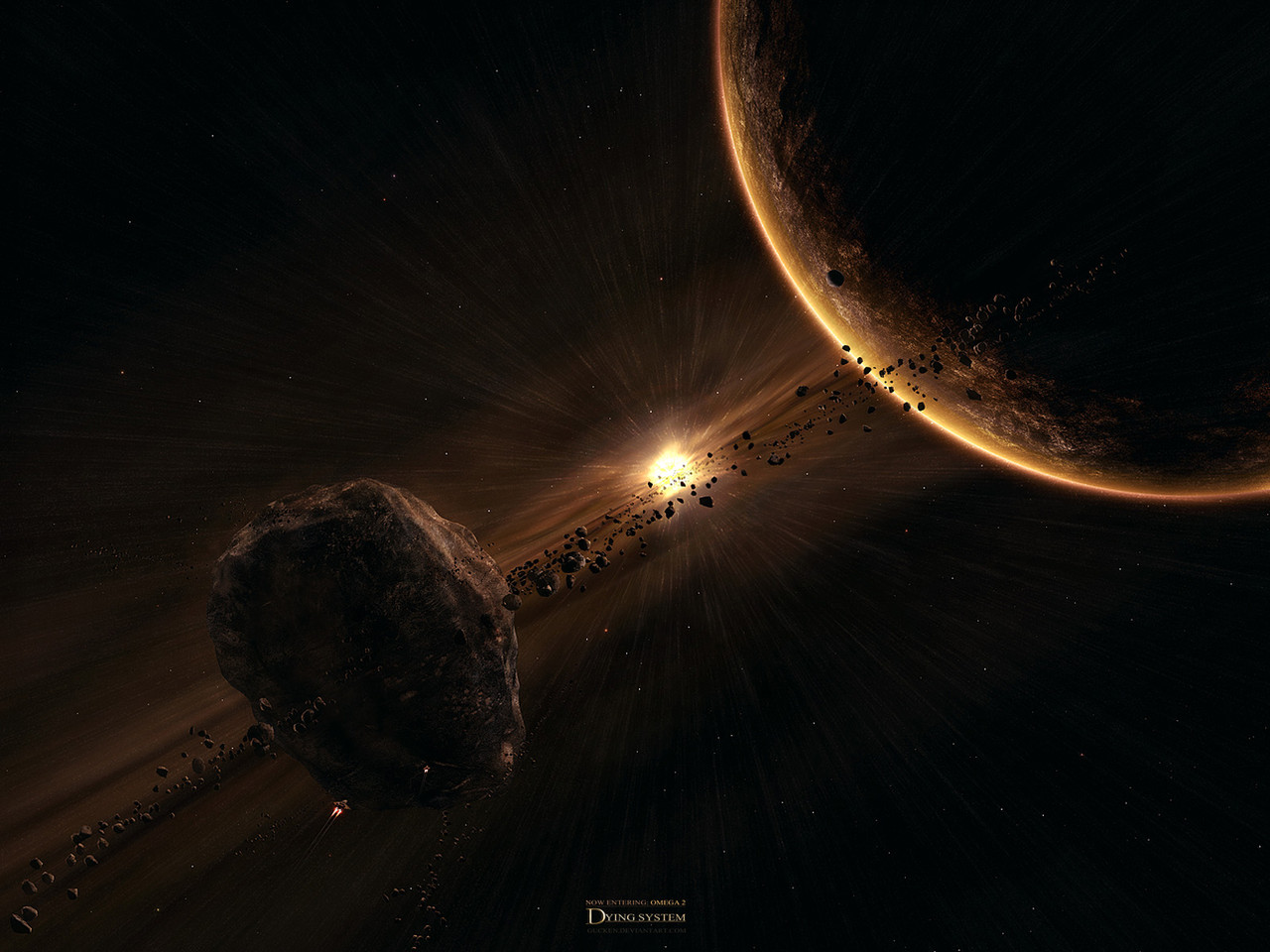
Older version looked like this: [link]
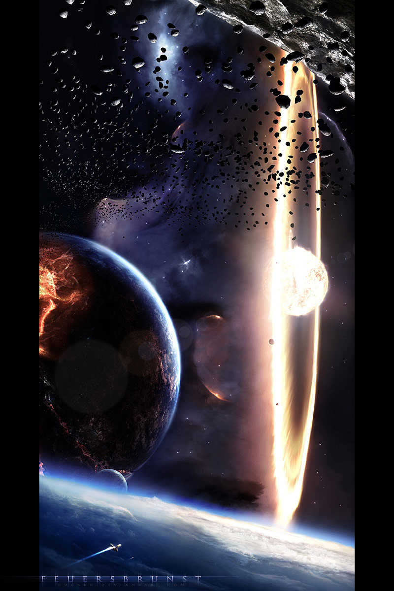
So this is again a simple piece for asteroid-, ring- and suntraining
and it's always the same:
3ds-max for asteroids
photoshop for the rest
time taken: about 10 hours
thanks for the visit and the feedback in advance

 (Smile)")
Related content


Comments: 242

I like to see more orange in space pictures. Most of the time people stick to blues, reds, and yellows. Nice job.
👍: 0 ⏩: 1

das sieht echt super aus!
leider geht der link zu der vorherigen version nicht mehr
")
👍: 0 ⏩: 1


...revamps are always a must no matter how expereinced one gets. Its just goes to show, that those that knew something "then", will also reupgrade and revamp an older image with what they are continually learning at the "now", and for me that's admirable and honorable in all aspects of this Genre of the Arts!
Fav'd!
👍: 0 ⏩: 1


Ah well, the main reason is that it now seems to be less of a scene. The visuals may seem smoother and help in the composition, but without all the other elements I find it to be a less original and interesting scene.
👍: 0 ⏩: 0


wow, i've had this picture since i began DEVart, i didn't realise it was so old
👍: 0 ⏩: 1


👍: 0 ⏩: 1


those rings sucked xD they weren't really in perspective and they were too pixelated
👍: 0 ⏩: 1

That's why I loved them ")
👍: 0 ⏩: 1


")
 (Wink)")
-Phil
👍: 0 ⏩: 1


the perspective kind of feels like I'm looking out of a speeding spaceship
👍: 0 ⏩: 1


still soo good! could you tell me how you did the ray's? I can't get them right after hundreds of tries :S
👍: 0 ⏩: 1
oh its not that hard.. first of all you need a thin white cross.
radial blur it in a circle
duplicate several times and set all your blurred cross layers to color dodge
👍: 0 ⏩: 1
| Next =>