HOME | DD
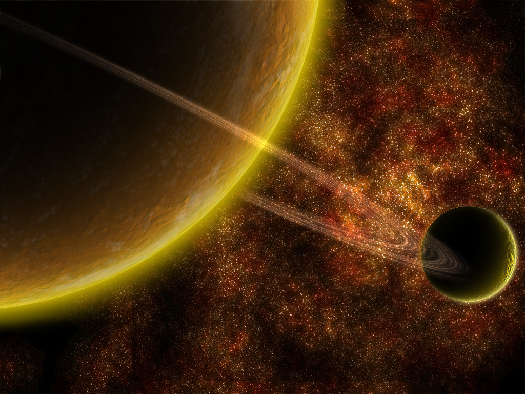
 vissroid — Red Planet

Published: 2004-08-09 22:52:16 +0000 UTC; Views: 2921; Favourites: 42; Downloads: 442
Redirect to original
Description
Well now...this is quite the mix...lolDid this with Terragen, 3D s Max 5, and PhotoShop 7...
Just havin fun...
Hope ya likes
Related content


Comments: 78

ThanX...I forgot about this one...lmao
👍: 0 ⏩: 1

You sure do have a great range.
I'll come back for a better look soon.

👍: 0 ⏩: 0

wouah...
very cool piece...
your planets are just awesome!!!
keep up!!
👍: 0 ⏩: 1

These space-views are truly amazing! Just love them, this one in particular is really beautiful! Good work indeed!
👍: 0 ⏩: 1

Wow...this is just plain awesome...I love the way you set this out I must fav this ^^
👍: 0 ⏩: 1

Awesome! I love how the asteroids are so sharp and black while everything else has this sort of soft hazy glow. I like your color choices a lot too.
👍: 0 ⏩: 1
ThanX that was kinda the idea
👍: 0 ⏩: 0

Dude i think it must be glowyness of it all which makes my brain scream at the fav button, its stunning
👍: 0 ⏩: 1


Wow, amazing, seeing such a beautiy gives me a glimpse, on how much more I need to learn.
👍: 0 ⏩: 1
No worries you'll get there...and Im still learning alot too
ThanX
👍: 0 ⏩: 0

Looks freaking awesome again m8 (Wink)")
👍: 0 ⏩: 1

WTF HELL!!! @__________@
GRRRRRRRRRRRRRRRRRRR
I HATE YOU MAN!!! >______<
(just kidding... T_____T)
THAT'S AWESOME!!!


👍: 0 ⏩: 1

This is a great view. A stunning quality. you can feel the severe heat of the planet you stand on as well as see it through the odd formations of the clouds and the exposure of the lighting.
I will agree with evanescent-void on the problematic points in the piece but you recognize them so there isn't much quam with me.
I have two things I'd like to say though... First to resize this image about 25 - 50% smaller would "push" a lot of detail in the larger planet's surface. Right now at full view it looks strained and a tad on the pixelated side.
Second... I'm not one to push off personal thoughts about peoples work because I know how much of ourselves we put into what we do. However, I am greatly curious as too how this piece would look without the larger planet in the composition at all. The smaller moon in the background has superb surface detail, and I think the overall lighting and feel would actually be magnified with a much more open starfield. If not completely gone form the scene, perhaps a smaller resize of the large planet. I feel a great realism may exist in the compositional soundness in this thought. Let me stress. I am in no way trying to push a personal opinion off as something that would make the piece better (I get comments like that a lot so the last thing I want to do is give one myself.), but I do have a curiosity about the look and feel of the image without the larger planet.
One again. A very nicely done perspective.
-absolute halo-
👍: 0 ⏩: 1
Lmao!...dangit!!!
I just deleted the psd file...son of a--!!!
I actually see what you mean and it prob' look better too...nuts...Well I'll save my psd's longer here on out...lol
I think I will shrink it down a bit though
👍: 0 ⏩: 1
Hmm... if you have a burner why not archive the .psd's to cd or dvd? I do that... because i tend to want to go back and do new things with old work. It helps haveing all the pieces instead of final flattened images.
-absolute halo-
👍: 0 ⏩: 1
lol...no worries I have alot of old ones in my comp...that just happened to be one of the ones I got rit of by mistake...lol
Its been risized too by the way
👍: 0 ⏩: 1
Yeah. I just took a look at it. I think it pops the surface texture of the larger planet out more. Looks even better than before in my opinion. scale and detail are important. I usually build planets anywhere from 3000 x 3000 to 6000 x 6000 so I can resize them smaller in the final composition and still have a very large planet. Kudos to you for your work .
-absolute halo-
👍: 0 ⏩: 1

Very spectacular image my friend! Beautiful red hot atmosphere and clouds... awesome asteroids also but I have to complain about the patches of streched blurry landscape and clouds on the main top left planet... maybe reducing the size of it or of the overall picture may help out. Otherwise a fantastic job!
")
👍: 0 ⏩: 2
no probs... oh and i love ur signature... it's the funniest! Cracked me up when i read it! lol
👍: 0 ⏩: 0

The texture on the large planet seems too consistent when it changes from land to cloud. It looks like there was only one bump map used for the cloud/land, try to separate the two. Also the deepness of the texture on some of the clouds make it look too solid, try to soften them up a bit next time. The planet in the background has too much contrast, judging by its size it's should be a good ways from the larger one, so the same level of detail shouldn't be as visible as it is, which is brought out by the clouds (which, in turn needs a shallower bump map, because the existing one is making them look solid).
Oh, and change the color of the star clusters to the right, because the only colors 'we' see, in terms of stars, are red, yellow, white, and blue (and various shades of those colors). There are violet and green stars, and it wouldn't be scientifically incorrect if you used them for sake of realism in the terms that there is something else looking at those stars, but all in all it doesn't go well with the piece, and would be better off closer to the colors used in the piece (then again, that's just personal preference on my part, because I lack the knowledge to argue about color theory). Color is a key point when it comes to the mood of a piece, and in this case there are too extremes (which isn't bad, but in this case was executed wrong).
There is also a part in the background on the terrain where a cloud abruptly ends, like it was cut out.
All in all it's a great piece, just those little things need to be looked at  (Smile)")
👍: 0 ⏩: 1
thanX...the clouds are on a different bumpmap and I just tossed the moon in there thats all...I was just messin around...actually this wasnt spossed to go up on here cuz I was just practicing somethings but came out nice enough that I decided to show people...so if I was goin to make this like normally I do at makin sure it was for here on DA it prob wouldny have those lil mess ups
ThanX...ya gots good eyes...ya just bout pointed out all the mess ups I did...and then some of the ones I tried fixin up...lol like the cloud deal next to the land...heh...it was black there and I didnt notice it till after the render was done over night...lol
ThanX agian
👍: 0 ⏩: 0

mmh great composition, but i think your planets are a bit too bright. Also your asteroids.. some appear to have light coming at them from below.. where does it come from?
But overall.. great impression.. great colorchoice.
👍: 0 ⏩: 1
ThanX
The light hittin the asteroids are from three places...The red planet...the moon that the view is on...and the sun thats off screen...hope that helps
👍: 0 ⏩: 1
yup it does .. thanks. Did you make the planet less bright? I seem to remember them more brightly.. probably not.. i should just go to sleep!!
👍: 0 ⏩: 1
aah.. 
👍: 0 ⏩: 1
grumble.. easy for you to laugh..
👍: 0 ⏩: 1
well then...for that...
HAHAHAHAHAHAHAHAHAHAHAHAHAHAAAAA!!!!!
Gasp! .::faints::.
👍: 0 ⏩: 1
*responding in very childish way* BIG ")
👍: 0 ⏩: 1


Your use of angle n shtuff in this is craaazy - just magnificent - with a cool terragen: that looks pretty sweet - with good clouds - and the atmosphere error (the flattening of the mountains at the back lighter than the sky) is effective. Your planet's amazingly good, extremely well textured and very real looking. I love the little ripples on it - I do however think that, although you got the clouds above the level of the terrain (on the planet I mean) so they look 3D ish - they're too flat. The rocks could have done with a bit more contrast to appear like they ARE where you've put them
Og.
👍: 0 ⏩: 1
yeah...ThanX
I was tweekin out on the land cloud deal with the terragen render also...but I wasnt about to wait a whole day to have another render...lol
Glad ya likes
👍: 0 ⏩: 0

brilliant work dude ... it looks absolute fantastic ...
👍: 0 ⏩: 1
| Next =>