HOME | DD
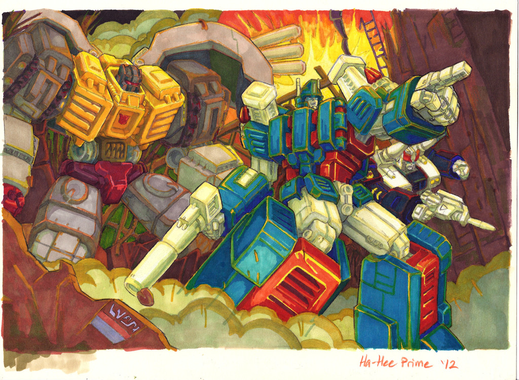
 Ha-HeePrime — 4 Years Later: Magnus and Co.
Published: 2012-09-12 17:33:33 +0000 UTC; Views: 1745; Favourites: 76; Downloads: 32
Redirect to original
Description
This took me forever.
And as usual, I'm still not happy with it, but it's time to call it done (for now.)
Ironic that DA just started a "Draw This Again" contest. I'll get it into that template so you can compare more easily.
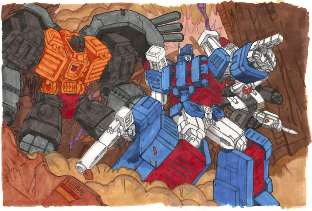
I wanted to recolor this specific picture because it was one of the very first ones I colored "seriously" and was able to post. (Old version here: [link] )
I put a lot of effort into it the first time, but it definitely deserves better. In fact, it deserves better than this here, but we'll see what I've learned after another 4 years, eh?
This, again, is [link] by under-the-radar Epic Art Practitioner You da man, bro.
Since I colored this last time:
--Got better markers -- thank you, ~WiEGoP
--Learned how to mix 'n' mingle and layer the colors to get [closer to] what I want
--Learned to use colored pencils on top to [fix mistakes], bump highlights, and add "juicy bits"
--Learned to let background and/or light colors reflect strongly on shiny robots
--Learned to keep working on things, not give up, keep hammerin' till I'm satisfied. (Oh yeah)
--Learned the power of the Neon Undercoat of terrifying acid trippiness. Mud is all too easy to make; saturation is tougher.
Things I still need to learn:
--Managing contrast. The more complex I make my colors, the more contrast I lose, it seems.
--Black. Dang it, I figured it out once, then forgot it, apparently. (Both times on Prowl, ironically) Black is HARD!!!!!
--Not losing sharpness through too much color layering.
Here's to another 4 years of making art! I hope I never stop learning.
Related content


Comments: 12

can't believe i ever missed this in your gallery! this is amazing!!!
👍: 0 ⏩: 1

Thanks so much!!
I'm just grateful you let me color it. Over and over. 
... Keep on practicin'! It's all I can do!

👍: 0 ⏩: 0

I like how Grimlock is huge, even compared to Ultra
👍: 0 ⏩: 0

this is really freakin awesome ^^ and never stop learning it's fun
👍: 0 ⏩: 1
Thanks so much, Koen. Your encouragement means a lot. Best of luck to you as well.
👍: 0 ⏩: 1
thx, hope you like the new devastator too ^^
👍: 0 ⏩: 0

8D
There is such a difference! The new version has SO much more depth, particularly noticed when comparing the Grimlocks!
Also the new background gives a fantastic feeling of movement, that is, actively occurring fire, explosions, etc. And the appropriately-colored highlighting on the mechs reflecting that adds alot to the feeling of being immersed in the scene. I want to do whatever Magnus says O__O
One thing that seems odd is Magnus' forward leg, the one that is closest to the viewer. I'm not sure why this is, but it does not seem quite to stand out as much as it should. And, actually, that is the case with the old version too, so I wonder if it is not a feature of the lineart...hmm...maybe since that leg is partially covered by smoke while the further-away leg is fully exposed. Yes, I think that might be the reason.
EXCELLENT JOB
")
👍: 0 ⏩: 1
Huh. I think there is some scanner issue here. Because in the real one, I joked that it was "A picture of Magnus's knee, with incidental robots." I think my values have gotten mashed a little. Will have to see what I can do about that... perhaps a new scan. Though the scans always end up off. *ponders*
Thanks for the good thoughts, though. I'm really glad you give me crits. (That's why you're the Trusted SIC, after all!)
Post those sketches you made on the trip. POOOOOOOOOOST THEMMMMMMMM!!!!!!!

👍: 0 ⏩: 1
LOL! A picture of Magnus's knee with incidental robots XDDDD
I can totally believe that the scanner ate the colors. Last time scanned something I had major color issues ")
Oh right...those sketches XD *cough* will do, sir.
👍: 0 ⏩: 0

Wow...a lot of difference between the two. I always love how your colors are so rich and intense, and the light reflections.

👍: 0 ⏩: 0

gsflahujjikk
DEM COLOURS
's lines are so delicate the entire thing looks like watercolours, which makes the different hues really "pop" against each other without the Black Line of the Edge interrupting them
I saw that template too and I'm tempted to try it just for shiggles - I wonder what the BEFORE of this looked like?


👍: 0 ⏩: 1
Like this:[link]
Thanks for all your encouragement, small human pal.
 (Smile)")

👍: 0 ⏩: 0