HOME | DD
 Harm-Less — Future Power

Published: 2008-02-14 07:38:30 +0000 UTC; Views: 6035; Favourites: 45; Downloads: 0
Redirect to original
Description
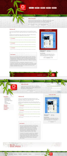
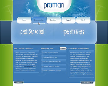
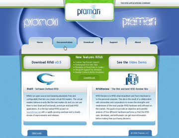
Hello everybody, well, it's been 4 months till my last deviation...I was busy all the time and lazy. But I'll upload more design coming weeks.This is a website for a company who are going to sell LED lights and accessoires. Thats why its soo....green


Its kind of my first real corporate template, so I hope you like it.
Logo needs to be replaced with a better one sometime.
Time:
10 Hours
The image of the lightbulb should be replaced by a LED light, but design needs approval first. I made that myself also btw, you can see it here a little bigger.
Edit:
Other logo
Related content
Comments: 44

ziet er zeker goed uit! 
👍: 0 ⏩: 1

Weet het niet precies waarom deze niet goed is...
Ik heb er namelijk 2 gemaakt, zet ik misschien ook wel op DA ooit (vindt het zelf niet al te goed gelukt)
Dit is de andere [link]
En die is gekozen...jammer maar helaas, want de groene vind ik veel mooier en ook beter gelukt qua content...
👍: 0 ⏩: 0

Jup, never came actually, been sitting here for 2 days now looking at this image, but still no sunset...don't understand it anymore....
Anyway, you are right I guess
👍: 0 ⏩: 1

LoL, you're funny
Anyway, I was referring to my wallpaper being used in the header
👍: 0 ⏩: 1

Oh now I understand...
I saw the wallpaper you made, I got it from Flickr. But I think its the same wallpaper.
But this design isn't approved, so none of it will be used.
👍: 0 ⏩: 0

the green is a little overwhelming. I think the top needs more sky, it feels oppressive to have the ground so close to the top, like some entrance is closing.
👍: 0 ⏩: 1

You're just jealous 
Well, you're the first who mentioned it. Client said it was a calm green and wasn't "overwhelming" or anything.
But the top area is big enough now, got to watch the image size when I'll export it to a working website.
But thanks for the concerns and criticism
👍: 0 ⏩: 0

Looks good mate, work on that "Future power" logo to make it better. Think about something, the text doesn't really look nice.
Good job on the details, really liking the navbar
👍: 0 ⏩: 1

Thanx, for the great criticism
Yeah, logo is just simple for now, will be updated soon.
👍: 0 ⏩: 0

Ziet dr goed uit.
De lamp zelf is ook mooi gedaan. Netjes! ^^
👍: 0 ⏩: 1

Dankje
Het was leuk om die lamp te ontwerpen
👍: 0 ⏩: 0

Yeah, about time huh
Well, more will follow soon, just a little lazy to upload something, I've 6 -7 designs done, so now you know where you will be waiting for
👍: 0 ⏩: 1

Dank je
But your designs also rock, got some good Dutch competition 
👍: 0 ⏩: 0

Don't curse
But thanks mate
👍: 0 ⏩: 0

Dank je, heb ik weer goed "gepeterd" (ander woord voor ontworpen) 
👍: 0 ⏩: 1

you write they want sell led lights and accessoires? but you use plants and green grass for the design. when they sell things you should show them on the design, too. I can't see that they sell lights with this design, you should change it a little bit.
👍: 0 ⏩: 1

Think about this, LED lights use less power, so, better for the environment and atmosphere. So the world will be "greener". Thats the idea.
But that you can't see they sell lights, is probably because you can't read Dutch. In the top-right info box is explained what the site does and what it sells.
I hope thats more explaining to you
👍: 0 ⏩: 1

I think that I can't read dutch is not the reason. You should use images in the design to show what they sell. Not only in the content, that's what I mean. Green is a good color and your idea is nice but I think it's not the right for a page with this topic.
👍: 0 ⏩: 1

What do you mean, there is a big-ass lightbulb in the header. Doesn't it become clear what they do then?
👍: 0 ⏩: 1

I know there is a lightbulb but I think the green isn't the right color for this maintopic. I think black with some lightbulbs are a better choice. But that's a personal opinion.
👍: 0 ⏩: 1

Most people would disagree with your statement I guess.
Because what color suites better in this case then green?
Its for a company who wants to spare the environment. And what the colors of nature, green.
But that's a personal opinion.
Thanks for the comment.
👍: 0 ⏩: 0


