HOME | DD
 hNsM — mynGee
Published: 2010-02-17 20:54:33 +0000 UTC; Views: 17419; Favourites: 81; Downloads: 381
Redirect to original
Description
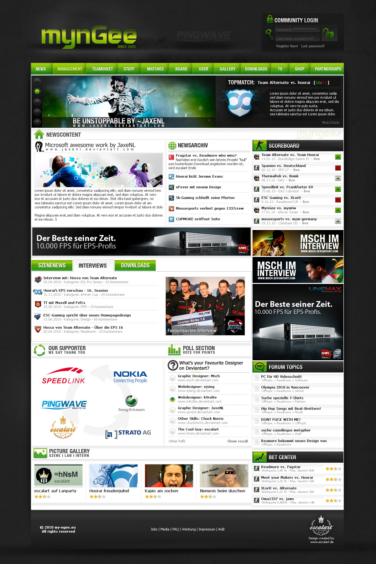
mynGee- New WebsitedesigneSport/Gaming Design
Logoupdate coming soon
Soon online@
[link]
Related content


Comments: 27

You did an AWESOME Work !
I would love to receive some resources from you !
I want to be Webmaster Webdesigner when I will be able to, so I want to learn a maximum !!
Please contact me.
Regards, Thomas24.
👍: 0 ⏩: 0

Your work have been featured in my blog [link]
Please take a look to see all the other fantastic artists that were features along with you.
👍: 0 ⏩: 0

Hey, richtig geile Arbeit!!!
Wie teuer is das und is es noch zu haben?
👍: 0 ⏩: 1


sieht schön sauber aus, so sollte eine page aussehen!
👍: 0 ⏩: 0

Der Login will mir nicht richtig gefallen.Ansonsten schockts!
👍: 0 ⏩: 0

Sorry Hannes, auch wenn das Design so gut ankommt, ich finde es irgendwie überhaupt nicht gut. Der Header ist ja garnichts, da hab ich schon viel bessere von dir gesehen. Dann z.B. das Topmatch, fehlt da nicht irgendwie ein bisschen 'Pepp'? Der Content sieht irgendwie super aus, auch mal was anderes, aber irgendwas stört mich noch mega daran.
Naja, wie gesagt, du bist keinesfalls ein schlechter Designer, nur dieses Design schmeist mich eben nicht vom Hocker.
👍: 0 ⏩: 0

 - :(")


great work, but i think that icons are too big. but if it wish of customer. they will be glad to u
👍: 0 ⏩: 0

 - :D")


Endlich mal nen Design wo der Content bissel Pepp hat  (Wink) - ;)")
👍: 0 ⏩: 0


Aus dem Topmatch hättest du mehr rausholen können
👍: 0 ⏩: 1


Sehr unübersichtlich, grundsätzlich dennoch sehr hübsch!
👍: 0 ⏩: 0

i don't know where i've to look ... advs are bigger then content ... i think that it's not ok ... i also think that you should spent more time on that project and do i better
👍: 0 ⏩: 0


Looks good! But why is the login and password area the other side around? I'd keep the login area on top and password area below the login area.
👍: 0 ⏩: 1


Der background ist der hammer  (Smile) - :)")
👍: 0 ⏩: 0