HOME | DD
 HotaruThodt — NeverRealms Promo
Published: 2010-05-28 03:28:19 +0000 UTC; Views: 2346; Favourites: 30; Downloads: 29
Redirect to original
Description
Media Used:Adobe PhotoShop CS3
Brushes:
Stock:
Tutorial:
"Slick Supernatural Text Effect Tutorial"
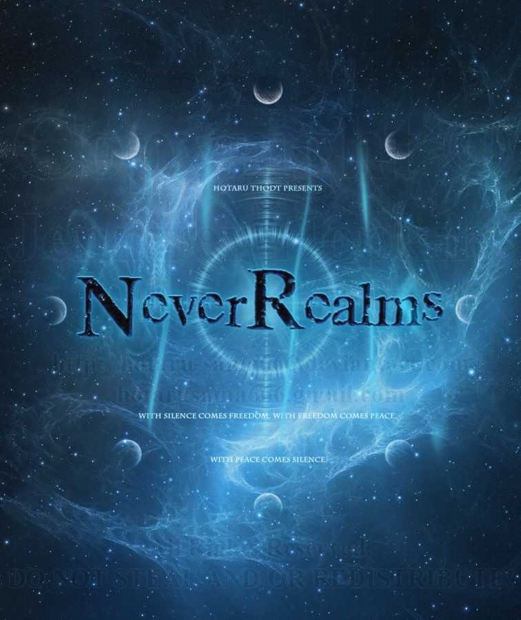
I think I finally have a working title for my various mythos thingers now, so after running it by ~AnarchicQ and showing her a prototype logo(she really liked it BTW), I decided to make a better, poster-sized logo to sort of "grab" people and get them interested.
The NeverRealms as they're called (meaning that they are "Realms that were Never meant to be," hence the title) are eight worlds/realms/dimensions (including my versions of Heaven, Hell, and Earth) with several pocket dimensions (I'm not sure if the Abyss is a full dimension or a pocket dimension since its sole purpose is to serve as a prison for the Chaos God Choronozon) with a dry, desolate, and deserted place called "Midian" serving as a sort of "Gateway" to each Realm...of course Midian is currently being controlled by Heaven (as of the turn of the century...1900-ish...something), preventing most inter-dimensional travel and forcing denizens of each Realm (with the exception of Eldra; Noctem's Realm) to take up teleportation or some form of space travel.
Other worlds exist outside of the NeverRealms, but most are separate save for those (such as *screamin-jazzy 's "City") that have connected with Hell and Hell-Earth (Earth is partially merged with Hell as of January 1st, 2000).
The tagline on my "Promo" comes from the song Illusion & Dream by Poets of the Fall. I found it fitting...although if I decide to sell this as a poster, the tagline will most likely be removed to avoid copyright infringment.
Playlist:
Poets of the Fall - Illusion & Dream
Dead Can Dance - The Host Of Seraphim
Dune OST/Toto - Trip To Arrakis
Dune OST/Toto - Paul Meets Chani
Dune OST/Toto - Take My Hand
"With silence comes peace. With peace comes freedom. With freedom.. comes silence."
NeverRealms Copyright © 2010-2013 Jennifer Hopkins/ Hotaru Thodt (=HotaruThodt --Mich!)
Related content


Comments: 57
 (Smile)")

Hey it's... don't know, my english vocabulary is lacking in words.... maybe the word I want to use is "astonishing"!!

👍: 0 ⏩: 1

Well, I'll take that as a compliment then. Thanks!
👍: 0 ⏩: 1
Yes it's a compliment!! You're welcome!

👍: 0 ⏩: 0

O.o pretty.....lol nice job on the use of blues and white.
👍: 0 ⏩: 1
Thank you so much. I really love using blues and whites when working. It's kind...calming.
👍: 0 ⏩: 1
it really is calming. blues mixed with greens and any turquoise colors remind me of they ocean.. and for some reason I find it very pretty and very calming.
👍: 0 ⏩: 1
Wow, thank you very much for the nice comment. 
👍: 0 ⏩: 1
yea, I used to work in a sports store and we shold Asics.... I can't remember what style they were but the color remined me of the ocean and scince then I've been attracted to blues and white as of course ocean colors. ^^
👍: 0 ⏩: 1
Oh, I've always been attracted to blue, and after I learned in one of my highschool classes that blue attracted the eye (hence why we were recommended to use a blue highlight pen rather than yellow), I learned why.
👍: 0 ⏩: 1
yea.. blues and reds. they attract they eye much more then those neon colors.
👍: 0 ⏩: 0


But...in space...in one can hear you SCREAM!!!

👍: 0 ⏩: 0

It looks like it'd be great for great for a hard cover book!!
Although one font style I think would fit would be one of these: [link] "angelic war"or "Bleeding cowboys"maybe...looks cool but..OR if you click on the next page on that current page I sent try clicking on the Celtic category and try out "Celt Caps Freehand", I found that one nice, but maybe perhaps make it look a bit faded and not so bold so it'll blend in.
BUT if you choose not to do anything with those, and try fading it a bit more with your current text.
Other than that, I'd so buy a book and would love a poster size picture of this to hang on my wall. ^_^
The background makes me want to read them so I can understand the background more cause it may have something to do with the book as well...(I has no idea what I is talking aboot)
👍: 0 ⏩: 1
Thanks, but as I told =JadineR , I chose "Crack Babies" as my font because it has sort of a "Shatter yet still kind of together" look (much like the NeverRealms themselves), plus Crack Babies is so free that I'm not even sure who made the font. I wanted a font that could "grab" people, but not be too pretty, and it's not supposed to blend in. It's supposed to "Pop Out" and looks like there's some dimension.
👍: 0 ⏩: 1
*reads it twice, and then starts laughing* You win, you win..crack baby stays XD wow...I'd want you to keep it just because of the name !!!
...Can I still has a poster size of it? ^-^
👍: 0 ⏩: 1
Well, that and both AngelicWar and Bleeding Cowboys are non-commercial (I downloaded them and read the read mes).
Yeah you can...once I find a place that that rprtins in 21x24". >.>;
👍: 0 ⏩: 1

Realms = Kingdoms ? I did not find it iny dictionary, so I used the Google translator but I am not sure the translation is good.
Anyway, your artwork is AMAZING !! It looks like a professional one, as we can see in movies, it is really impressive 
👍: 0 ⏩: 1
Kind of In my terminology, Realms also = Worlds/Dimensions, although Kingdoms isn't far off. Google Translator is probably the best translator I've found thus far though. ")
👍: 0 ⏩: 1
Thank you so much for your explanation, Google translator is the only translator I know, so I cannot compare. But in fact, as you say, kingdom is not so far from World/Dimension. And I must add I appreciate too the 3 sentences you wrote, it is poetic and mysterious.
👍: 0 ⏩: 1
You're very welcome. I used to use "Babelfish" to translate until I found Google's.
👍: 0 ⏩: 1
I do not know it but at office, we have a translator called "Babylon". Babel = languages, it is an appropriated name, LOL
👍: 0 ⏩: 0

Absolutely beautiful, save for the logo which is just a tad simplistic looking for me 
I love the tagline as well, so it's a shame you might have to remove it for print. Although....[link]
👍: 0 ⏩: 1
Well, for me less is more, which is why I chose "Crack Babies" as my font of choice. It has a bit of a "Shattered but still kind of together" look I wanted for the story. That and the font is pretty much so free that I don't need permission from anyone to use it. I double checked and made sure. >.>;
Originally there were 11 planets in the stock photo. I has to careful remove some of them them realign everything so there were eight worlds...I wanted it to sort of resemble a chaos emblem.
And that's actually pretty awesome. Thanks for the link.
👍: 0 ⏩: 1
Ehh, like I said, my preferences vs. yours 
Chaos emblem...why does that sound familiar?
👍: 0 ⏩: 1
Well, its actually called the Chaosphere, but here's a picture of it: [link]
👍: 0 ⏩: 1
Oh, I think I've seen that before
👍: 0 ⏩: 1
Well, I used to have it on two of my DA IDs. Maybe that's it.
👍: 0 ⏩: 0


Now.... That's freaking epic... A very nice title indeed. It's certainly caught my interest, alright.
Swirly~
The Host Of Seraphim... Lovely choice by the way. XD
👍: 0 ⏩: 1

ZOMG thats some dead pro looking digital swirling bollocks right there! I do like it.
now you have a cover, you better get something to slap it on XD
👍: 0 ⏩: 1
Yay! Jazzy Jazz approves! Now we KNOW this is made of epic win!!!
And I will, but there is MOAR work to be done with refining and world-building!!!

👍: 0 ⏩: 1
STUUUUUFFF MAKE STUUUUUFFFF ^o^
I was thinking of making a really shit furry comic that idiots would think was awesome and thus give me allot of money to shit out pointlessly... since I don't have to think about PLOT or WORDING because people are dumb I can just draw a random page a week and put it online and see what happens O.O;;;
👍: 0 ⏩: 1
YEEEEEEEEEEESSSSSSS.
Dude, that actually sounds...like a fucking GREAT idea. I mean, furries do have a tendecy to be pretty damned shallow so why not.

👍: 0 ⏩: 0

oooh! I really like! It reminds me of either a movie poster or a game cover. And it makes me want to redo my Amethyst Eyes "cover", as this is pure awesome and looks so clean and professional.
👍: 0 ⏩: 1
Wow, thank you very much. I'm thinking this will probably be a post/promo thing. It could be the actually cover though. Thank you!
👍: 0 ⏩: 0

Crazy awesomeness!!! Good luck and congrats and getting a title picked out! I don't care what anyone else says but I think that putting a proper title to a story is about 85% of the work! XD
👍: 0 ⏩: 1
Thank you very much. Truth be told, despite all the refining and world building all around fleshing out the characters just didn't feel "whole" until the title...came to me.
The title has to really sell the story so to speak. It along with good character development and a good plot anyway...which is why I STILL wonder how in Hell Twilight made it. >.>;
👍: 0 ⏩: 1
because it's a sell out.
👍: 0 ⏩: 1
| Next =>