HOME | DD
 hulkdaddyg — Fisticuff try
Published: 2010-02-02 21:46:55 +0000 UTC; Views: 2036; Favourites: 48; Downloads: 161
Redirect to original
Description
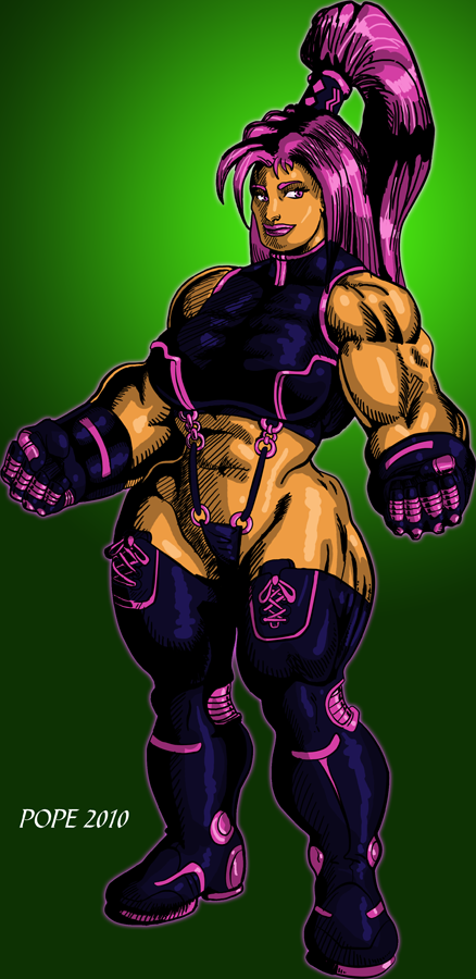
's Fisticuff. There are quite a few tribute pics so I figured I'd practice my inks and shadows on one I had already done pencils on HERERelated content


Comments: 27

 - :D")


Ha! I'm not sure about that...
 (Smile) - :)")
👍: 0 ⏩: 1

lol ok maybe not. Still looks tough.
👍: 0 ⏩: 1
Nothing wrong with a strong woman!
👍: 0 ⏩: 1

Thanks, Rod. What do you think of this style with the heavy blacks? I am thinking it's starting to look more professional.
👍: 0 ⏩: 2

"look good in certain areas"
Sorry Gary, I should stop trying to do this at work.

👍: 0 ⏩: 1

👍: 0 ⏩: 0
I think the heavy black inks look in certain areas like reflective surfaces or textures (in this case Fisty's suit) or when shooting for extreme contrast.
It tends to give things a hard, stark look so I wouldnt use it everywhere.
Fisty's a tough lady, but there's velvet covering that hammer
 (Wink) - ;)")
👍: 0 ⏩: 1
Great and helpful insight. Thanks, Rod.
👍: 0 ⏩: 0

Thanks, Eric. You sound as if you didn't do a tribute of your own. LOL I did lose her cute factor though.
👍: 0 ⏩: 1

I know Jeb is loving it! Nice job man!
👍: 0 ⏩: 0
Thanks, Jed, I'm really glad you like it. Any tips for improvement? I made some changes from the pencils to make it a bit better, but I lost her cute factor.
👍: 0 ⏩: 1

Hmm- it looks like her expression changed from pencil to ink- she had a sort of impish look in pencil, more serious in ink. Also the outline of her face is sort of bumpy and large jawed which may account for some loss of cute.
Other things that pop out to me are proportion issues- her legs look really good and solidly drawn, but they are short compared to her torso. Her chest, arms and head are all a bit large for her legs, and her abdomen from sternum to hip is very short (I do this too a lot) making for a very abrupt transition to her big hips. If you draw a little more waist you can make a longer, smoother transition from ribs to hips and a more attractive line to the torso.
Regarding inking, the hatching is a bit harsh once you apply color- have you considered doing a color hold on the shading on skin and hair, making it a color instead of black?
👍: 0 ⏩: 1
Thanks, Jed. I think you told me that about the torso before too. I have much to keep in mind. I really appreciate you taking the time to crit.
👍: 0 ⏩: 0