HOME | DD
 hulkdaddyg — Gilead Samson
Published: 2009-08-08 05:28:15 +0000 UTC; Views: 2296; Favourites: 38; Downloads: 103
Redirect to original
Description
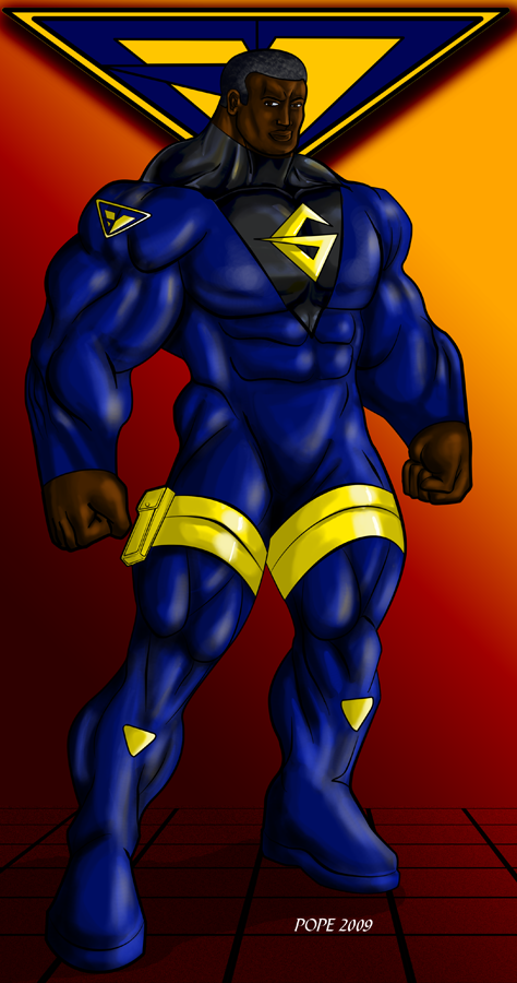
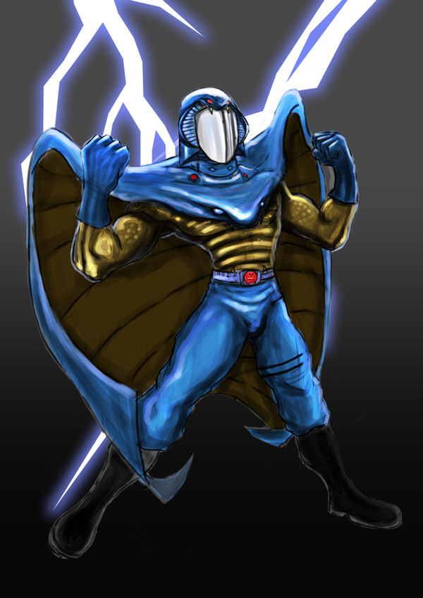
Oh God people still fav this! Here's the update*EDIT* I took off the "butler" gloves and changed the costume color behind the G to make it stand out more. Thanks for everyone's input! I think he looks awesome now.
*edit* Changed facial structure, it was really bothering me.
*edit changed bg colors and his "bib" look. Looked like a giant baby and that's not what I intended, but in pulling the design down to a V shape I let his musculature distort the look. I guess you have to give somewhere.
Well after much introspection I have decided to give my entire concept an overhaul. I really felt my flagship character didn't carry enough distinction and was a bit boring to look at so I gave him a new look. I am rethinking my entire approach to my comic idea as well. Everyone that I gave my outline to said nearly identical things, so a change was in order.
My concept of Elohim Rapha is dead. Anyone curious about that name, it comes from Hebrew words in the Bible. Elohim is the plural word for God and was used three times for angels. Rapha means mighty, large or giant. So very loosely Elohim Rapha means Giant Angels. It may catch on eventually but I'm trading the cerebral for the flashy...
Introducing the team G-7! Much of my ideas revolve around what I know to be God's numbers as they appear in the Bible. 3, 4(40), 6(666),7 and 12. 7 is what I understand to be God's number of completion and as a Christian to me it is significant, however this new name will bear much less explanation. G-7 can simply be Gilead's 7 team members or whatever one comes to the conclusion that it is. It can make sense in a few ways and I like that.
As I am submitting this I haven't yet responded to my comments on the preliminary design with a basic outline over my pencils and some flats and highlights. i gotta give thanks to for suggesting the gloves. I also want to thank him and for feedback on my outline which has led to these major changes.
I will not be using the old costume and the rest of the team will be going through changes as well.
Related content


Comments: 34

I'll start with this one would you like me to use the same picture for the " classified" head shot. I just need basic powers. I can do wonders with that.
👍: 0 ⏩: 1

...well here's his bio [link] If you don't have time to read all that then let me know... maybe this [link] can help summarize a bit too.
👍: 0 ⏩: 1
LOL i ALMOST HAVE YOU FINISHED.
👍: 0 ⏩: 0

That is awesome! I think he would look good with black gloves that go up to his elbow.It would also look good with black leg boots going down from the yellow leg thingies. Just an idea to even out the extra black.
👍: 0 ⏩: 1
That's a cool idea, but I think I like how it is now. Thanks for your input, I really appreciate it.
 (Smile)")
👍: 0 ⏩: 0

I agree with ~tsukijin about a different approach to the gloves. Maybe they could go a bit further up the forearm too.
👍: 0 ⏩: 1
...I'm killing the gloves. Thanks.
👍: 0 ⏩: 0

I like how the new look has that slick futuristic feel, like he's been a superhero and knows how to kick ass. But the gloves just don't seem to go with the rest of the outfit.
kinda reminds me of those gloves that you'd always see the butlers wearing in those old timey movies. ...maybe if you add some sort of deign to go with the rest of the suit, like some blue areas or something.
like this>> [link] Something simple really. ^^
👍: 0 ⏩: 1
Thanks Tsuki. I like that idea, I think I'll see if I can make that work. One of the thoughts I had when redesigning was to make it simpler, easier to draw an entire comic with him without getting burned out.
👍: 0 ⏩: 1
that's true, it's one of those problems that we all face eventually. ^^ don't even get me started on how frustrating it is with animation. >,<
that's mainly why I was suggesting something simple. it'll help define the gloves but also be easy to draw over and over again.

👍: 0 ⏩: 0
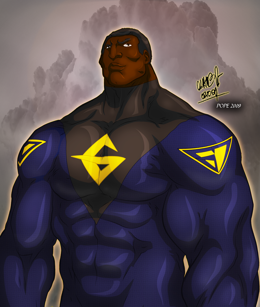
I like this I think you did a good job. He looks quite powerful.
👍: 0 ⏩: 1
Thanks, man. I got a lot of new stuff coming.
👍: 0 ⏩: 1
Awesome well it's very cool to hear that.
👍: 0 ⏩: 0

It's tough to see you struggling with all the re-designs. There was a lot I liked about the original look. It struck me as distinctly unique. I'll need to go back and take another look. Not to say that this one won't work exceedingly well. Just my thoughts. Like Adam Meyer and Rod and, yes, even me, keep on experimenting. Something's gonna scream to you eventually!
👍: 0 ⏩: 1
Thanks Eric. I appreciate the support. This last issue was an artistic one that I noticed while doing other sketches of Gilead and... others. I do like this design better that the old because it will fit better with what I have in mind for my story. I also believe it's a far more iconic look akin to Superman that will carry on long after I'm gone.
👍: 0 ⏩: 1
Hope you don't mind but I took a rough rough crack at how I might make Gilead if he were part of my universe. You prolly won't like it but I tried to keep some elements from your first renderings of him and altered other elements. As far as color schemes, I was torn between two. Uploading shortly....
👍: 0 ⏩: 1
Of course I don't mind. I love seeing my characters and in fact I am honored when anyone thinks enough of them to render them! Can't wait to see it!
")
👍: 0 ⏩: 0

Not bad...I'm still partial to the original...I'm not crazy about the boots being blue...makes it look like he's wearing a total jumpsuit...maybe make the boots and gloves black? Maybe add a black outline around the insignia on his chest to key it in? Just some ideas...rock on Gary!!
👍: 0 ⏩: 1
Thanks for the ideas Gabe. I will run them through photoshop and see if they gel with me. I was going for a more streamlined look here.
👍: 0 ⏩: 1
Sure thing bro! May turn out rather cool...then again, it may not too...lol...either way just have fun dude!
👍: 0 ⏩: 0

Simplifying the concept makes a lot a sense, so I definitely understand it, I had to do the same with my original teams.
👍: 0 ⏩: 1
Thanks for the support, James. There are many changes for me in the works.
👍: 0 ⏩: 0


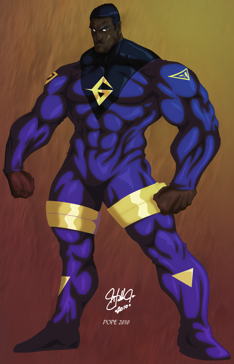
I really like this redesign. He is much more iconic now. I always thought Gilead could have used a bit of a revamp. He's your flagship character and in my opinion he was one of the least impressive looking of your universe. I do wonder however if going so much in a superhero direction is what you want. I sort of miss the details on the boots and the less "spandexy" style. I'm not one that hopes you keep both looks but the other did have it's charm. If you still use it, it might work well as an early outfit before he gets this one. I'm really curious about the rest of the team now... particularly Grudge!
👍: 0 ⏩: 1
Thanks, Jami. It is true to me that Gilead's old look was the least impressive. I was truly going for the understated look for many reasons, but as I said I am trading the cerebral for the flash so..viola! ...but after hearing some comments about the old look, I have actually sketched up a reasonable alternate that I will post soon. Grudge already had two costumes so it's no biggie. The alternate has NO SPANDEX.

👍: 0 ⏩: 0

Change is always exciting, but please "don't throw the baby out with the bath water."
There was a lot I liked about your concept, especially the virtuous Gilead.
The new Gilead looks very cool though and I'm eager to see what other changes you've made.
👍: 0 ⏩: 1
Thanks, Rod. Virtuous Gilead remains and will be highlighted as a major point in the story. After these reactions, I may have to keep the old uniform as an alternate. New Grudge has two.
👍: 0 ⏩: 0

Hey- how about we refer to them as Golden Age and Silver Age Gileads? Or maybe Earth-1 and Earth-2 Gileads? Just kidding, but I really did like the short-sleeved, work boot combo- this was a guy going to work! I like the new design, too so I'm just torn on this.
👍: 0 ⏩: 1
I am awesomely glad you liked the old costume, and though I was not planning on it, may keep it as an alternate. I was going for "Superman" with this look.
👍: 0 ⏩: 1
Cool. I look forward to seeing how the other changes you have put in will gel together!
👍: 0 ⏩: 1
I have decided to add a redesigned version of the old one based on yours and others comments, in fact my 11 year old son prefers him with the belt and was happy when he woke up and saw my sketch this morning.
👍: 0 ⏩: 0

the white breaks the one tone feel i've been getting from your team... ^_^ i'm bothered by how the suit is streamlined all over... IMO the yellow part should realy stick out... to give a more 3D feel... and i'm missing something with the boots ^_^
👍: 0 ⏩: 1
...I'm at a loss on how to respond here... but I'll try. The white area I cycled through many colors. It was going to be red, and my son didn't like it so I ended up with silver. I guess I need to make it more shiny. The streamlined look was to go the more superhero route and make him look more like Superman or the X-Men. As far as the boots go I wanted a streamlined look, so I made it simple. These are just what I was thinking when I did it.
👍: 0 ⏩: 0